It's a bit of a joke that everything I do ends up turning into a revamp of a UI system. So here's how this came about.
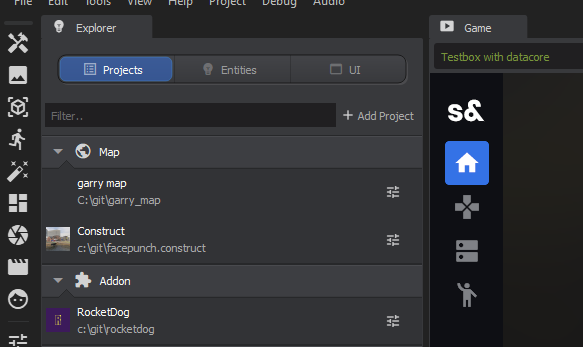
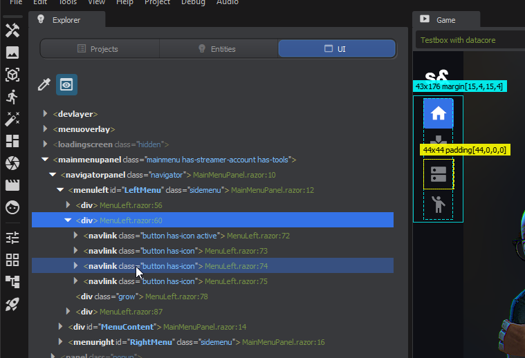
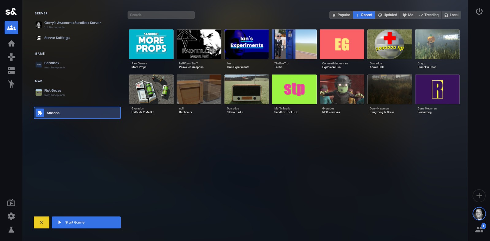
The addons needed main menu ui changes. So I started doing that and I realised that it'd be a bunch easier if our HTML-like template system could have some basic logic blocks. So I started coding that, basic if blocks etc.
So about a day in I realised that this was fucking stupid. I was basically making a stupid way to make Razor templates.
At this point I have two options. Carry on down this path, knowing that I'd likely throw all this code away, just to hack it all in so I can carry on coding the addon stuff.. or I could spend a week seeing if it's feasible to use Razor.
How this works
Our UI isn't a html renderer. It's panels, like vgui or derma. But we can parse html/razor templates and build those panels.
So your razor code might look like this..
<root class="player-row">
<div class="title">@Player.Name</div>
<div class="score">@Player.Score</div>
@if ( Player.IsAdmin )
{
<div>ADMIN</div>
}
</root>
@code
{
public PlayerEntity Player { get; set; }
}attribute 'data-code' not allowedattribute 'data-language' not allowedattribute 'contenteditable' not allowedattribute 'blocktype' not allowed
The Razor system converts that to c# code. The c# code basically builds the actual UI panels. This is called building the render tree. Any time any of the contents are changed in this component, we'll rebuild the tree.
Rebuilding the tree doesn't mean creating new panels every time. It's smart about it. It'll only create a panel if it's missing, or delete one if it's no longer in the tree.
The nicest thing is it's component based. So you might have another Razor file that looks like this
<root>
@foreach ( var player in Entity.All.OfType<PlayerEntity>() )
{
<PlayerRow Player=@player></PlayerRow>
}
</root>
attribute 'data-code' not allowedattribute 'data-language' not allowedattribute 'contenteditable' not allowedattribute 'blocktype' not allowed
And that'll create the PlayerRow panel that was defined above, for each player. This is simple stuff that was so frustrating to do in the old system.
Why does this work?
This is the perfect fit for s&box because of our hotloading. You can save your code and in half a second it's updated. It's the exact same with these razor files.
This wouldn't really work in other engines, because they can't hotload like we do. Even the actual Razor/Blazor doesn't work as good as this does in terms of iteration.
What sucks?
Intellisense doesn't work great. It works well enough, but it could definitely be better. This is really a visual studio thing. For some reason they ship all of the tooling with Visual Studio, so you can't just grab it and make your own version as far as I can see.
I tried a few things to make it better, like mocking up all the classes that their internal tooling looks for in the assemblies, but in the end it was no good.
On the bright side this is only something that can get better.
More Information
 attribute 'blocktype' not allowedattribute 'contenteditable' not allowed
 attribute 'contenteditable' not allowedattribute 'blocktype' not allowed
 attribute 'contenteditable' not allowedattribute 'blocktype' not allowed
 attribute 'data-gallery-style' not allowed
 attribute 'data-gallery-style' not allowed
 attribute 'data-gallery-style' not allowed
 attribute 'data-gallery-style' not allowed
 attribute 'blocktype' not allowedattribute 'data-image-style' not allowedattribute 'contenteditable' not allowed
 attribute 'blocktype' not allowedattribute 'data-image-style' not allowedattribute 'title' not allowedattribute 'contenteditable' not allowed
 attribute 'contenteditable' not allowedattribute 'blocktype' not allowed
 attribute 'contenteditable' not allowedattribute 'blocktype' not allowed
 attribute 'blocktype' not allowedattribute 'contenteditable' not allowed
 attribute 'blocktype' not allowedattribute 'contenteditable' not allowed
 attribute 'contenteditable' not allowedattribute 'blocktype' not allowed
 attribute 'contenteditable' not allowedattribute 'blocktype' not allowed
 attribute 'contenteditable' not allowedattribute 'blocktype' not allowed
 attribute 'data-gallery-style' not allowedattribute 'data-gallery-alignment' not allowed
 attribute 'data-gallery-style' not allowedattribute 'data-gallery-alignment' not allowed
 attribute 'data-gallery-style' not allowed