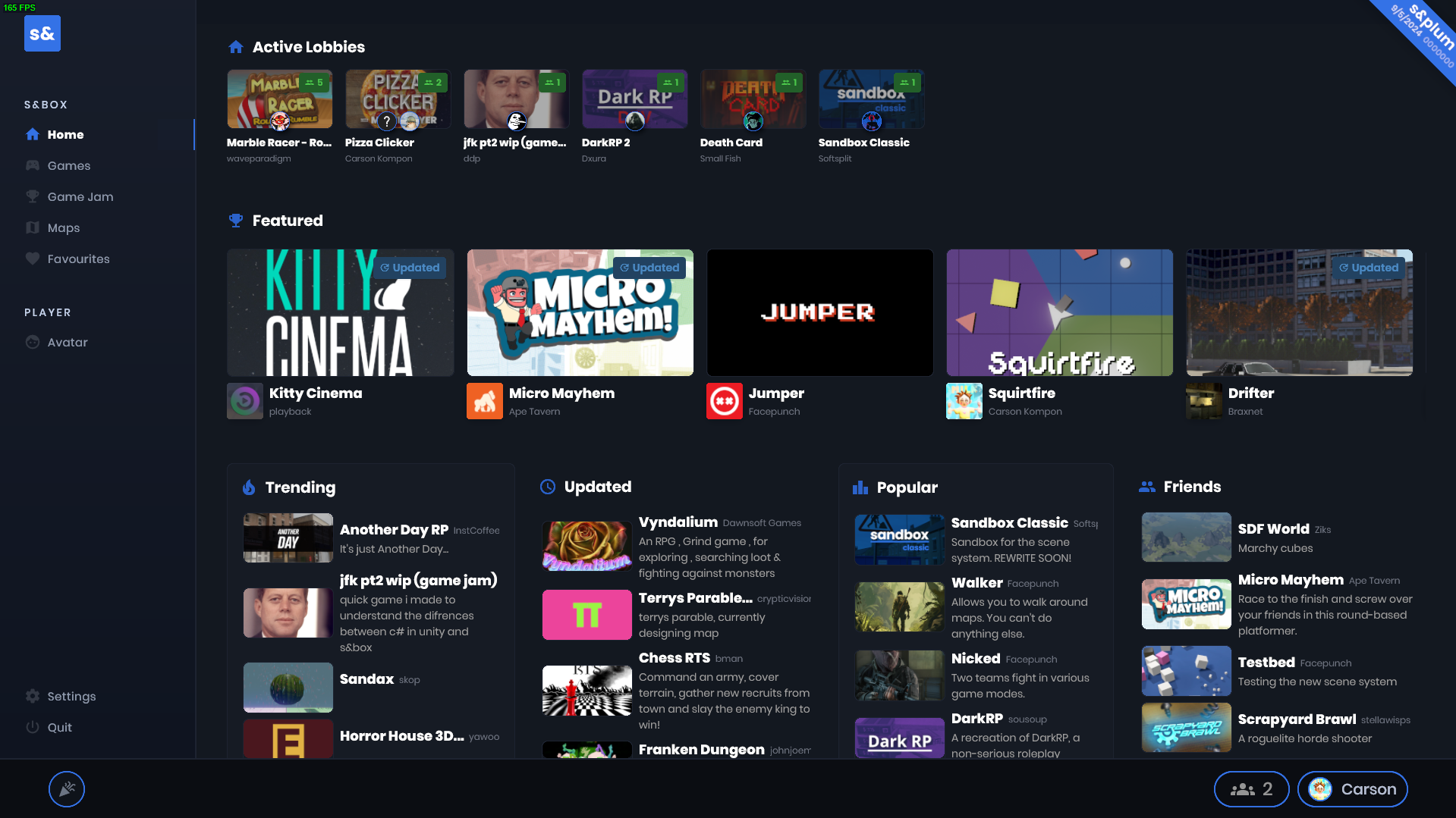
A few months ago Lewis designed a brand new Main Menu, and I spent most of this month implementing and fine-tuning it. The goal is to make the Main Menu feel less like a console game and more like a proper games library.
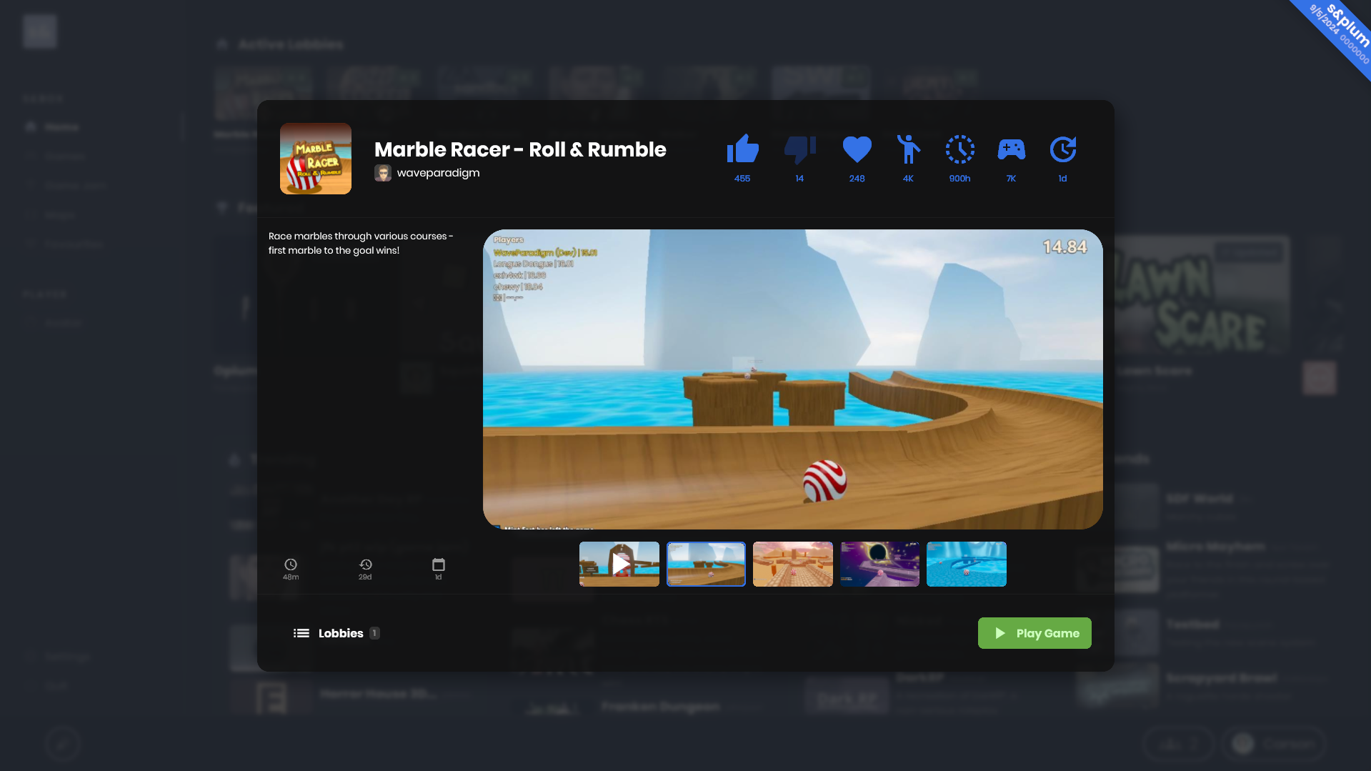
Nearly everything is broken up into different modals now, including a modal that tells you a bit about a game before you jump into it. We're hoping this new flow encourages engagement like rating and reviews so it's super easy for players to instantly give feedback on games.
There's still more to be done, and things will likely change again, but this step was essential for us to realize the flaws with our current Main Menu and cleanup proper.


