The s&box editor comes with a node editor framework, used by built-in tools such as Shader Graph and (at the time of writing) Action Graph.
The framework itself is extensible, allowing for a wide range of tools to be built from it, supporting custom functionality. In the following guide, we're going to build a basic node-based calculator to introduce you to the framework and it's concepts.
I have tried to break it down into separate segments to try and make it easier to understand for people, however with a lot of interconnected parts there is bound to be some confusion jumping between several classes and making changes. I'm open to feedback.
Project code can be found on GitHub, with each chapter/milestone having a snapshot of the code at that point in the tutorial.
The Interfaces
The provided interfaces can be split into two categories - the UI and the data.
Depending on how much you wish to deviate from the default styling - you can get away with very few custom classes when it comes to UI. The main 'UI' classes include:
GraphView - This is the main Widget that handles the display of the IGraph and all of the nodes it contains. It also contains most of the visual based functionality, such as context menus, search results, etc.
NodeUI - The visual of each INode contained within the graph. Can be heavily customised to suit your preferred style.
Plug/PlugIn/PlugOut - The visual representation of node inputs and outputs. These are created as children of the NodeUI, including their positioning relative to the node. At the time of writing, they cannot be visually customized due to being hardcoded types in the NodeUI.
Connection - The lines that are drawn between the inputs and outputs of nodes when they are connected.
A majority of the 'data' classes are simply interfaces that serve to tie the UI to your node data. These include:
IGraph - The graph. As the graph is mostly just a container for nodes, it has very limited functionality, notably adding and removing nodes. It does, however, handle the serialization - which is important for saving and loading.
INode - A node. Nodes are one of the most complex classes across the framework with a large interface. INode will be covered in more detail in the calculator example.
INodeType - Used by the GraphView to populate menus and acts as a factory to instantiate new nodes.
IPlug/IPlugIn/IPlugOut - The plugs on the nodes. The IPlug interface carries with it a lot of the foundational properties of a plug that are inherited further by the In and Outs. IPlugIn then carries a reference to the connected output, and IPlugOut is empty as it mostly serves as a reference plug.
Most of the work involved with setting up the node editor is around implementing the interfaces. Once the interfaces are in place, lots of the built in editor widgets will handle the rest, which can then be extended with custom functionality.
To begin work on our calculator, we will need to create our editor tool and it's corresponding UI. Keep in mind to keep your code in it's own namespace for organization, and to work inside your project's Editor folder (or the Editor folder of a library).
We'll start by creating our main widgets. We're going to need a widget to act as the EditorApp, one for the GraphView, and another for the Properties panel (or Inspector)
GraphView:
public class CalculatorGraphView : GraphView
{
    public CalculatorGraphView(Widget parent) : base(parent)
    {
    }
}
Properties:
public class CalculatorProperties : Widget
{
    public CalculatorProperties( Widget parent ) : base( parent )
    {
       FixedWidth = 300;
       Layout = Layout.Column();
    }
}
EditorApp:
[EditorApp("Calculator", "calculate", "A rather impractical node based calculator.")]
public class Calculator : Widget
{
    private CalculatorGraphView _graphView;
    private CalculatorProperties _properties;

    public Calculator()
    {
       WindowTitle = "Calculator";
       SetWindowIcon( "calculate" );
       FixedSize = new Vector2( 1200, 800 );

       Layout = Layout.Row();

       _graphView = new CalculatorGraphView( this );
       _properties = new CalculatorProperties( this );

       Layout.Add( _graphView );
       Layout.Add( _properties );
    }
}
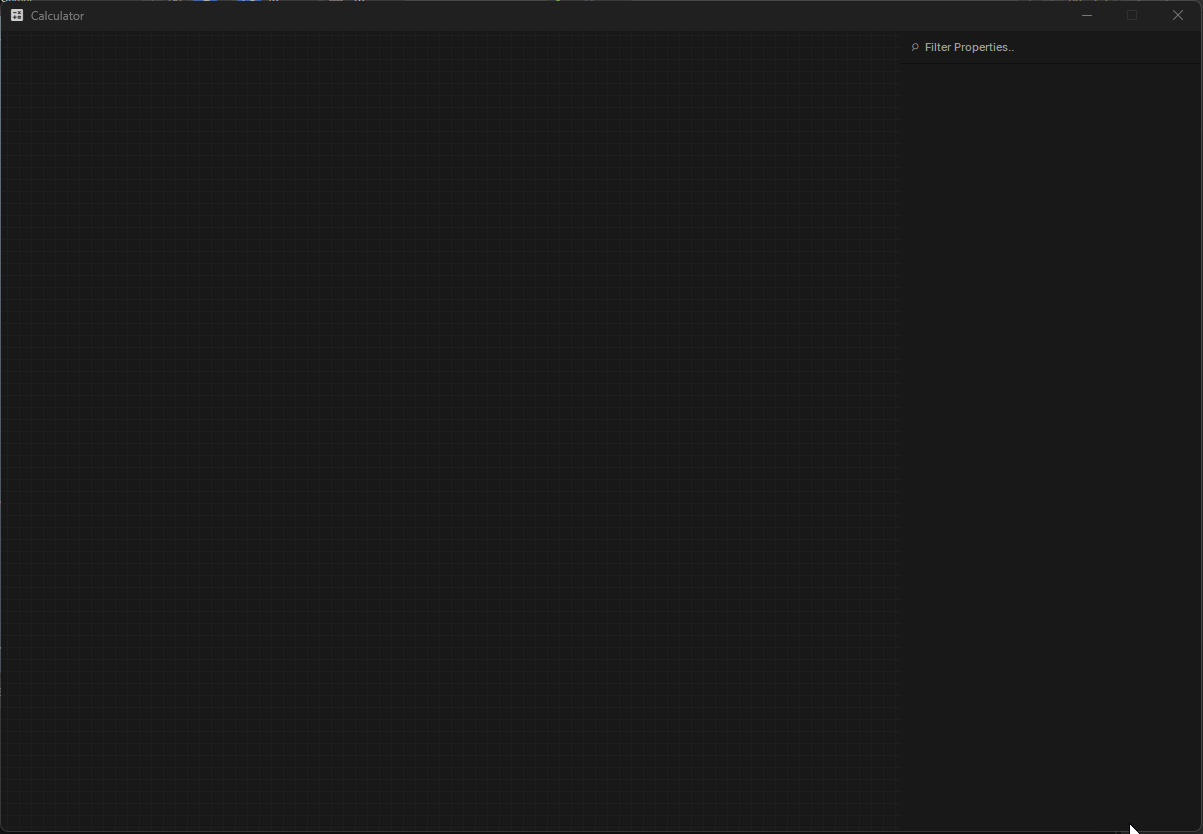
With these three classes in place, you should now have a new tool in the Tools tab of the editor.
Opening your tool should give you a GraphView on the left, and a blank Properties widget on the right.
We're going to get our nodes set up as early as possible in order to have something visual to work with. Start by creating a base node class, which will implement the INode interface. The base node will be an abstract class and be the parent for all our functioning nodes.
Your IDE should handle implementing the missing members of INode. I have mine set up to implement as public members and to make properties automatic properties. We will be changing most of these later anyway to suit our needs. I have added comments to each of the implemented members for extra context.
public abstract class CalculatorNode : INode
{
    // Called when the node is changed.
    public event Action Changed;

    // The unique identifier of the node.
    public string Identifier { get; }

    // The display info of the node, such as title, icon description, etc. - this is used by the NodeUI for styling and for populating menus with our node.
    public DisplayInfo DisplayInfo { get; }

    // Can the node be duplicated? For some unique nodes you may wish to only have one (for example, ShaderGraph's 'Material' node - which serves as it's output)
    public bool CanClone { get; }

    // Can the node be removed from the graph? Similar use case to CanClone.
    public bool CanRemove { get; }

    // The position of the node within the graph.
    public Vector2 Position { get; set; }

    // The size of the node. This is determined by the NodeUI, but can be overridden here if you want to enforce a custom size.
    public Vector2 ExpandSize { get; }

    // Let the NodeUI handle the sizing of the node based on its content.
    public bool AutoSize { get; }

    // The inputs and outputs of the node.
    public IEnumerable<IPlugIn> Inputs { get; }
    public IEnumerable<IPlugOut> Outputs { get; }

    // Error checking/validation.
    public string ErrorMessage { get; }
    public bool IsReachable { get; }

    // An optional thumbnail - if the node has one, the NodeUI will display it.
    public Pixmap Thumbnail { get; }

    // Can be used to draw over the top of our custom node.
    public void OnPaint( Rect rect )
    {
       throw new NotImplementedException();
    }

    // Called when the node is double clicked.
    public void OnDoubleClick( MouseEvent e )
    {
       throw new NotImplementedException();
    }

    // If this is true, the NodeUI will display the title of the node in the UI.
    public bool HasTitleBar { get; }

    // Creates the UI of the node.
    public NodeUI CreateUI( GraphView view )
    {
       throw new NotImplementedException();
    }

    // The color used by the NodeUI to color it.
    public Color GetPrimaryColor( GraphView view )
    {
       throw new NotImplementedException();
    }

    // An optional context menu.
    public Menu CreateContextMenu( NodeUI node )
    {
       throw new NotImplementedException();
    }
}
There are some changes we need to make in order for our node to be rendered in a GraphView. Firstly, we need to change CreateUI and make it return a NodeUI, as this is what makes the UI instance for our graph. I'm also going to make it virtual so we can override it with custom UI later on a per-node basis if needed.
// Creates the UI of the node.
public virtual NodeUI CreateUI( GraphView view )
{
    return new NodeUI( view, this );
}
We can also set the default color of our node. I'm going to make a virtual Color property that we can override in future nodes also.
[JsonIgnore, Hide, Browsable( false )]
public virtual Color PrimaryColor { get; } = new Color( 0.2f, 0.45f, 0.92f );

// The color used by the NodeUI to color it.
public Color GetPrimaryColor( GraphView view )
{
    return PrimaryColor;
}
We're going to need to clear the NotImplementedException from the OnPaint method. Nodes get painted constantly on events like MouseOver so this will need to be cleared to ensure no exceptions are thrown. While we are fixing that, we will make the function virtual so we can do custom painting on nodes in future.
// Can be used to draw over the top of our custom node.
public virtual void OnPaint( Rect rect )
{

}
And lastly, we're going to need to create the empty lists of our Inputs and Outputs. Without initialized lists the NodeUI will give us a NRE. We'll also make them virtual as well.
// The inputs and outputs of the node.
public virtual IEnumerable<IPlugIn> Inputs { get; protected set; } = [];
public virtual IEnumerable<IPlugOut> Outputs { get; protected set; } = [];
With these changes made to our base CalculatorNode class, our node should have enough of the interface implemented to be created on a graph.
Before we can add our node to the graph, we're going to need to make a new class implementing INodeType.
The purpose of this class is to store a node's Type and DisplayInfo, and then instantiate them from that type when needed. This is also used to populate menus, like the one we are going to use to create our node. Similar to how we implemented INode, we'll implement INodeType into this new class.
public class CalculatorNodeType : INodeType
{
    public Menu.PathElement[] Path { get; }

    public bool TryGetInput( Type valueType, out string name )
    {
       throw new NotImplementedException();
    }

    public bool TryGetOutput( Type valueType, out string name )
    {
       throw new NotImplementedException();
    }

    public INode CreateNode( IGraph graph )
    {
       throw new NotImplementedException();
    }
}
We can use the EditorTypeLibrary to get TypeDescriptions of nodes, which we can then pass into our NodeType class and then use that to populate our menus. We'll add a constructor to our NodeType class along with some properties for this.
// The type and the display info related to this node type.
public TypeDescription Type { get; }
public DisplayInfo DisplayInfo { get; protected set; }

public virtual string Identifier => Type.FullName;

public CalculatorNodeType( TypeDescription type )
{
    Type = type;
    if ( Type is not null )
       DisplayInfo = DisplayInfo.ForType( Type.TargetType );
    else
       DisplayInfo = new DisplayInfo();
}
Now we have access to the node's DisplayInfo, we can use that to populate the menu path.
public Menu.PathElement[] Path => Menu.GetSplitPath( DisplayInfo );
Lastly for our NodeType class, we need to update the CreateNode method so it is capable of creating instances of our nodes.
// Create a new node.
public INode CreateNode( IGraph graph )
{
    return Type.Create<CalculatorNode>();
}
Now that we have our node and the information to create it, we just need to add them to the context menu of our GraphView so we can create them.
Returning to our CalculatorGraphView, make a function that uses EditorTypeLibrary to get all the different types of CalculatorNodes. Using those TypeDescriptions, we can instance a new CalculatorNodeType and add it to our list of available nodes.
private readonly Dictionary<string, INodeType> _availableNodes = new( StringComparer.OrdinalIgnoreCase );

private void AddNodeTypes()
{
    var types = EditorTypeLibrary.GetTypes<CalculatorNode>()
       .Where( x => !x.IsAbstract ).OrderBy( x => x.Name );

    foreach ( var type in types )
    {
       var nodeType = new CalculatorNodeType( type );
       _availableNodes.TryAdd( nodeType.Identifier, nodeType );
    }
}
By adding AddNodeTypes to the constructor of the CalculatorGraphView, we can ensure that the node list is populated every time we open a new Calculator window.
GraphView comes with features to filter by relevant nodes, which is particularly useful later on, but for now we will need to implement it in order to ensure it returns the list of NodeTypes we just created. We can do so simply by adding an override for now.
Finally we have enough implemented to create a node. However, we do not have a node to spawn. We'll need to create a placeholder to test with. Make a new class derived from our base CalculatorNode and give it some attributes to make it pretty in the menu we just set up.
[Title( "Add" ), Icon( "add" ), Description( "Adds two values together" )]
public class Add : CalculatorNode
{
}
With that final piece of the puzzle, you should now be able to open a new Calculator window and create your placeholder node.
The plugs can be where things start to get messy, with several new interfaces being introduced and many different ways to populate your plugs based on the purpose of your tool. In order to try and keep things simple, we will first create temporary plugs manually, and then look at populating them automatically via property attributes.
Plugs come with 3 main interfaces to implement - IPlug, IPlugIn and IPlugOut.
IPlug is the parent interface of both IPlugIn and IPlugOut, so we will begin by creating a new recordfor our plug, letting our IDE handle the default implementation of the interface. I have provided an example along with some comments for extra context.
public record CalculatorPlug : IPlug
{
// A reference to the node this plug belongs to.
public INode Node { get; }
// The name of this plug, typically matches the name of the property it is attached to.
public string Identifier { get; }
// The type of the property that this plug represents. (eg. bool, Vector2, MyCustomStruct)
public Type Type { get; }
// The DisplayInfo of the plug, usually populated via the property that it represents.
public DisplayInfo DisplayInfo { get; }
// Plugs can have custom editors in the UI - ShaderGraph's 'Blend' node uses a custom value editor for the Fraction property, displaying a slider for users to adjust the value with.
public ValueEditor CreateEditor( NodeUI node, Plug plug )
{
throw new NotImplementedException();
}
// Like nodes, you can define custom context menus for plugs.
public Menu CreateContextMenu( NodeUI node, Plug plug )
{
throw new NotImplementedException();
}
// Similar to context menus, you can run code when a plug is double-clicked.
public void OnDoubleClick( NodeUI node, Plug plug, MouseEvent e )
{
throw new NotImplementedException();
}
// Various styling options for the plugs - you can play around with these to see the different way NodeUIs are drawn.
public bool ShowLabel { get; }
public bool AllowStretch { get; }
public bool ShowConnection { get; }
public bool InTitleBar { get; }
// Same debug stuff as nodes.
public bool IsReachable { get; }
public string ErrorMessage { get; }
}
IPlugIn is next. We'll make another record, this time inheriting from the CalculatorPlug record we just defined, while implementing the IPlugIn interface. There is only a handful of stuff here, as the bulk of it is handled by the parent.
It is worth noting here the ConnectedOutput property that comes with IPlugIn. This is what references the output connected to it and is what makes the whole graph work. Output plugs don't care what they are connected to, or what happens with their outputs - it's up to the Inputs to have a reference to the outputs so they can reference the node and read the property.
public record CalculatorPlugIn : CalculatorPlug, IPlugIn
{
// The output that plugs into this input.
public IPlugOut ConnectedOutput { get; set; }
public float? GetHandleOffset( string name )
{
throw new NotImplementedException();
}
public void SetHandleOffset( string name, float? value )
{
throw new NotImplementedException();
}
}
Lastly is the IPlugOut interface. This one is a easy one-liner, it doesn't even need a body.
public record CalculatorPlugOut : CalculatorPlug, IPlugOut;
We'll start with implementing the reference to the owning node by requiring it in the default constructor of the IPlug interface, and then doing the same with the records that inherit from it.
public record CalculatorPlug( CalculatorNode Node ) : IPlug
{
// A reference to the node this plug belongs to.
INode IPlug.Node => Node;
...
}
The UI also requires plugs to have a Type - so we will add a placeholder type for now which we will later populate from the property of the type it represents.
// The type of the property that this plug represents. (eg. bool, float, Vector2, MyCustomStruct)
public Type Type => typeof( float );
Lastly, we will not be covering the creation of custom editors (yet, anyway) - so returning null will default it to a normal plug.
// Plugs can have custom editors in the UI - ShaderGraph's 'Blend' node uses a custom value editor for the Fraction property, displaying a slider for users to adjust the value with.
public ValueEditor CreateEditor( NodeUI node, Plug plug )
{
return null;
}
We should now have enough implemented to create a plug, so to test it out, we'll hard code a new input into our base CalculatorNode to make sure it works. We can do this by simply making a new CalculatorPlugIn and adding it to our Inputs list.
public CalculatorNode()
{
Inputs = [ new CalculatorPlugIn( this ) ];
}
Creating our placeholder node should now come with an input plug. With the ability to manually create inputs we can test out how the built in UI class handles the positioning and placement of inputs and outputs for us. Let's add a bunch of inputs and outputs.
public CalculatorNode()
{
Inputs = [ new CalculatorPlugIn( this ), new CalculatorPlugIn( this ), new CalculatorPlugIn( this ), new CalculatorPlugIn( this ), new CalculatorPlugIn( this ) ];
Outputs = [ new CalculatorPlugOut( this ), new CalculatorPlugOut( this ),new CalculatorPlugOut( this ),];
}
Now would be a good time to adjust some style settings in our base CalculatorNode to get them looking nicer. We can make AutoSize virtual and default it to true - this will let the NodeUI size the node according to the size it needs for the plugs.
// Let the NodeUI handle the sizing of the node based on its content.
public virtual bool AutoSize => true;
I'm also going to do the same to HasTitleBar, so we can see the name of the node once we implement that part.
// If this is true, the NodeUI will display the title of the node in the UI.
public virtual bool HasTitleBar => true;
The placeholder node should look more stylish, but with a lack of information to display it is looking a bit slim.
An excellent way to automate the creation of node inputs and outputs is via property attributes. Similar to how we can add a [Title] attribute to change the display name of a property in the editor, we can also create plugs using an attribute.
We'll start by defining our attributes. Because attributes only need to go on node properties, we can define the attributes inside the base node class. I will add these two to the bottom of my base CalculatorNode.
[AttributeUsage( AttributeTargets.Property )]
public class InputAttribute : Attribute
{
public Type Type;
public InputAttribute( Type type = null )
{
Type = type;
}
}
[AttributeUsage( AttributeTargets.Property )]
public class OutputAttribute : Attribute
{
public Type Type;
public OutputAttribute( Type type = null )
{
Type = type;
}
}
With our attributes added, we need a method to:
Get all the properties in the node that have an [Input] or [Output] attribute.
Create a new CalculatorPlugIn and CalculatorPlugOut respectively.
Add those to our input and output lists.
We can add a static function that does just that to our base CalculatorNode as well.
private static (IEnumerable<IPlugIn> Inputs, IEnumerable<IPlugOut> Outputs) GetInputsAndOutputs( CalculatorNode node )
{
var type = node.GetType();
var inputs = new List<CalculatorPlugIn>();
var outputs = new List<CalculatorPlugOut>();
foreach ( var propertyInfo in type.GetProperties() )
{
if ( propertyInfo.GetCustomAttribute<InputAttribute>() is { } inputAttrib )
{
inputs.Add( new CalculatorPlugIn( node ) );
}
if ( propertyInfo.GetCustomAttribute<OutputAttribute>() is { } outputAttrib )
{
outputs.Add( new CalculatorPlugOut( node ) );
}
}
return (inputs, outputs);
}
Whenever we run this function, it will populate our inputs and outputs. An ideal place to do this would be in the constructor, so whenever we create a new node, it will auto-populate the plugs. Removing the placeholder code from earlier, our constructor now looks like the below.
public CalculatorNode()
{
(Inputs, Outputs) = GetInputsAndOutputs( this );
}
To test this, we'll add a few properties to our placeholder node and see how it goes. I'm also going to preemptively add some extra attributes such as a Title and Description, because we'll be using them later.
[Title( "Add" ), Icon( "add" ), Description( "Adds two values together" )]
public class Add : CalculatorNode
{
[Input, Title( "Float" ), Description( "This is a test input." )] public float MyTestInput { get; set; }
[Input] public int MyOtherTestInput { get; set; }
[Output] public bool MyTestOutput { get; set; }
}
Opening up our calculator and creating the node results in exactly what we wanted - the node now has it's own inputs and outputs from the properties we just added.
The editor comes with a really handy struct called DisplayInfo - which is populated from built-in engine attributes such as [Title], [Icon] or [Description] to name a few. Just like how we now create node inputs and outputs from attributes, we can use DisplayInfo to make our Calculator a bit more pretty.
Let's start with the base CalculatorNode. This one is straightforward - the INode interface already implemented our DisplayInfo property (which is used in the NodeUI). However, we never set it, which is why our node is a bit naked - so we can add a single line into the CalculatorNode constructor to do so. I'll also make the DisplayInfo property virtual while we're here so we can make changes to it in future nodes. It's almost like just about all of INode is worth making virtual huh?
DisplayInfo also has a very handy static method to get DisplayInfo for something. So the code we add to the constructor can look something like this:
DisplayInfo = DisplayInfo.For( this );
This one line of code will populate our DisplayInfo to be used in the NodeUI, pulling attributes such as [Title] and [Icon] which we added to our placeholder node earlier on. So now we can see how NodeUI uses those two attributes. It even gives us a little context menu using the [Description] when we hover over it.So now we've got the DisplayInfo for our node set, it's time we did the same with our inputs and outputs.
Going back to our PlugIn and PlugOuts - we are already getting the [Input] and [Output] Attributes. We're going to extend this using reflection to get a PropertyInfo, which we can then use to generate a DisplayInfo for. To do so, we're going to need a CalculatorPlugInfo class. Each of our plug records will have a PlugInfo, which will store various information on that plug, such as the type of property it is.
public class CalculatorPlugInfo
{
public string Name { get; set; }
public Type Type { get; set; }
public DisplayInfo DisplayInfo { get; set; }
public PropertyInfo Property { get; set; } = null;
public CalculatorPlugInfo( PropertyInfo property )
{
Name = property.Name;
Type = property.PropertyType;
var displayInfo = DisplayInfo.ForMember( Type );
displayInfo.Name = property.Name;
DisplayInfo = displayInfo;
Property = property;
}
}
We can now create a PlugInfo for each [Input] and [Output] attribute and use that to populate the DisplayInfo of our original plugs. This will require extending the CalculatorPlug constructors to take a PlugInfo now.
public record CalculatorPlug( CalculatorNode Node, CalculatorPlugInfo Info ) : IPlug
Along with extending the CalculatorNode class to now make use of the property info.
// Uses reflection to find properties with the Input and Output attributes, and creates plugs for them.
private static (IEnumerable<IPlugIn> Inputs, IEnumerable<IPlugOut> Outputs) GetInputsAndOutputs( CalculatorNode node )
{
var type = node.GetType();
var inputs = new List<CalculatorPlugIn>();
var outputs = new List<CalculatorPlugOut>();
foreach ( var propertyInfo in type.GetProperties() )
{
if ( propertyInfo.GetCustomAttribute<InputAttribute>() is { } inputAttrib )
{
inputs.Add( new CalculatorPlugIn( node, new CalculatorPlugInfo( propertyInfo ) ) );
}
if ( propertyInfo.GetCustomAttribute<OutputAttribute>() is { } outputAttrib )
{
outputs.Add( new CalculatorPlugOut( node, new CalculatorPlugInfo( propertyInfo ) ) );
}
}
return (inputs, outputs);
}
We can update our plugs to use the plug info being passed into them.
// The name of this plug, typically matches the name of the property it is attached to.
public string Identifier => Info.Name;
// The type of the property that this plug represents. (eg. bool, float, Vector2, MyCustomStruct)
public Type Type => Info.Type;
// The DisplayInfo of the plug, usually populated via the property that it represents.
public DisplayInfo DisplayInfo => Info.DisplayInfo;
The calculator now shows some useful information when hovering over the inputs and outputs, however currently populated from the PropertyInfo and not the attributes. Now is a good time to set the ShowLabel in the CalculatorPlug as well.
// Various styling options for the plugs - you can play around with these to see the different way NodeUIs are drawn.
public bool ShowLabel => true;
We are already setting the title of the attribute in the PlugInfo, so while we do that, we can add a check to see if it has a Title attribute and set the title there. We'll also set the Description while we're at it.
public class CalculatorPlugInfo
{
public string Name { get; set; }
public Type Type { get; set; }
public DisplayInfo DisplayInfo { get; set; }
public PropertyInfo Property { get; set; } = null;
// Get the DisplayInfo from the PropertyInfo.
public CalculatorPlugInfo( PropertyInfo property )
{
Name = property.Name;
Type = property.PropertyType;
var displayInfo = DisplayInfo.ForMember( Type );
// Rename to the property name instead of the type.
displayInfo.Name = property.Name;
// Override that name if we have a Title attribute.
var titleAttr = property.GetCustomAttribute<TitleAttribute>();
if ( titleAttr is not null )
{
displayInfo.Name = titleAttr.Value;
}
// Add a description if we have a Description attribute.
var descriptionAttr = property.GetCustomAttribute<DescriptionAttribute>();
if ( descriptionAttr is not null )
{
displayInfo.Description = descriptionAttr.Value;
}
DisplayInfo = displayInfo;
Property = property;
}
}
And with that, our plugs should now properly use the attributes we give them.
Up until now we have been setting up a lot of connections and UI in the node, completely ignoring the graph side of things. GraphView has been holding up but it's time we made our own implementation of IGraph, because we're going to need it to tie everything together.
public class CalculatorGraph : IGraph
{
public IEnumerable<INode> Nodes { get; }
public void AddNode( INode node )
{
throw new System.NotImplementedException();
}
public void RemoveNode( INode node )
{
throw new System.NotImplementedException();
}
public string SerializeNodes( IEnumerable<INode> nodes )
{
throw new System.NotImplementedException();
}
public IEnumerable<INode> DeserializeNodes( string serialized )
{
throw new System.NotImplementedException();
}
}
The graph is straightforward compared to our INode - it has a list of all the nodes contained within it, methods to add and remove nodes, and methods to serialize and deserialize nodes for saving and loading. Serialization won't be covered in this tutorial, perhaps in a future one.
All we really need to do in our new Graph class is add some utility methods that will make working with nodes easier. We can start by adding a dictionary to store nodes and their GUID - this will give us a way to look up and select nodes by GUID, opening up a lot of utility that we will need when we start traversing our graph and making connections.
In order to satisfy the requirements of the IGraph interface, we'll also add a field that enumerates through that dictionary, and then make the interface return that.
// The IGraph interface implementation - we just return the custom enumeration below.
IEnumerable<INode> IGraph.Nodes => Nodes;
// A GUID/Node dictionary - so we can look up nodes by GUID.
private readonly Dictionary<string, CalculatorNode> _nodes = new();
// Enumerates through our dictionary of nodes.
public IEnumerable<CalculatorNode> Nodes => _nodes.Values;
We'll do the same for the AddNode and RemoveNode interface functions, casting them to a CalculatorNode before adding them to our dictionary.
// IGraph interface implementation - it casts the INode to a CalculatorNode.
public void AddNode( INode node )
{
AddNode( (CalculatorNode)node );
}
// The cast node is then added to our dictionary along with it's GUID.
public void AddNode( CalculatorNode node )
{
_nodes.Add( node.Identifier, node );
}
// IGraph interface implementation - it casts the INode to a CalculatorNode.
public void RemoveNode( INode node )
{
RemoveNode( (CalculatorNode)node );
}
// The cast node is then removed from our dictionary.
public void RemoveNode( CalculatorNode node )
{
_nodes.Remove( node.Identifier );
}
While we're here, we'll add two utility functions to the graph which we will use later, FindNode() and ClearNodes(). As mentioned above, FindNode can be used to find a node using it's GUID, which we will need when creating node connections and compiling our graph.
public CalculatorNode FindNode( string name )
{
_nodes.TryGetValue( name, out var node );
return node;
}
public void ClearNodes()
{
_nodes.Clear();
}
Now that we have a way to search and look up nodes by GUID - it would probably help if we actually gave our nodes a GUID. So heading back to CalculatorNode, we can add a method to generate a new GUID for nodes. We'll also need to give the Identifier property a setter, which it was missing from our default interface implementation.
public string NewIdentifier()
{
Identifier = Guid.NewGuid().ToString();
return Identifier;
}
We can then call this in the constructor, so every time a new node is created, it gets assigned a GUID.
We'll need to return to our CalculatorGraphView and get it to start using our new Graph class we just made. GraphView already has an implementation for handling IGraph, so use the new specifier to start using it as a CalculatorGraph instead.
public new CalculatorGraph Graph
{
get => (CalculatorGraph)base.Graph;
set => base.Graph = value;
}
We can make a new instance in the constructor to ensure we have a loaded CalculatorGraph when we open the calculator.
public CalculatorGraphView(Widget parent) : base(parent)
{
Graph = new CalculatorGraph();
AddNodeTypes();
}
Now that we have a custom graph class, we should be ready to start bringing all the pieces together.
Now we just need to draw the lines between connected nodes so they can reference one another. Earlier we created a PlugInfo class to store all the information related to the plugs, so we're going to add one more property to store the connected plug. In the CalculatorPlugInfo add:
public IPlugOut ConnectedPlug { get; set; } = null;
We can now go to CalculatorPlugIn and add to our getters and setters.
public IPlugOut ConnectedOutput
{
get => Info.ConnectedPlug;
set
{
if (Info.ConnectedPlug == value) return;
Info.ConnectedPlug = value;
}
}
The Node Editor interfaces handle all of the UI for us by drawing lines from the IPlugIn to the IPlugOut that is connected to it, as an input can only have one input, but an output can be connected to multiple inputs.
The very last and most important step is to go back to our base CalculatorPlug and make sure that we are drawing the connection - otherwise it will be invisible.
public bool ShowConnection => true;
This is pretty much the last piece of the puzzle. The actual functionality of your node editor is up to you, but you should now have the working foundation of a node editor implemented that you can expand upon.
I'm going to try and breeze through this because the bulk of the tutorial was just to cover the above. At the moment we're only setting the connections - but we want to also set the values of these properties when we form these connections as well. So we'll expand the ConnectedOutput code to also set the value of the input property when a connection is made.
public IPlugOut ConnectedOutput
{
get => Info.ConnectedPlug;
set
{
if (Info.ConnectedPlug == value) return;
Info.ConnectedPlug = value;
var property = Info.Property;
if ( value is null )
{
property.SetValue( Node, null );
return;
}
if ( value is not CalculatorPlugOut connectedOutput )
{
return;
}
property.SetValue( Node, connectedOutput.Info.Property.GetValue( connectedOutput.Node ) );
}
}
This will set the value of the property when we make a connection, or set it to null if we are breaking the connection. It does not, however, do any checks to make sure the types are matching, if you want some homework you're free to build that in on yours.
We're going to get our properties panel in place and set up an event system between it and our Calculator class, so it can notify it when a property is changed:
public class CalculatorProperties : Widget
{
public Action PropertyUpdated { get; set; }
private string filterText;
private readonly Layout Editor;
private ScrollArea scrollArea;
private ControlSheet cs;
public object Target
{
get => field;
set
{
if ( value == field )
return;
field = value;
Editor.Clear( true );
if ( value is not null )
{
var so = value.GetSerialized();
so.OnPropertyChanged += x =>
{
PropertyUpdated?.Invoke();
};
cs = new ControlSheet();
cs.AddObject( so );
}
scrollArea = new ScrollArea( this );
scrollArea.Canvas = new Widget();
scrollArea.Canvas.Layout = Layout.Column();
scrollArea.Canvas.VerticalSizeMode = SizeMode.CanGrow;
scrollArea.Canvas.HorizontalSizeMode = SizeMode.Flexible;
if (value is not null) scrollArea.Canvas.Layout.Add( cs );
scrollArea.Canvas.Layout.AddStretchCell();
Editor.Add( scrollArea );
}
}
public CalculatorProperties( Widget parent ) : base( parent )
{
FixedWidth = 300;
Layout = Layout.Column();
var toolbar = new ToolBar( this );
var filter = new LineEdit( toolbar ) { PlaceholderText = "⌕ Filter Properties.." };
filter.TextEdited += OnFilterEdited;
toolbar.AddWidget( filter );
Layout.Add( toolbar );
Layout.AddSeparator();
Editor = Layout.AddRow( 1 );
}
private void OnFilterEdited( string filter )
{
filterText = filter;
cs.Clear( true );
cs.AddObject( Target.GetSerialized(), PropertyFilter );
scrollArea.Update();
}
bool PropertyFilter( SerializedProperty property )
{
if ( property.HasAttribute<HideAttribute>() ) return false;
if ( string.IsNullOrEmpty( filterText ) ) return true;
if ( property.Name.ToLower().Contains( filterText.ToLower() ) ) return true;
if ( property.DisplayName.ToLower().Contains( filterText.ToLower() ) ) return true;
if ( property.TryGetAsObject( out var obj ) )
{
if ( property.TryGetAttribute<ConditionalVisibilityAttribute>( out var conditional ) )
{
if ( conditional.TestCondition( obj ) ) return false;
}
foreach ( var childProp in obj )
{
if ( childProp.HasAttribute<HideAttribute>() ) continue;
if ( childProp.Name.ToLower().Contains( filterText.ToLower() ) || childProp.DisplayName.ToLower().Contains( filterText.ToLower() ) )
{
cs.AddRow( childProp );
}
}
}
return false;
}
}
We'll subscribe to the property changed event in our Calculator class. We'll also add a function to set the property target to a new node when we want to.
[EditorApp("Calculator", "calculate", "A rather impractical node based calculator.")]
public class Calculator : Widget
{
private CalculatorGraphView _graphView;
private CalculatorProperties _properties;
public Calculator()
{
WindowTitle = "Calculator";
SetWindowIcon( "calculate" );
FixedSize = new Vector2( 1200, 800 );
Layout = Layout.Row();
_graphView = new CalculatorGraphView( this );
_properties = new CalculatorProperties( this );
_properties.PropertyUpdated += () =>
{
if (_properties.Target is CalculatorNode node) _graphView.UpdateNode( node );
};
Layout.Add( _graphView );
Layout.Add( _properties );
}
public void OnNodeSelected( CalculatorNode node )
{
_properties.Target = node;
}
}
And GraphView has a OnSelectionChanged event we can use to send that information to our calculator:
public class CalculatorGraphView : GraphView
{
private Calculator _calculator;
public new CalculatorGraph Graph
{
get => (CalculatorGraph)base.Graph;
set => base.Graph = value;
}
public CalculatorGraphView( Widget parent ) : base(parent)
{
_calculator = parent as Calculator;
Graph = new CalculatorGraph();
AddNodeTypes();
OnSelectionChanged += SelectionChanged;
}
private readonly Dictionary<string, INodeType> _availableNodes = new( StringComparer.OrdinalIgnoreCase );
private void AddNodeTypes()
{
var types = EditorTypeLibrary.GetTypes<CalculatorNode>()
.Where( x => !x.IsAbstract ).OrderBy( x => x.Name );
foreach ( var type in types )
{
var nodeType = new CalculatorNodeType( type );
_availableNodes.TryAdd( nodeType.Identifier, nodeType );
}
}
protected override IEnumerable<INodeType> GetRelevantNodes( NodeQuery query )
{
    return _availableNodes.Values;
}
private void SelectionChanged()
{
var item = SelectedItems
.OfType<NodeUI>()
.FirstOrDefault();
if ( !item.IsValid() )
{
_calculator.OnNodeSelected( null );
return;
}
_calculator.OnNodeSelected( ( CalculatorNode )item.Node );
}
}
I'm going to pretty up our nodes and make it so we have properties we can change, as well as clean up all the working stuff we had in our placeholder node. I'm also going to use that virtual OnPaint method we have in our base node so that we can draw the output of the node and see what they output.
[Title( "Add" ), Icon( "add" ), Description( "Adds two values together" )]
public class Add : CalculatorNode
{
    [Input, Hide] public float InputA { get; set; }

    [Input, Hide] public float InputB { get; set; }

    [Output, ReadOnly] public float OutputA => InputA + InputB;

    [Hide] public override Color PrimaryColor => new Color( 0.1f, 0.8f, 0.1f );

    public override void OnPaint( Rect rect )
    {
       base.OnPaint(rect);
       Paint.SetPen( Color.White );
       Paint.DrawText( rect, OutputA.ToString(), TextFlag.Center );
    }
}
[Title( "Float" ), Icon( "numbers" ), Description( "A float input" )]
public class Float : CalculatorNode
{
    [Property]
    public float Value { get; set; }

    [Output, Hide] public float OutputA => Value;

    public override void OnPaint( Rect rect )
    {
       base.OnPaint(rect);
       Paint.SetPen( Color.White );
       Paint.DrawText( rect, Value.ToString(), TextFlag.Center );
    }
}
[Title( "Subtract" ), Icon( "remove" ), Description( "Subtracts input A from input B" )]
public class Subtract : CalculatorNode
{
    [Input, Hide] public float InputA { get; set; }

    [Input, Hide] public float InputB { get; set; }

    [Output, ReadOnly] public float OutputA => InputA - InputB;

    [Hide] public override Color PrimaryColor => new Color( 0.8f, 0.1f, 0.1f );

    public override void OnPaint( Rect rect )
    {
       base.OnPaint(rect);
       Paint.SetPen( Color.White );
       Paint.DrawText( rect, OutputA.ToString(), TextFlag.Center );
    }
}
We should now have somewhat of a working calculator.There is still a bit of work that would be required to get it polished up obviously, like propogating property changes when they are changed, or various safety checks when making connections - but I hope this tutorial covers enough of the basics to get you started with the in-built node editor.
Any feedback is welcome - I understand it might have gotten a bit wordy or some things may be unclear. I would love feedback for better clarity.