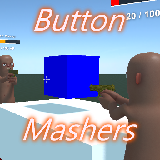
Button Mashers
Released
ui/components/packagecard.razor.scss
@import "/styles/_theme.scss";
$background-size: 8px;

PackageCard
{
	flex-shrink: 0;

	&:hover
	{
		sound-in: "ui.button.over";
	}

	&:active
	{
		sound-in: "ui.button.press";
	}

	flex-direction: column;
	position: relative;
	background-color: rgba( $default-950, 0 );
	border-radius: $rounding-default;
	transition: all 150ms ease;
	cursor: pointer;
	z-index: 0;
	height: 200px;

	.image
	{
		flex-grow: 1;
		flex-shrink: 0;
		transition: all 150ms ease;
		border: 1px solid rgba( white, 0.025 );
		aspect-ratio: 16 / 9;
		background-position: center;
		background-size: cover;
		border-radius: $rounding-small;
		position: relative;
	}

	column
	{
		padding: 8px 2px; // Optically aligned
	}

	&.list
	{
		flex-grow: 1;
		height: 64px;
		flex-direction: row;
		gap: 12px;
		padding: 4px;

		.inner column
		{
			flex-grow: 1;
		}

		.image
		{
			height: 100%;
			aspect-ratio: 1;
			flex-grow: 0;
			flex-shrink: 0;
		}

		column
		{
			gap: 3px;
			justify-content: center;
		}

		.package-title
		{
			flex-shrink: 0;
			max-width: 500px;
		}

		.package-users
		{
			top: 1px;
			right: 1px;
		}

		&:hover
		{
			background-color: $default-800;
			transform: none;

			&::after
			{
				display: none;
			}
		}
	}

	&.wide
	{
		height: 250px;

		.package-title
		{
			max-width: 300px;
		}
	}

	&.small
	{
		height: 200px;
		aspect-ratio: 3/4;

		.image
		{
			aspect-ratio: 1;
		}

		.package-title
		{
			max-width: 140px;
		}
	}

	&.tall
	{
		height: 400px;

		.image
		{
			aspect-ratio: 9/16;
		}

		.package-title
		{
			max-width: 200px;
		}
	}

	.package-title
	{
		text-overflow: ellipsis;
		max-height: 24px;
		flex-shrink: 1;
		max-width: 150px;
		font-size: 14px;
	}

	.package-users
	{
		position: absolute;
		bottom: 4px;
		right: 4px;
		background-color: rgba( 10, 40, 10, 0.95 );
		padding: 3px 5px;
		border-radius: 2px;
		justify-content: center;
		align-items: center;
		gap: 3px;
		font-size: 11px;
		color: #def;
		border: 1px solid #252;
		color: #2f3;

		&:before
		{
			content: '●';
			font-size: 0.5rem;
		}
	}
	// Hover effect (not for list)
	&:not(.list)
	{
		&::after
		{
			content: "";
			position: absolute;
			top: 0;
			left: 0;
			bottom: 0;
			right: 0;
			background-color: rgba( $default-950, 0 );
			transition: all 150ms ease;
			z-index: -10;
			border-radius: $rounding-large;
			pointer-events: none;
		}

		&:hover
		{
			transform: scale( 1.05 );

			&::after
			{
				background-color: $default-800;
				top: -$background-size;
				left: -$background-size;
				right: -$background-size;
				bottom: -$background-size;
				box-shadow: 0 0 25px rgba( black, 0.3 );
			}

			z-index: 100;
			background-color: $default-900;
		}
	}
}