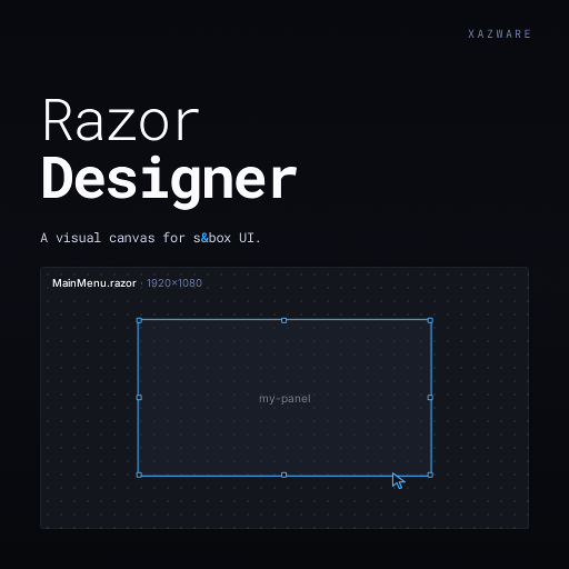
Razor Designer
Released
Editor/Document/Appearance.cs
using Sandbox; // Color
using Grains.RazorDesigner.Projection; // IAppearance

namespace Grains.RazorDesigner.Document;

public readonly record struct Appearance : IAppearance
{
    public Appearance() { }

    // --- Layout ---

    // How wide this control is.
    public Length Width  { get; init; } = Length.Auto;

    // How tall this control is.
    public Length Height { get; init; } = Length.Auto;

    // Stack children left-to-right (Row) or top-to-bottom (Column).
    public FlexDirection Direction { get; init; } = FlexDirection.Row;

    // How children are spaced along the stacking direction.
    public JustifyContent Justify { get; init; } = JustifyContent.Start;

    // How children line up across the stacking direction.
    public AlignItems Align { get; init; } = AlignItems.Stretch;

    // Space between children.
    public float Gap { get; init; } = 8f;

    // Space between this control's edge and its contents (per-side: top, right, bottom, left).
    public Edges Padding { get; init; } = Edges.Zero;

    public FlexWrap Wrap { get; init; } = FlexWrap.NoWrap;

    // --- Positioning (grd-7t2z) ---

    // Relative (in-flow, default) or Absolute (out-of-flow, offset by the four sides below).
    public PositionKind Position { get; init; } = PositionKind.Relative;

    // Offset from each edge. Auto = unset. Meaningful for Position=Absolute; a relative nudge otherwise.
    public Length Top    { get; init; } = Length.Auto;
    public Length Left   { get; init; } = Length.Auto;
    public Length Right  { get; init; } = Length.Auto;
    public Length Bottom { get; init; } = Length.Auto;

    // --- Flex self ---

    // How much this control stretches to fill empty space.
    public float FlexGrow { get; init; } = 0f;

    public float FlexShrink { get; init; } = 1f;

    // Starting size before stretching or shrinking.
    public Length FlexBasis { get; init; } = Length.Auto;

    // Per-child cross-axis alignment override. Auto = inherit the parent's Align (grd-7s3).
    public AlignSelfKind AlignSelf { get; init; } = AlignSelfKind.Auto;

    // --- Typography + OverrideTypography ---

    // Emit per-control typography rules. Off = inherit from theme.
    public bool OverrideTypography { get; init; } = false;

    // Font family (e.g. Poppins, Roboto Mono). Empty = inherit family from theme.
    public string FontFamily { get; init; } = "";

    // Font size.
    public Length FontSize { get; init; } = Length.Px( 14 );

    // CSS font-weight: 100-900 (common: 400 normal, 600 semibold, 700 bold).
    public int FontWeight { get; init; } = 400;

    public Color Color { get; init; } = Color.White;

    public TextAlignment TextAlign { get; init; } = TextAlignment.Left;

    public bool FontStyleItalic { get; init; } = false;

    // CSS text-transform. None = leave text as authored.
    public TextTransformKind TextTransform { get; init; } = TextTransformKind.None;

    // CSS letter-spacing. Auto = inherit.
    public Length LetterSpacing { get; init; } = Length.Auto;

    public Length LineHeight { get; init; } = Length.Auto;

    // --- Background + OverrideBackground ---

    // Emit per-control background rules. Off = inherit from theme.
    public bool OverrideBackground { get; init; } = false;

    // Background color.
    public Color BackgroundColor { get; init; } = Color.White;

    // Background image: url('asset.png'), linear-gradient(...), or empty.
    public string BackgroundImage { get; init; } = "";

    public string BackgroundSize { get; init; } = "";

    public string BackgroundPosition { get; init; } = "";

    public string BackgroundRepeat { get; init; } = "";

    // --- Border + OverrideBorder ---

    // Emit per-control border rules. Off = inherit from theme.
    public bool OverrideBorder { get; init; } = false;

    public Length BorderRadius { get; init; } = Length.Px( 0 );

    public Color BorderColor { get; init; } = Color.Transparent;

    public Length BorderWidth { get; init; } = Length.Px( 0 );

    // --- Effects + OverrideEffects ---

    // Emit per-control box-shadow. Off = inherit from theme.
    public bool OverrideEffects { get; init; } = false;

    public Length BoxShadowX { get; init; } = Length.Px( 0 );

    // Vertical offset of the box-shadow.
    public Length BoxShadowY { get; init; } = Length.Px( 2 );

    // Blur radius of the box-shadow.
    public Length BoxShadowBlur { get; init; } = Length.Px( 4 );

    // Box-shadow color.
    public Color BoxShadowColor { get; init; } = Color.Black;

    // Render the shadow inside the element instead of outside.
    public bool BoxShadowInset { get; init; } = false;

    // Opacity extends the Effects group (gated by OverrideEffects). 1 = fully opaque, 0 = invisible.
    public float Opacity { get; init; } = 1f;

    // --- Constraints + OverrideConstraints ---

    public bool OverrideConstraints { get; init; } = false;

    // Space between this control's edge and its siblings (per-side: top, right, bottom, left).
    public Edges Margin { get; init; } = Edges.Zero;

    // Floor on this control's width.
    public Length MinWidth { get; init; } = Length.Auto;

    // Ceiling on this control's width.
    public Length MaxWidth { get; init; } = Length.Auto;

    // Floor on this control's height.
    public Length MinHeight { get; init; } = Length.Auto;

    // Ceiling on this control's height.
    public Length MaxHeight { get; init; } = Length.Auto;

    // --- Interaction + OverrideInteraction ---

    public bool OverrideInteraction { get; init; } = false;

    // Mouse cursor when hovering this control.
    public CursorKind Cursor { get; init; } = CursorKind.Auto;

    // How to handle children that overflow this control's box.
    public OverflowKind Overflow { get; init; } = OverflowKind.Visible;

    public int ZIndex { get; init; } = 0;

    // CSS pointer-events — true (default) = receives mouse; false = transparent to input (pointer-events: none).
    public bool PointerEvents { get; init; } = true;

    public static readonly Appearance Default = new();
}