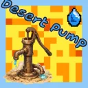
Desert Pump
Released
One squeaky handle. One very dry desert. A clicker about pulling water out of nothing. Pump by hand, sell what you collect, and
ui/gamehud.razor.scss
$sand: #e8bd7a;
$sand-dark: #cf9a4c;
$panel: rgba( 18, 22, 32, 0.72 );
$gold: #f5c542;
$water: #4fb0e8;

.hud
{
	position: absolute;
	top: 0;
	left: 0;
	width: 100%;
	height: 100%;
	flex-direction: column;
	font-family: Poppins;
	color: white;
	overflow: hidden;

	// s&box does not inherit pointer-events down the tree and the screen root starts
	// as "none", so every clickable element sets "all" for itself. Setting it here
	// only would leave the whole UI dead to the mouse.
	pointer-events: all;
}

// ---------------------------------------------------------------- background

// Backdrop layers never take the mouse - they sit under the whole screen and would
// otherwise swallow clicks meant for the pump.
.sky,
.sun,
.dune,
.floor,
.clouds,
.motes,
.shimmer,
.fx
{
	pointer-events: none;
}

// The rows that hold clickable things, in case the engine wants the whole ancestor
// chain live rather than inheriting from .hud.
.topbar,
.stage,
.actions,
.collection
{
	pointer-events: all;
}

.sky
{
	position: absolute;
	top: 0;
	left: 0;
	width: 100%;
	height: 100%;
	background-image: linear-gradient( to bottom, #4aa3d8 0%, #8fd0ea 38%, #f4d69c 70%, #e9b264 100% );
}

.sun
{
	position: absolute;
	top: 70px;
	right: 160px;
	width: 170px;
	height: 170px;
	border-radius: 100%;
	background-color: #ffd84d;
	box-shadow: 0px 0px 90px 30px rgba( 255, 216, 77, 0.35 );
	align-items: center;
	justify-content: center;
	animation: sun-breathe 9s ease-in-out infinite;
}

// A slowly turning square behind the disc. One panel, and it reads as light bending
// off something very bright - eight individual ray divs looked like a cartwheel.
.sun-rays
{
	position: absolute;
	width: 230%;
	height: 230%;
	border-radius: 22%;
	background-color: rgba( 255, 240, 180, 0.10 );
	animation: sun-turn 70s linear infinite;
}

@keyframes sun-turn
{
	0% { transform: rotate( 0deg ); }
	100% { transform: rotate( 360deg ); }
}

// Scale, not blur radius. The disc and its shadow are drawn once and the transform
// moves the result, where animating the shadow re-blurs a 170px quad every frame for
// as long as the game is running - and the sun is on screen the whole time.
@keyframes sun-breathe
{
	0% { transform: scale( 1 ); }
	50% { transform: scale( 1.07 ); }
	100% { transform: scale( 1 ); }
}

// ---------------------------------------------------------------- clouds

.clouds
{
	position: absolute;
	top: 0;
	left: 0;
	width: 100%;
	height: 55%;
	overflow: hidden;
}

// Soft ellipses with a wide shadow rather than drawn puffs - at this scale the shadow
// is what sells it, and it costs one panel each.
.cloud
{
	position: absolute;
	border-radius: 50%;
	background-color: rgba( 255, 255, 255, 0.5 );
	box-shadow: 0px 0px 50px 24px rgba( 255, 255, 255, 0.3 );

	&.c1
	{
		top: 12%;
		width: 260px;
		height: 54px;
		animation: drift-a 96s linear infinite;
	}

	&.c2
	{
		top: 30%;
		width: 180px;
		height: 38px;
		opacity: 0.7;
		animation: drift-b 138s linear infinite;
	}

	&.c3
	{
		top: 5%;
		width: 340px;
		height: 62px;
		opacity: 0.45;
		animation: drift-c 176s linear infinite;
	}
}

@keyframes drift-a
{
	0% { left: -22%; }
	100% { left: 108%; }
}

@keyframes drift-b
{
	0% { left: -16%; }
	100% { left: 104%; }
}

@keyframes drift-c
{
	0% { left: -30%; }
	100% { left: 112%; }
}

// ---------------------------------------------------------------- dust

.motes
{
	position: absolute;
	top: 0;
	left: 0;
	width: 100%;
	height: 100%;
	overflow: hidden;
}

// Specks of sand on the wind. Purely atmosphere, and the one thing on screen that
// keeps moving when the player has stopped.
.mote
{
	position: absolute;
	width: 5px;
	height: 5px;
	border-radius: 100%;
	background-color: rgba( 255, 244, 214, 0.55 );

	&.m1 { top: 42%; width: 4px; height: 4px; animation: mote-a 17s linear infinite; }
	&.m2 { top: 58%; animation: mote-b 23s linear infinite; }
	&.m3 { top: 71%; width: 3px; height: 3px; animation: mote-c 14s linear infinite; }
	&.m4 { top: 36%; animation: mote-b 29s linear infinite; }
	&.m5 { top: 64%; width: 6px; height: 6px; animation: mote-a 21s linear infinite; }
	&.m6 { top: 79%; width: 4px; height: 4px; animation: mote-c 26s linear infinite; }
	&.m7 { top: 50%; width: 3px; height: 3px; animation: mote-b 19s linear infinite; }
	&.m8 { top: 86%; animation: mote-a 31s linear infinite; }
}

@keyframes mote-a
{
	0% { left: -3%; opacity: 0; transform: translateY( 0px ); }
	14% { opacity: 0.8; }
	86% { opacity: 0.8; }
	100% { left: 103%; opacity: 0; transform: translateY( -46px ); }
}

@keyframes mote-b
{
	0% { left: -3%; opacity: 0; transform: translateY( 0px ); }
	18% { opacity: 0.6; }
	82% { opacity: 0.6; }
	100% { left: 103%; opacity: 0; transform: translateY( 30px ); }
}

@keyframes mote-c
{
	0% { left: -3%; opacity: 0; transform: translateY( 0px ); }
	20% { opacity: 0.9; }
	80% { opacity: 0.9; }
	100% { left: 103%; opacity: 0; transform: translateY( -18px ); }
}

// ---------------------------------------------------------------- heat haze

// A band of light sitting on the horizon, breathing. Off by default and turned up by
// the scenes where the air would actually be shaking.
.shimmer
{
	position: absolute;
	bottom: 8%;
	left: 0;
	width: 100%;
	height: 22%;
	opacity: 0;
	background-image: linear-gradient( to top, rgba( 255, 255, 255, 0.22 ) 0%, rgba( 255, 255, 255, 0 ) 100% );
	animation: haze 7s ease-in-out infinite;
}

// Deliberately does not touch opacity - that is the switch each scene uses to turn the
// haze on, and a keyframe writing it would override the switch and show it everywhere.
@keyframes haze
{
	0% { transform: scaleY( 1 ); }
	50% { transform: scaleY( 1.3 ); }
	100% { transform: scaleY( 1 ); }
}

// Wide flat ellipses - only the top curve shows, which reads as a dune ridge.
.dune
{
	position: absolute;
	border-radius: 50%;

	&.far
	{
		left: -34%;
		width: 105%;
		bottom: 14%;
		height: 26%;
		background-color: $sand;
	}

	&.near
	{
		left: 28%;
		width: 105%;
		bottom: 12%;
		height: 24%;
		background-color: $sand;
	}
}

// A very wide ellipse, so the horizon is a gentle curve. As a plain rectangle its
// top edge cut a hard straight line across the sky wherever no dune covered it.
.floor
{
	position: absolute;
	bottom: -34%;
	left: -25%;
	width: 150%;
	height: 70%;
	border-radius: 50%;
	background-color: $sand-dark;
}

// ---------------------------------------------------------------- top bar

.topbar
{
	height: 96px;
	align-items: center;
	padding-left: 28px;
	padding-right: 28px;
	flex-shrink: 0;
}

.stat
{
	background-color: $panel;
	border-radius: 18px;
	padding: 10px 18px;
	align-items: center;
	margin-right: 16px;
}

.coins
{
	position: relative;
	transition: transform 0.12s ease-out;

	.coin
	{
		width: 32px;
		height: 32px;
		border-radius: 100%;
		background-color: $gold;
		border: 3px solid #a8791a;
		margin-right: 10px;
	}

	.value
	{
		font-size: 30px;
		font-weight: 700;
	}

	// Mounted only for the moment after a sale, so it starts its animation fresh every
	// time. Toggling a class on a panel that is already there does not reliably restart
	// one, and a payout that doesn't visibly land is the whole point of this.
	.coinflash
	{
		position: absolute;
		top: 0;
		left: 0;
		width: 100%;
		height: 100%;
		border-radius: 18px;
		border: 2px solid $gold;
		animation: coin-flash 0.36s ease-out;
	}

	&.pop
	{
		transform: scale( 1.06 );
	}
}

@keyframes coin-flash
{
	0% { opacity: 0.95; transform: scale( 1 ); }
	100% { opacity: 0; transform: scale( 1.18 ); }
}

.tankstat
{
	.tank
	{
		width: 26px;
		height: 54px;
		border-radius: 8px;
		background-color: rgba( 255, 255, 255, 0.16 );
		border: 2px solid rgba( 255, 255, 255, 0.45 );
		margin-right: 12px;
		flex-direction: column;
		justify-content: flex-end;
		overflow: hidden;
		position: relative;
	}

	.tank-fill
	{
		width: 100%;
		background-color: $water;
		transition: height 0.12s linear;
		position: relative;
	}

	// A pale disc riding the surface, wider than the tank so only its curve shows. It
	// rocks side to side, which turns a rectangle sliding up into something with liquid in it.
	.tank-wave
	{
		position: absolute;
		top: -5px;
		left: -30%;
		width: 160%;
		height: 10px;
		border-radius: 50%;
		background-color: #8fd8ff;
		animation: tank-rock 1.9s ease-in-out infinite;
	}

	// Fixed glass highlight down the left, so the tank reads as a cylinder.
	.tank-shine
	{
		position: absolute;
		top: 8%;
		left: 14%;
		width: 5px;
		height: 60%;
		border-radius: 999px;
		background-color: rgba( 255, 255, 255, 0.35 );
	}

	.tank-text
	{
		flex-direction: column;
	}

	.value
	{
		font-size: 22px;
		font-weight: 600;
	}

	.unit
	{
		font-size: 15px;
		opacity: 0.7;
	}

	.sub
	{
		font-size: 13px;
		opacity: 0.65;
	}

	&.full .tank-fill
	{
		background-color: #ff8b4a;
	}

	&.full .tank-wave
	{
		background-color: #ffb98a;
	}

	&.full .sub
	{
		color: #ffb37a;
		opacity: 1;
	}

	// A full tank is wasted pumping, so the whole readout nags rather than sitting there.
	&.full
	{
		animation: tank-nag 1.1s ease-in-out infinite;
	}
}

@keyframes tank-rock
{
	0% { transform: translateX( -4px ) rotate( -2deg ); }
	50% { transform: translateX( 4px ) rotate( 2deg ); }
	100% { transform: translateX( -4px ) rotate( -2deg ); }
}

@keyframes tank-nag
{
	0% { box-shadow: 0px 0px 0px 0px rgba( 255, 139, 74, 0.5 ); }
	50% { box-shadow: 0px 0px 18px 3px rgba( 255, 139, 74, 0.55 ); }
	100% { box-shadow: 0px 0px 0px 0px rgba( 255, 139, 74, 0.5 ); }
}

.spacer
{
	flex-grow: 1;
}

.iconbutton
{
	width: 56px;
	height: 56px;
	border-radius: 14px;
	background-color: $panel;
	align-items: center;
	justify-content: center;
	cursor: pointer;
	pointer-events: all;
	position: relative;
	margin-left: 10px;
	transition: transform 0.09s ease-out, background-color 0.12s linear;

	i
	{
		font-family: Material Icons;
		font-size: 30px;
	}

	&:hover
	{
		background-color: rgba( 40, 48, 64, 0.9 );
		transform: translateY( -2px );
	}

	&:active
	{
		transform: translateY( 1px );
	}

	&.muted
	{
		background-color: rgba( 200, 110, 40, 0.85 );
	}

	// Something in the shop is affordable. A dot in the corner rather than a colour
	// change on the button, so it reads the way an unread badge does everywhere else.
	.dot
	{
		position: absolute;
		top: -4px;
		right: -4px;
		width: 16px;
		height: 16px;
		border-radius: 100%;
		background-color: $gold;
		border: 2px solid rgba( 18, 22, 32, 0.9 );
	}

	&.highlight
	{
		animation: btn-nudge 2.4s ease-in-out infinite;
	}
}

@keyframes btn-nudge
{
	0% { transform: translateY( 0px ); }
	8% { transform: translateY( -5px ); }
	16% { transform: translateY( 0px ); }
	24% { transform: translateY( -3px ); }
	32% { transform: translateY( 0px ); }
	100% { transform: translateY( 0px ); }
}

// ---------------------------------------------------------------- stage

.stage
{
	flex-grow: 1;
	flex-direction: column;
	align-items: center;
	justify-content: center;
	position: relative;
}

// Wraps the pump so the effects layer has something the exact size and place of the
// pump to anchor to. Anchoring to .stage instead put every burst too low, because the
// nameplate under the pump pushes the pump above the stage's centre.
.pumpwrap
{
	position: relative;
	align-items: center;
	justify-content: center;
}

.pumparea
{
	width: 330px;
	height: 330px;
	align-items: center;
	justify-content: center;
	position: relative;
	cursor: pointer;
	pointer-events: all;
	transition: transform 0.07s ease-out;

	.pumpart
	{
		width: 100%;
		height: 100%;
	}

	// Size and brightness come in as an inline style - they track pressure.
	.glow
	{
		position: absolute;
		border-radius: 100%;
		background-color: rgba( 255, 255, 255, 0.14 );
		transition: width 0.2s ease-out, height 0.2s ease-out;
	}

	// Only shows once pressure is pinned. The ring, not the glow, is what tells you
	// you're at the top - a glow that just keeps brightening has no ceiling to read.
	.heatring
	{
		position: absolute;
		width: 86%;
		height: 86%;
		border-radius: 100%;
		border: 3px solid rgba( 255, 190, 90, 0.85 );
		opacity: 0;
	}

	.ground
	{
		position: absolute;
		bottom: 2%;
		width: 70%;
		height: 8%;
		border-radius: 50%;
		background-color: rgba( 90, 60, 20, 0.22 );
	}

	&:hover
	{
		transform: scale( 1.03 );
	}

	&.pumping
	{
		transform: scale( 0.93 );
	}

	&.full .glow
	{
		background-color: rgba( 255, 140, 60, 0.25 );
	}

	&.hot
	{
		.heatring
		{
			opacity: 1;
			animation: heat-ring 1.05s ease-out infinite;
		}

		.pumpart
		{
			animation: hot-throb 0.62s ease-in-out infinite;
		}
	}
}

@keyframes heat-ring
{
	0% { transform: scale( 0.94 ); opacity: 0.9; }
	100% { transform: scale( 1.18 ); opacity: 0; }
}

@keyframes hot-throb
{
	0% { transform: scale( 1 ); }
	50% { transform: scale( 1.035 ); }
	100% { transform: scale( 1 ); }
}

// ---------------------------------------------------------------- effects layer

// A zero-size anchor dead centre on the pump. Everything in here positions itself off
// it with margins, which is why the particle code can work in plain pixel offsets.
.fx
{
	position: absolute;
	left: 50%;
	top: 50%;
	width: 0px;
	height: 0px;
	align-items: center;
	justify-content: center;
}

.particle
{
	position: absolute;
	pointer-events: none;

	// Water thrown up out of the pump head.
	&.drop
	{
		border-radius: 50%;
		background-color: #9fe0ff;
		border: 2px solid rgba( 255, 255, 255, 0.75 );
	}

	// Coins off a sale. Round, gold, and spinning - the spin comes in inline.
	&.coinbit
	{
		border-radius: 100%;
		background-color: $gold;
		border: 3px solid #a8791a;
	}

	// The flat radial burst on a surge or a new pump.
	&.spark
	{
		border-radius: 100%;
		background-color: #fff6d8;
		box-shadow: 0px 0px 14px 4px rgba( 255, 214, 120, 0.75 );
	}
}

// A ring thrown off the pump on every click. Mounted fresh each time so it always
// plays from the start.
// Centred by hand with half its size off the top and left. The layout engine will
// centre an absolutely positioned child off the parent's alignment, but only while no
// inset is set - too subtle a rule to hang the whole effects layer on.
.clickring
{
	position: absolute;
	left: 50%;
	top: 50%;
	margin-left: -105px;
	margin-top: -105px;
	width: 210px;
	height: 210px;
	border-radius: 100%;
	border: 4px solid rgba( 190, 235, 255, 0.75 );
	pointer-events: none;
	animation: click-ring 0.42s ease-out;
}

@keyframes click-ring
{
	0% { transform: scale( 0.42 ); opacity: 0.85; }
	100% { transform: scale( 1.3 ); opacity: 0; }
}

.surgering
{
	position: absolute;
	left: 50%;
	top: 50%;
	margin-left: -150px;
	margin-top: -150px;
	width: 300px;
	height: 300px;
	border-radius: 100%;
	border: 6px solid rgba( 255, 226, 150, 0.9 );
	box-shadow: 0px 0px 40px 10px rgba( 255, 200, 90, 0.5 );
	pointer-events: none;
	animation: surge-ring 0.6s ease-out;
}

@keyframes surge-ring
{
	0% { transform: scale( 0.3 ); opacity: 1; }
	100% { transform: scale( 1.7 ); opacity: 0; }
}

// A wash of warm light over the whole screen for a fifth of a second.
.surgeflash
{
	position: absolute;
	top: 0;
	left: 0;
	width: 100%;
	height: 100%;
	background-color: rgba( 255, 220, 150, 0.4 );
	pointer-events: none;
	animation: surge-flash 0.4s ease-out;
}

@keyframes surge-flash
{
	0% { opacity: 0.75; }
	100% { opacity: 0; }
}

// ---------------------------------------------------------------- shake

// The stage shakes, not the whole HUD. Moving the root would drag the sky and the
// dunes with it and show bare edges at the screen border.
.hud.shake-soft .stage
{
	animation: shake-soft 0.32s ease-out;
}

.hud.shake-hard .stage
{
	animation: shake-hard 0.32s ease-out;
}

@keyframes shake-soft
{
	0% { transform: translateX( 0px ) translateY( 0px ); }
	25% { transform: translateX( -4px ) translateY( 2px ); }
	50% { transform: translateX( 3px ) translateY( -2px ); }
	75% { transform: translateX( -2px ) translateY( 1px ); }
	100% { transform: translateX( 0px ) translateY( 0px ); }
}

@keyframes shake-hard
{
	0% { transform: translateX( 0px ) translateY( 0px ); }
	15% { transform: translateX( -9px ) translateY( 4px ); }
	32% { transform: translateX( 8px ) translateY( -5px ); }
	50% { transform: translateX( -6px ) translateY( 3px ); }
	70% { transform: translateX( 4px ) translateY( -2px ); }
	85% { transform: translateX( -2px ) translateY( 1px ); }
	100% { transform: translateX( 0px ) translateY( 0px ); }
}

// ---------------------------------------------------------------- pressure

// Sits between the pump and the nameplate. Always laid out, faded out when cold, so
// showing and hiding it never shunts the nameplate up and down the screen.
.pressure
{
	flex-direction: column;
	align-items: center;
	margin-top: 6px;
	transition: opacity 0.25s linear;

	&.cold { opacity: 0.25; }

	.pressure-bar
	{
		width: 240px;
		height: 10px;
		border-radius: 999px;
		background-color: rgba( 0, 0, 0, 0.45 );
		border: 1px solid rgba( 255, 255, 255, 0.22 );
		overflow: hidden;
	}

	.pressure-fill
	{
		height: 100%;
		background-color: $water;
		transition: width 0.1s linear, background-color 0.3s linear;
	}

	.pressure-label
	{
		margin-top: 4px;
		align-items: center;
	}

	.pressure-name
	{
		font-size: 11px;
		letter-spacing: 3px;
		opacity: 0.7;
		margin-right: 8px;
	}

	.pressure-value
	{
		font-size: 14px;
		font-weight: 800;
		color: #bfe9ff;
	}

	// Four bands rather than a continuous ramp - a colour you can name is a colour you
	// can chase, and the game tells you which band you're in without a number.
	&.s1 .pressure-fill { background-color: #6fd3a0; }
	&.s1 .pressure-value { color: #9ff0c6; }

	&.s2 .pressure-fill { background-color: #ffb54a; }
	&.s2 .pressure-value { color: #ffd08a; }

	&.s3
	{
		.pressure-fill
		{
			background-color: #fff0c0;
			box-shadow: 0px 0px 14px 3px rgba( 255, 200, 90, 0.8 );
		}

		.pressure-value
		{
			color: #fff2cc;
		}

		.pressure-bar
		{
			border-color: rgba( 255, 214, 120, 0.9 );
			animation: pressure-max 0.8s ease-in-out infinite;
		}
	}
}

@keyframes pressure-max
{
	0% { box-shadow: 0px 0px 0px 0px rgba( 255, 200, 90, 0.6 ); }
	50% { box-shadow: 0px 0px 16px 3px rgba( 255, 200, 90, 0.6 ); }
	100% { box-shadow: 0px 0px 0px 0px rgba( 255, 200, 90, 0.6 ); }
}

.nameplate
{
	flex-direction: column;
	align-items: center;
	margin-top: 4px;
	padding: 10px 30px 14px 30px;
	border-radius: 22px;
	background-color: rgba( 16, 20, 30, 0.38 );

	.tierno
	{
		font-size: 14px;
		letter-spacing: 3px;
		opacity: 1;
		text-shadow: 0px 2px 0px rgba( 0, 0, 0, 0.6 );
	}

	.name
	{
		font-size: 40px;
		font-weight: 800;
		text-shadow: 0px 3px 0px rgba( 0, 0, 0, 0.35 );
	}

	.tagline
	{
		font-size: 16px;
		opacity: 1;
		text-shadow: 0px 2px 0px rgba( 0, 0, 0, 0.55 );
	}

	.perclick
	{
		margin-top: 8px;
		font-size: 15px;
		background-color: rgba( 18, 22, 32, 0.55 );
		padding: 4px 16px;
		border-radius: 999px;
	}
}

// Lives in .fx now, so left/top come in inline off the pump's centre. The fixed width
// with centred text is what lets the code place it without measuring the string - keep
// it in step with FloaterWidth in GameHud.razor.
.floater
{
	position: absolute;
	width: 300px;
	text-align: center;
	justify-content: center;
	font-size: 30px;
	font-weight: 800;
	color: #d3f0ff;
	text-shadow: 0px 2px 0px rgba( 0, 0, 0, 0.45 );
	pointer-events: none;

	&.coin
	{
		color: $gold;
	}

	&.surge
	{
		font-size: 40px;
		color: #fff4d2;
		letter-spacing: 2px;
		text-shadow: 0px 3px 0px rgba( 120, 60, 0, 0.55 );
	}
}

.toast
{
	position: absolute;
	bottom: 13%;
	background-color: rgba( 18, 22, 32, 0.85 );
	padding: 10px 22px;
	border-radius: 999px;
	font-size: 18px;
	pointer-events: none;
}

.idlenote
{
	position: absolute;
	top: 5%;
	background-color: rgba( 30, 90, 130, 0.85 );
	padding: 8px 20px;
	border-radius: 999px;
	font-size: 16px;
	pointer-events: none;
	align-items: center;
	border: 2px solid rgba( 140, 210, 255, 0.5 );

	i
	{
		font-family: Material Icons;
		font-size: 20px;
		margin-right: 8px;
	}
}

// Scoped to the stage on purpose - as a bare ".hint" this rule reached into the
// settings panel and threw its sub-labels to the bottom of the screen.
.stage .hint
{
	position: absolute;
	bottom: 4%;
	font-size: 14px;
	letter-spacing: 2px;
	opacity: 1;
	padding: 5px 16px;
	border-radius: 999px;
	background-color: rgba( 16, 20, 30, 0.38 );
	pointer-events: none;
}

// ---------------------------------------------------------------- actions

.actions
{
	height: 130px;
	align-items: center;
	justify-content: center;
	flex-shrink: 0;
}

.bigbutton
{
	width: 420px;
	height: 92px;
	border-radius: 22px;
	align-items: center;
	padding: 0px 24px;
	margin: 0px 12px;
	cursor: pointer;
	pointer-events: all;
	transition: transform 0.07s ease-out;
	border-bottom: 6px solid rgba( 0, 0, 0, 0.35 );
	position: relative;
	overflow: hidden;

	.btn-icon i
	{
		font-family: Material Icons;
		font-size: 40px;
		margin-right: 16px;
	}

	// A band of light that sweeps across the face. Parked off the left edge and only
	// sent across when the button is actually worth pressing.
	.shine
	{
		position: absolute;
		top: 0;
		left: -40%;
		width: 30%;
		height: 100%;
		background-image: linear-gradient( to right, rgba( 255, 255, 255, 0 ) 0%, rgba( 255, 255, 255, 0.35 ) 50%, rgba( 255, 255, 255, 0 ) 100% );
		opacity: 0;
	}

	.btn-text
	{
		flex-direction: column;
	}

	.btn-title
	{
		font-size: 23px;
		font-weight: 800;
	}

	.btn-sub
	{
		font-size: 16px;
		opacity: 0.85;
	}

	&:hover
	{
		transform: translateY( -3px );
	}

	&:active
	{
		transform: translateY( 2px );
	}

	&.sell
	{
		background-color: #3aa7e0;

		&:not(.disabled) .shine
		{
			opacity: 1;
			animation: shine-sweep 3.4s linear infinite;
		}
	}

	&.buy
	{
		background-color: #f0a92c;
	}

	// Affordable. This is the moment the whole loop is pointed at, so it gets the
	// brightest thing on screen after the pump itself.
	&.buy.ready
	{
		animation: buy-ready 1.6s ease-in-out infinite;

		.shine
		{
			opacity: 1;
			animation: shine-sweep 2.2s linear infinite;
		}
	}

	&.maxed
	{
		background-color: #7a5cc4;
		cursor: default;
	}

	&.disabled
	{
		background-color: #5f6675;
		opacity: 0.65;
		cursor: default;

		&:hover
		{
			transform: translateY( 0px );
		}
	}
}

@keyframes shine-sweep
{
	0% { left: -40%; }
	40% { left: 110%; }
	100% { left: 110%; }
}

@keyframes buy-ready
{
	0% { box-shadow: 0px 0px 0px 0px rgba( 245, 197, 66, 0.55 ); }
	50% { box-shadow: 0px 0px 30px 6px rgba( 245, 197, 66, 0.5 ); }
	100% { box-shadow: 0px 0px 0px 0px rgba( 245, 197, 66, 0.55 ); }
}

// ---------------------------------------------------------------- collection

.collection
{
	height: 170px;
	align-items: center;
	justify-content: center;
	padding-bottom: 14px;
	flex-shrink: 0;
}

.slot
{
	width: 118px;
	height: 142px;
	margin: 0px 6px;
	padding: 8px;
	flex-direction: column;
	align-items: center;
	justify-content: flex-end;
	border-radius: 16px;
	background-color: rgba( 18, 22, 32, 0.4 );
	border: 3px solid rgba( 0, 0, 0, 0 );
	position: relative;
	transition: transform 0.12s ease-out, background-color 0.2s linear;

	&:hover
	{
		transform: translateY( -4px );
	}

	.tick
	{
		position: absolute;
		top: 6px;
		right: 6px;
		width: 22px;
		height: 22px;
		border-radius: 100%;
		background-color: #4f9a45;
		align-items: center;
		justify-content: center;

		i
		{
			font-family: Material Icons;
			font-size: 15px;
		}
	}

	.slotart
	{
		width: 100%;
		height: 92px;
		position: relative;
		align-items: center;
		justify-content: center;
	}

	.question
	{
		position: absolute;
		font-size: 38px;
		font-weight: 800;
		color: rgba( 255, 255, 255, 0.7 );
	}

	.slotlabel
	{
		margin-top: 4px;
		font-size: 12px;
		text-align: center;
		opacity: 0.9;
	}

	&.owned
	{
		background-color: rgba( 42, 92, 60, 0.5 );
	}

	&.next
	{
		border-color: $gold;
		box-shadow: 0px 0px 16px 2px rgba( 245, 197, 66, 0.4 );
		animation: slot-next 2s ease-in-out infinite;
	}
}

// The glow is a fixed shadow and the pulse is a colour. Animating the blur radius
// instead makes the renderer rebuild a blurred quad on every frame of every second the
// game is open, and this one is always on because there is always a next pump.
//
// The border, specifically. .slot animates neither - it transitions transform for its
// hover lift and background-color for its owned state, and a keyframe on either of
// those would fight something: an animation outranks the hover for as long as it runs,
// which would have quietly killed the lift on the one slot the player is most likely
// to point at.
@keyframes slot-next
{
	0% { border-color: rgba( 245, 197, 66, 0.45 ); }
	50% { border-color: rgba( 255, 226, 140, 1 ); }
	100% { border-color: rgba( 245, 197, 66, 0.45 ); }
}

// ---------------------------------------------------------------- fallback

.missing
{
	position: absolute;
	top: 40%;
	left: 50%;
	margin-left: -260px;
	width: 520px;
	flex-direction: column;
	align-items: center;
	background-color: rgba( 18, 22, 32, 0.85 );
	border-radius: 18px;
	padding: 24px;

	.missing-title
	{
		font-size: 22px;
		font-weight: 700;
	}

	.missing-body
	{
		font-size: 15px;
		opacity: 0.8;
		margin-top: 6px;
	}
}

// ---------------------------------------------------------------- scenery

// Extra layers the default scene doesn't use - each background switches them on.
.stars,
.scenery
{
	position: absolute;
	pointer-events: none;
}

.stars
{
	top: 0;
	left: 0;
	width: 100%;
	height: 60%;
	opacity: 0;
}

.scenery
{
	bottom: 0;
	left: 0;
	width: 100%;
	height: 40%;
	opacity: 0;
}

// ---- Blood Moon: night dunes under something large and red

.scene-dusk
{
	.sky { background-image: linear-gradient( to bottom, #150a24 0%, #241436 40%, #5c2536 78%, #8c3a35 100% ); }

	.sun
	{
		background-color: #d94f43;
		box-shadow: 0px 0px 120px 40px rgba( 217, 79, 67, 0.4 );
		width: 210px;
		height: 210px;
	}

	.dune.far { background-color: #45283f; }
	.dune.near { background-color: #45283f; }
	.floor { background-color: #2c1a2c; }

	// a scatter of stars, faked with a few hard-stop gradients
	.stars
	{
		opacity: 0.9;
		background-image: linear-gradient( to bottom, rgba( 255, 255, 255, 0.16 ) 0%, rgba( 255, 255, 255, 0 ) 70% );
	}

	.nameplate .name { text-shadow: 0px 3px 0px rgba( 0, 0, 0, 0.55 ); }
}

// ---- Green Oasis: you pumped enough that things started growing

.scene-oasis
{
	.sky { background-image: linear-gradient( to bottom, #2f8fbf 0%, #6fc6c2 45%, #a9d98d 80%, #6ea84e 100% ); }

	.sun
	{
		background-color: #fff2a8;
		box-shadow: 0px 0px 100px 34px rgba( 255, 242, 168, 0.45 );
	}

	.dune.far { background-color: #67ab55; }
	.dune.near { background-color: #4f8f3a; }
	.floor { background-color: #3d7330; }

	.scenery
	{
		opacity: 1;
		background-image: linear-gradient( to top, rgba( 40, 90, 40, 0.55 ) 0%, rgba( 40, 90, 40, 0 ) 55% );
	}
}

// ---- Neon Wastes: the desert, some time after everyone left

.scene-neon
{
	.sky { background-image: linear-gradient( to bottom, #12042a 0%, #2a0b45 42%, #7b2062 76%, #ff5fa2 100% ); }

	.sun
	{
		background-color: #ff7ac6;
		box-shadow: 0px 0px 140px 46px rgba( 255, 95, 162, 0.45 );
		width: 220px;
		height: 220px;
	}

	.dune.far { background-color: #35114f; }
	.dune.near { background-color: #24093a; }
	.floor { background-color: #160526; }

	.stars
	{
		opacity: 0.8;
		background-image: linear-gradient( to bottom, rgba( 255, 255, 255, 0.12 ) 0%, rgba( 255, 255, 255, 0 ) 65% );
	}

	// horizon glow standing in for a synth grid
	.scenery
	{
		opacity: 1;
		background-image: linear-gradient( to top, rgba( 255, 95, 162, 0.35 ) 0%, rgba( 255, 95, 162, 0 ) 40% );
	}

	.nameplate .name { color: #ffd9ec; }
}

// ---------------------------------------------------------------- tier bar

.tierbar
{
	width: 260px;
	height: 8px;
	border-radius: 999px;
	background-color: rgba( 0, 0, 0, 0.45 );
	border: 1px solid rgba( 255, 255, 255, 0.25 );
	margin-top: 10px;
	overflow: hidden;
}

.tierfill
{
	height: 100%;
	background-color: $gold;
	transition: width 0.2s ease-out;
}

// ---------------------------------------------------------------- gusher

.gusher
{
	position: absolute;
	width: 96px;
	height: 96px;
	margin-left: -48px;
	margin-top: -48px;
	align-items: center;
	justify-content: center;
	cursor: pointer;
	pointer-events: all;
	animation: gusher-bob 1.6s ease-in-out infinite;

	// Teardrop rather than a disc, and blue-white rather than yellow - as a glowing
	// yellow circle it was indistinguishable from the sun behind it.
	.gusher-drop
	{
		width: 46px;
		height: 58px;
		border-radius: 50% 50% 50% 50%;
		background-image: linear-gradient( to bottom, #eaf9ff, #4fb0e8 );
		border: 3px solid #ffffff;
		box-shadow: 0px 0px 34px 10px rgba( 79, 176, 232, 0.6 );
	}

	.gusher-ring
	{
		position: absolute;
		width: 92px;
		height: 92px;
		border-radius: 100%;
		border: 3px solid rgba( 160, 225, 255, 0.7 );
		animation: gusher-pulse 1.6s ease-out infinite;
	}

	&:hover .gusher-drop { transform: scale( 1.12 ); }
}

@keyframes gusher-bob
{
	0% { transform: translateY( 0px ); }
	50% { transform: translateY( -12px ); }
	100% { transform: translateY( 0px ); }
}

@keyframes gusher-pulse
{
	0% { transform: scale( 0.7 ); opacity: 0.9; }
	100% { transform: scale( 1.25 ); opacity: 0; }
}

// ---------------------------------------------------------------- daily

.daily
{
	position: absolute;
	top: 110px;
	left: 28px;
	align-items: center;
	background-color: rgba( 24, 30, 44, 0.9 );
	border: 3px solid $gold;
	border-radius: 18px;
	padding: 12px 20px 12px 14px;
	cursor: pointer;
	pointer-events: all;
	animation: daily-glow 2.2s ease-in-out infinite;

	.daily-icon
	{
		margin-right: 12px;

		i
		{
			font-family: Material Icons;
			font-size: 34px;
			color: $gold;
		}
	}

	.daily-text { flex-direction: column; }
	.daily-title { font-size: 16px; font-weight: 800; letter-spacing: 1px; }
	.daily-sub { font-size: 13px; opacity: 0.8; }

	&:hover { transform: scale( 1.03 ); }
}

@keyframes daily-glow
{
	0% { box-shadow: 0px 0px 0px 0px rgba( 245, 197, 66, 0.5 ); }
	50% { box-shadow: 0px 0px 26px 4px rgba( 245, 197, 66, 0.45 ); }
	100% { box-shadow: 0px 0px 0px 0px rgba( 245, 197, 66, 0.5 ); }
}

// ---------------------------------------------------------------- the tree

.treearea
{
	position: absolute;
	left: 34px;
	bottom: 14%;
	align-items: flex-end;
	pointer-events: all;
}

.tree
{
	width: 118px;
	height: 150px;
	position: relative;
	cursor: pointer;
	pointer-events: all;
	background-repeat: no-repeat;
	background-position: bottom center;
	background-size: contain;
	transition: transform 0.25s ease-out;

	&:hover { transform: scale( 1.06 ); }

	&.growing { animation: tree-sway 3.4s ease-in-out infinite; }
}

@keyframes tree-sway
{
	0% { transform: rotate( -1.5deg ); }
	50% { transform: rotate( 1.5deg ); }
	100% { transform: rotate( -1.5deg ); }
}

.treeinfo
{
	flex-direction: column;
	margin-left: 10px;
	margin-bottom: 8px;
	background-color: rgba( 18, 22, 32, 0.7 );
	border-radius: 14px;
	padding: 10px 12px;

	.treeheight
	{
		font-size: 15px;
		font-weight: 700;
		align-items: center;

		i
		{
			font-family: Material Icons;
			font-size: 18px;
			margin-right: 6px;
			color: #7fd06f;
		}
	}

	.treebar
	{
		width: 130px;
		height: 7px;
		border-radius: 999px;
		background-color: rgba( 0, 0, 0, 0.35 );
		margin-top: 6px;
		overflow: hidden;
	}

	.treefill
	{
		height: 100%;
		background-color: #7fd06f;
		transition: width 0.2s ease-out;
	}

	.treestatus
	{
		font-size: 12px;
		opacity: 0.75;
		margin-top: 4px;

		&.growing { color: #7fd06f; opacity: 1; }
	}

	.treebtn
	{
		margin-top: 8px;
		padding: 6px 12px;
		border-radius: 10px;
		background-color: #4f9a45;
		font-size: 13px;
		font-weight: 700;
		align-items: center;
		justify-content: center;
		cursor: pointer;
		pointer-events: all;

		i
		{
			font-family: Material Icons;
			font-size: 16px;
			margin-right: 6px;
		}

		&:hover { background-color: #5cae50; }

		&.board { background-color: #3aa7e0; }
		&.board:hover { background-color: #4bb8f0; }

		&.disabled
		{
			background-color: #5f6675;
			opacity: 0.6;
			cursor: default;
		}
	}
}

// ---- Sandstorm: ochre haze, the horizon eaten by dust

.scene-sandstorm
{
	.sky { background-image: linear-gradient( to bottom, #d9ae6b 0%, #c99a52 45%, #a97c3c 78%, #7a5326 100% ); }
	.sun { background-color: #f0d9a6; box-shadow: 0px 0px 130px 50px rgba( 240, 217, 166, 0.3 ); }
	.dune.far { background-color: #a9803f; }
	.dune.near { background-color: #96702f; }
	.floor { background-color: #7a5326; }
	.scenery
	{
		opacity: 1;
		background-image: linear-gradient( to top, rgba( 200, 160, 90, 0.4 ) 0%, rgba( 200, 160, 90, 0 ) 60% );
	}
}

// ---- Golden Hour: the twenty minutes a day the desert looks kind

.scene-golden
{
	.sky { background-image: linear-gradient( to bottom, #5b3a86 0%, #c1476a 38%, #f2884b 74%, #f7b167 100% ); }
	.sun { background-color: #fff0c4; box-shadow: 0px 0px 120px 44px rgba( 255, 200, 120, 0.5 ); }
	.dune.far { background-color: #a4553f; }
	.dune.near { background-color: #8c4436; }
	.floor { background-color: #6d3630; }
}

// ---- Starfield: no moon, no cloud, rather a lot of sky

.scene-starfield
{
	.sky { background-image: linear-gradient( to bottom, #04060f 0%, #070b1c 40%, #18213f 75%, #2b3560 100% ); }
	.sun
	{
		background-color: #dfe6ff;
		width: 90px;
		height: 90px;
		box-shadow: 0px 0px 70px 22px rgba( 223, 230, 255, 0.35 );
	}
	.dune.far { background-color: #1b2340; }
	.dune.near { background-color: #141a30; }
	.floor { background-color: #0d1122; }
	.stars
	{
		opacity: 1;
		background-image: linear-gradient( to bottom, rgba( 255, 255, 255, 0.22 ) 0%, rgba( 255, 255, 255, 0 ) 75% );
	}
}

// ---- Aurora: green light over the ice

.scene-aurora
{
	.sky { background-image: linear-gradient( to bottom, #04121f 0%, #0b2c3a 35%, #1c6b63 70%, #3fd6a0 100% ); }
	.sun { background-color: #b9f5e2; box-shadow: 0px 0px 110px 40px rgba( 100, 230, 190, 0.4 ); }
	.dune.far { background-color: #1d5a5a; }
	.dune.near { background-color: #16414a; }
	.floor { background-color: #0f2c35; }
	.stars
	{
		opacity: 1;
		background-image: linear-gradient( to bottom, rgba( 120, 255, 210, 0.18 ) 0%, rgba( 120, 255, 210, 0 ) 70% );
	}
	.scenery
	{
		opacity: 1;
		background-image: linear-gradient( to top, rgba( 63, 214, 160, 0.3 ) 0%, rgba( 63, 214, 160, 0 ) 45% );
	}
}

// ---- Volcanic: warm rock, water comes up boiling

.scene-volcanic
{
	.sky { background-image: linear-gradient( to bottom, #120404 0%, #1a0806 40%, #7d2412 78%, #e2542a 100% ); }
	.sun { background-color: #ff8a4a; box-shadow: 0px 0px 130px 46px rgba( 226, 84, 42, 0.5 ); }
	.dune.far { background-color: #3a1410; }
	.dune.near { background-color: #2a0d0a; }
	.floor { background-color: #1c0806; }
	.scenery
	{
		opacity: 1;
		background-image: linear-gradient( to top, rgba( 226, 84, 42, 0.45 ) 0%, rgba( 226, 84, 42, 0 ) 40% );
	}
}

// ---- Crystal Cavern: deep enough that the walls glow

.scene-crystal
{
	.sky { background-image: linear-gradient( to bottom, #0a0620 0%, #160d33 40%, #3f2a70 76%, #7f6ae0 100% ); }
	.sun { background-color: #cfc2ff; box-shadow: 0px 0px 120px 42px rgba( 160, 140, 255, 0.45 ); }
	.dune.far { background-color: #2e2059; }
	.dune.near { background-color: #241947; }
	.floor { background-color: #170f2e; }
	.stars
	{
		opacity: 1;
		background-image: linear-gradient( to bottom, rgba( 190, 170, 255, 0.2 ) 0%, rgba( 190, 170, 255, 0 ) 70% );
	}
}

// ---------------------------------------------------------------- new pump

// Buying a pump is the reward the whole loop points at, and it used to be a line of
// toast text. Two and a half seconds of the screen stopping to say so instead.
.celebrate
{
	position: absolute;
	top: 0;
	left: 0;
	width: 100%;
	height: 100%;
	align-items: center;
	justify-content: center;
	pointer-events: none;
	animation: celebrate-fade 2.6s ease-out;

	.celebrate-ring
	{
		position: absolute;
		left: 50%;
		top: 50%;
		margin-left: -210px;
		margin-top: -210px;
		width: 420px;
		height: 420px;
		border-radius: 100%;
		border: 8px solid rgba( 255, 226, 150, 0.85 );
		animation: celebrate-ring 1.1s ease-out;

		&.two
		{
			margin-left: -130px;
			margin-top: -130px;
			width: 260px;
			height: 260px;
			border-width: 5px;
			border-color: rgba( 255, 255, 255, 0.8 );
			animation: celebrate-ring 1.5s ease-out;
		}
	}

	.celebrate-card
	{
		flex-direction: column;
		align-items: center;
		background-color: rgba( 16, 20, 30, 0.86 );
		border: 3px solid $gold;
		border-radius: 24px;
		padding: 20px 46px;
		animation: celebrate-card 2.6s ease-out;
	}

	.celebrate-kicker
	{
		font-size: 14px;
		letter-spacing: 5px;
		color: $gold;
		font-weight: 700;
	}

	.celebrate-name
	{
		font-size: 46px;
		font-weight: 800;
		margin-top: 2px;
		text-shadow: 0px 3px 0px rgba( 0, 0, 0, 0.45 );
	}

	.celebrate-sub
	{
		font-size: 16px;
		opacity: 0.8;
		margin-top: 2px;
	}
}

@keyframes celebrate-fade
{
	0% { opacity: 1; }
	80% { opacity: 1; }
	100% { opacity: 0; }
}

@keyframes celebrate-ring
{
	0% { transform: scale( 0.2 ); opacity: 0.95; }
	100% { transform: scale( 1.6 ); opacity: 0; }
}

@keyframes celebrate-card
{
	0% { transform: scale( 0.6 ); opacity: 0; }
	9% { transform: scale( 1.08 ); opacity: 1; }
	16% { transform: scale( 1 ); opacity: 1; }
	86% { transform: scale( 1 ); opacity: 1; }
	100% { transform: scale( 1 ); opacity: 0; }
}

// ---------------------------------------------------------------- scene weather

// The ambient layers are shared markup, so each scene only has to say what its own
// air is doing. Dawn is the baseline: clouds, a little haze off the sand.

.scene-dawn
{
	.shimmer { opacity: 0.7; }
}

.scene-dusk
{
	.cloud { background-color: rgba( 120, 70, 90, 0.5 ); box-shadow: 0px 0px 50px 24px rgba( 120, 70, 90, 0.3 ); }
	.mote { background-color: rgba( 255, 190, 190, 0.4 ); }
	.shimmer { opacity: 0.25; }
}

.scene-oasis
{
	.cloud { background-color: rgba( 255, 255, 255, 0.7 ); }
	// Seeds and pollen rather than sand, drifting rather than blowing through.
	.mote { background-color: rgba( 220, 255, 190, 0.7 ); }
	.shimmer { opacity: 0; }
}

.scene-neon
{
	.cloud { background-color: rgba( 255, 120, 190, 0.28 ); box-shadow: 0px 0px 60px 30px rgba( 255, 95, 162, 0.22 ); }
	.mote { background-color: rgba( 255, 150, 220, 0.75 ); }
	.shimmer { opacity: 0.4; }
}

// Enough dust in the air that the clouds have gone and the haze has taken over.
.scene-sandstorm
{
	.cloud { background-color: rgba( 220, 190, 140, 0.4 ); box-shadow: 0px 0px 70px 40px rgba( 200, 160, 90, 0.3 ); }
	.mote { background-color: rgba( 255, 230, 180, 0.85 ); width: 7px; height: 7px; }
	.shimmer { opacity: 1; }
}

.scene-golden
{
	.cloud { background-color: rgba( 255, 210, 180, 0.55 ); box-shadow: 0px 0px 60px 26px rgba( 255, 170, 120, 0.35 ); }
	.mote { background-color: rgba( 255, 220, 170, 0.7 ); }
	.shimmer { opacity: 0.6; }
}

// No cloud and no wind - the motes hold still enough to read as stars.
.scene-starfield
{
	.clouds { opacity: 0; }
	.mote { background-color: rgba( 235, 240, 255, 0.9 ); }
	.shimmer { opacity: 0; }
}

.scene-aurora
{
	.cloud { background-color: rgba( 120, 255, 210, 0.2 ); box-shadow: 0px 0px 70px 34px rgba( 100, 230, 190, 0.22 ); }
	.mote { background-color: rgba( 235, 255, 250, 0.85 ); width: 6px; height: 6px; }
	.shimmer { opacity: 0.3; }
}

// Embers, and air you can see moving.
.scene-volcanic
{
	.cloud { background-color: rgba( 90, 40, 30, 0.5 ); box-shadow: 0px 0px 70px 34px rgba( 226, 84, 42, 0.25 ); }
	.mote { background-color: rgba( 255, 160, 90, 0.9 ); box-shadow: 0px 0px 8px 2px rgba( 255, 120, 50, 0.6 ); }
	.shimmer { opacity: 1; }
}

.scene-crystal
{
	.clouds { opacity: 0; }
	.mote { background-color: rgba( 210, 190, 255, 0.85 ); box-shadow: 0px 0px 8px 2px rgba( 170, 140, 255, 0.5 ); }
	.shimmer { opacity: 0.35; }
}