
UI Pro
Released
Create UI in the editor, without code.
It's recommended to restart the editor after installing this library
What's Included 👍
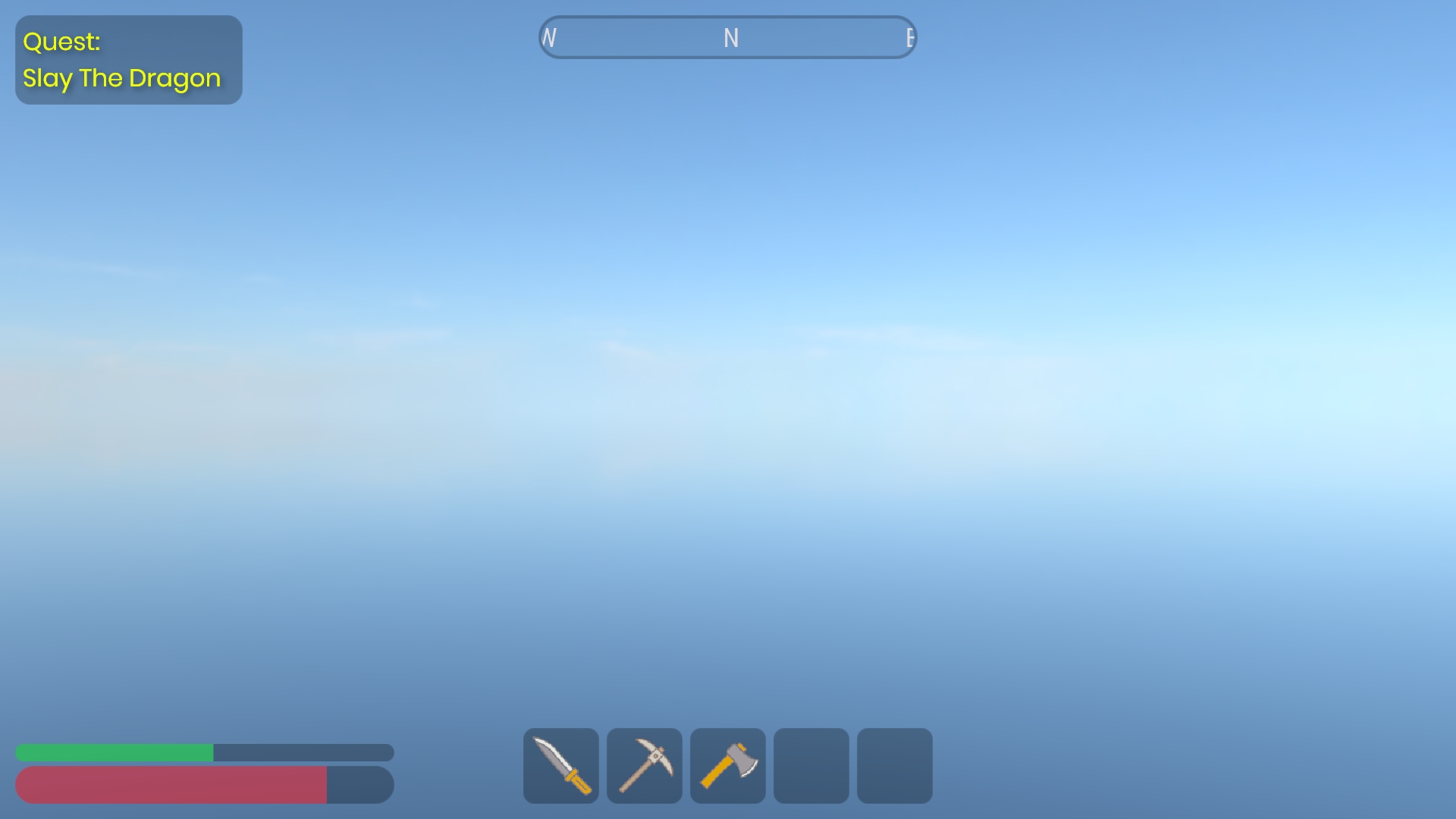
- Screen Space UI with Resolution Scaling
- Image & Text Nodes
- Borders & Rounded Corners
- Input System
- Buttons
- Parent/Child Anchoring, Padding, Clipping, Stretching
What's Planned ⏰
- Edit Mode Preview
- World Space UI
- Sliders, Checkboxes & Toggles
- Input Fields
- Horizontal & Vertical Layouts
- Scroll Views
- Proper documentation
Getting Started 🎯
The fastest way to understand UI Pro is to open the included example scene.
It has a working Canvas, Input System and Button that updates a TextNode when you click it.
Press play, click the button, then inspect how GameObjects and Components are wired together - that's the whole pattern.
It has a working Canvas, Input System and Button that updates a TextNode when you click it.
Press play, click the button, then inspect how GameObjects and Components are wired together - that's the whole pattern.
The Way It Works ⚙️
Every UI Pro setup has the same layout
Canvas
Canvas
The renderer and root of your UI. Every UI Node must be a child GameObject of a canvas.
Image & Text Nodes
The visible bits - placed as child GameObjects of a Canvas
then positioned and styled by their various properties in the inspector.
- Note: you should only have one Image/Text Node per GameObject.
Input System
You need only one Input System component somewhere in the scene.
It reads the mouse and dispatches click/hover events. Without it, nothing
is interactive.
- Note: you must enable "Receive Pointer Input" on a Node for buttons etc to work
Behaviour - Buttons
Sits alongside a node and reacts to pointer events. Set its Target to the
node it should recolour on hover/press, and hook up its OnClick.
Creating Your Own Button 🪄
1. Add an InputSystem Component to any GameObject (only one needed).
2. Add a Canvas Component to another GameObject.
3. Under the canvas, add a child GameObject with an ImageNode Component.
Give it a Size in Layout Settings.
4. On that node, tick "Receive Pointer Input" so it can be clicked. (Nodes
are non-interactive by default, so text and decoration don't eat clicks.)
5. On the same GameObject, add a Button Component and set its Target to the
ImageNode. Adjust the Default / Hovered / Pressed tints.
6. (Optional) Subscribe to the buttons OnClick event from another script to make the button do cool stuff
--------------------------------
This is an early release built by one person. Bug reports are hugely appreciated, and if there's a widget you
need that's missing, say so. Real use cases drive what gets built next.
Links
https://github.com/lilboiUK/sandbox-ui-pro
https://youtube.com/@lilboiUK
need that's missing, say so. Real use cases drive what gets built next.
Links
https://github.com/lilboiUK/sandbox-ui-pro
https://youtube.com/@lilboiUK