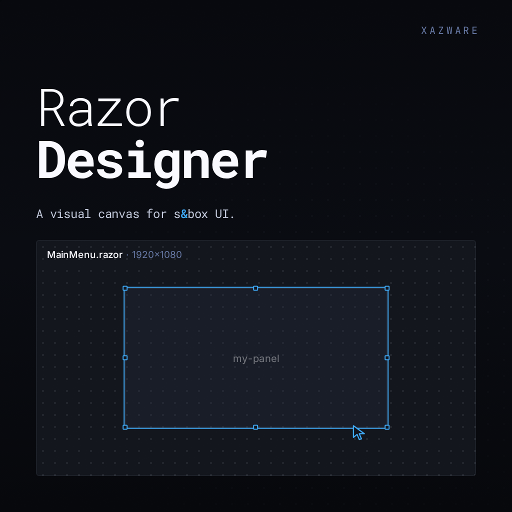
Razor Designer
Released
Editor/Document/ControlRecord.cs
A data model for a UI control in the RazorDesigner editor. Stores identity, layout, typography, background, border, effects, interaction and content properties, plus child controls, bindings, state rules, custom styles, and helpers for copying fields and exposing a Payload and LivePanel.
using System;
using System.Collections.Generic;
using Sandbox;
using Sandbox.UI;

namespace Grains.RazorDesigner.Document;

public sealed class ControlRecord
{
	[Hide] public ControlType Type { get; init; }

	[Hide] public Guid Id { get; init; } = Guid.NewGuid();

	[Hide] public bool IsSlot { get; set; }
	[Hide] public string SlotName { get; set; } = "";

	[Group( "Identity" )]
	[Title( "Name" )]
	[Description( "CSS class name for this control. Used in the saved .razor and .razor.scss." )]
	public string ClassName { get; set; }

	[Hide] public List<ControlRecord> Children { get; init; } = new();

	[Hide] public List<StateRule> StateRules { get; init; } = new();

	[Hide] public List<Grains.RazorDesigner.Wiring.Binding> Bindings { get; init; } = new();

	[Hide] public Dictionary<string, string> CustomStyles { get; init; } = new();

	private Appearance _appearance = Appearance.Default;

	// --- Layout group ---

	[Group( "Layout" )] [Title( "Width" )]   [Description( "How wide this control is." )]
	public Length Width  { get => _appearance.Width;  set => _appearance = _appearance with { Width  = value }; }

	[Group( "Layout" )] [Title( "Height" )]  [Description( "How tall this control is." )]
	public Length Height { get => _appearance.Height; set => _appearance = _appearance with { Height = value }; }

	// In the Layout group; no Override gate, emit-when-non-default like Width/Height.
	[Group( "Layout" )] [Title( "Position" )]
	[Description( "Relative = normal in-flow layout. Absolute = positioned by Top/Left/Right/Bottom relative to the nearest positioned ancestor. Switching back to Relative clears Top/Left/Right/Bottom so the control flows again instead of being nudged off its flex position; the explicit Width/Height are kept." )]
	public PositionKind Position
	{
		get => _appearance.Position;
		set
		{
			if ( _appearance.Position == PositionKind.Absolute && value != PositionKind.Absolute )
			{
				_appearance = _appearance with
				{
					Position = value,
					Top = Length.Auto, Left = Length.Auto, Right = Length.Auto, Bottom = Length.Auto,
				};
				return;
			}
			_appearance = _appearance with { Position = value };
		}
	}

	[Group( "Layout" )] [Title( "Top" )]    [Description( "Offset from the top edge. Auto = unset." )]
	public Length Top    { get => _appearance.Top;    set => _appearance = _appearance with { Top    = value }; }

	[Group( "Layout" )] [Title( "Left" )]   [Description( "Offset from the left edge. Auto = unset." )]
	public Length Left   { get => _appearance.Left;   set => _appearance = _appearance with { Left   = value }; }

	[Group( "Layout" )] [Title( "Right" )]  [Description( "Offset from the right edge. Auto = unset." )]
	public Length Right  { get => _appearance.Right;  set => _appearance = _appearance with { Right  = value }; }

	[Group( "Layout" )] [Title( "Bottom" )] [Description( "Offset from the bottom edge. Auto = unset." )]
	public Length Bottom { get => _appearance.Bottom; set => _appearance = _appearance with { Bottom = value }; }

	[Group( "Layout" )] [Title( "Direction" )] [Description( "Stack children left-to-right (Row) or top-to-bottom (Column)." )]
	public FlexDirection Direction { get => _appearance.Direction; set => _appearance = _appearance with { Direction = value }; }

	[Group( "Layout" )] [Title( "Justify" )]   [Description( "How children are spaced along the stacking direction." )]
	public JustifyContent Justify { get => _appearance.Justify; set => _appearance = _appearance with { Justify = value }; }

	[Group( "Layout" )] [Title( "Align" )]     [Description( "How children line up across the stacking direction." )]
	public AlignItems Align { get => _appearance.Align; set => _appearance = _appearance with { Align = value }; }

	[Group( "Layout" )] [Title( "Gap" )]       [Description( "Space between children." )]
	public float Gap { get => _appearance.Gap; set => _appearance = _appearance with { Gap = value }; }

	[Group( "Layout" )] [Title( "Padding" )]   [Description( "Space between this control's edge and its contents (per-side: top, right, bottom, left)." )]
	public Edges Padding { get => _appearance.Padding; set => _appearance = _appearance with { Padding = value }; }

	// [EnumDropdown] opts out of EnumControlWidget's <4-entries segmented branch (WrapReverse clips at our column width).
	[Group( "Layout" )] [Title( "Wrap" )]      [Description( "Whether children wrap to a new line when they run out of room." )] [EnumDropdown]
	public FlexWrap Wrap { get => _appearance.Wrap; set => _appearance = _appearance with { Wrap = value }; }

	// --- Flex group ---

	[Group( "Flex" )] [Title( "Grow" )]   [Description( "How much this control stretches to fill empty space." )]
	public float FlexGrow { get => _appearance.FlexGrow; set => _appearance = _appearance with { FlexGrow = value }; }

	// Default 1 (web CSS), not 0 (Yoga); without shrink, percent + gap overflows.
	[Group( "Flex" )] [Title( "Shrink" )] [Description( "How much this control shrinks when space is tight." )]
	public float FlexShrink { get => _appearance.FlexShrink; set => _appearance = _appearance with { FlexShrink = value }; }

	[Group( "Flex" )] [Title( "Basis" )]  [Description( "Starting size before stretching or shrinking." )]
	public Length FlexBasis { get => _appearance.FlexBasis; set => _appearance = _appearance with { FlexBasis = value }; }

	// Per-child cross-axis alignment — overrides the parent's Align for just this control. Auto = inherit. (grd-7s3.)
	[Group( "Flex" )] [Title( "Self Align" )] [Description( "Cross-axis alignment for just this control (overrides the parent's Align). Auto = inherit from the parent." )]
	public AlignSelfKind AlignSelf { get => _appearance.AlignSelf; set => _appearance = _appearance with { AlignSelf = value }; }


	[Group( "Content" )] [Title( "Content" )] public string Content { get; set; } = "";

	[Group( "Content" )] [Title( "Placeholder" )]
	[Description( "Greyed hint text shown inside the TextEntry when empty." )]
	public string Placeholder { get; set; } = "";

	[Group( "Content" )] [Title( "Box Size" )]
	[Description( "Size of the checkbox box (independent of label font size). Auto = theme baseline. Note: % height needs a fixed parent height to resolve against; % width works on flex." )]
	public Length CheckboxSize { get; set; } = Length.Px( 16 );

	[Group( "Image" )] [Title( "Source" )]
	[Description( "Image asset for <image src='...'/>. Drag from Asset Browser or click to pick." )]
	[ImagePicker]
	public string Source { get; set; } = "";

	[Group( "Icon" )] [Title( "Icon" )]
	[Description( "Material Icons glyph name (e.g. star, help, settings). Click to open picker." )]
	[IconName]
	public string IconName { get; set; } = "";

	// --- Typography group ---

	[Group( "Typography" )] [Title( "Override" )]
	[Description( "Emit per-control typography rules. Off = inherit from theme." )]
	public bool OverrideTypography { get => _appearance.OverrideTypography; set => _appearance = _appearance with { OverrideTypography = value }; }

	[Group( "Typography" )] [Title( "Font" )]
	[Description( "Font family (e.g. Poppins, Roboto Mono). Empty = inherit family from theme." )]
	public string FontFamily { get => _appearance.FontFamily; set => _appearance = _appearance with { FontFamily = value }; }

	[Group( "Typography" )] [Title( "Size" )]
	[Description( "Font size." )]
	public Length FontSize { get => _appearance.FontSize; set => _appearance = _appearance with { FontSize = value }; }

	[Group( "Typography" )] [Title( "Weight" )]
	[Description( "CSS font-weight: 100-900 (common: 400 normal, 600 semibold, 700 bold)." )]
	public int FontWeight { get => _appearance.FontWeight; set => _appearance = _appearance with { FontWeight = value }; }

	[Group( "Typography" )] [Title( "Color" )]
	[Description( "Color of the control's content text. On TextEntry this is the entered text only — placeholder hint stays muted via the theme's .textentry .placeholder rule." )]
	public Color Color { get => _appearance.Color; set => _appearance = _appearance with { Color = value }; }

	[Group( "Typography" )] [Title( "Align" )]
	[Description( "Horizontal text alignment within the label." )]
	public TextAlignment TextAlign { get => _appearance.TextAlign; set => _appearance = _appearance with { TextAlign = value }; }

	// Typography extras (grd-7t2z) — gated by OverrideTypography at emit time, like the rest of this group.
	[Group( "Typography" )] [Title( "Italic" )]
	[Description( "Render the text in italic (font-style: italic)." )]
	public bool FontStyleItalic { get => _appearance.FontStyleItalic; set => _appearance = _appearance with { FontStyleItalic = value }; }

	[Group( "Typography" )] [Title( "Transform" )]
	[Description( "CSS text-transform — uppercase, lowercase, capitalize, or none." )]
	public TextTransformKind TextTransform { get => _appearance.TextTransform; set => _appearance = _appearance with { TextTransform = value }; }

	[Group( "Typography" )] [Title( "Letter Spacing" )]
	[Description( "Extra space between characters. Auto = inherit." )]
	public Length LetterSpacing { get => _appearance.LetterSpacing; set => _appearance = _appearance with { LetterSpacing = value }; }

	[Group( "Typography" )] [Title( "Line Height" )]
	[Description( "Line box height. Auto = inherit. Use em or % — the engine treats a bare number as px." )]
	public Length LineHeight { get => _appearance.LineHeight; set => _appearance = _appearance with { LineHeight = value }; }

	// --- Constraints group ---

	[Group( "Constraints" )] [Title( "Override" )]
	[Description( "Emit per-control margin / size constraint rules." )]
	public bool OverrideConstraints { get => _appearance.OverrideConstraints; set => _appearance = _appearance with { OverrideConstraints = value }; }

	[Group( "Constraints" )] [Title( "Margin" )]
	[Description( "Space between this control's edge and its siblings (per-side: top, right, bottom, left)." )]
	public Edges Margin { get => _appearance.Margin; set => _appearance = _appearance with { Margin = value }; }

	[Group( "Constraints" )] [Title( "Min Width" )]
	[Description( "Floor on this control's width." )]
	public Length MinWidth { get => _appearance.MinWidth; set => _appearance = _appearance with { MinWidth = value }; }

	[Group( "Constraints" )] [Title( "Max Width" )]
	[Description( "Ceiling on this control's width." )]
	public Length MaxWidth { get => _appearance.MaxWidth; set => _appearance = _appearance with { MaxWidth = value }; }

	[Group( "Constraints" )] [Title( "Min Height" )]
	[Description( "Floor on this control's height." )]
	public Length MinHeight { get => _appearance.MinHeight; set => _appearance = _appearance with { MinHeight = value }; }

	[Group( "Constraints" )] [Title( "Max Height" )]
	[Description( "Ceiling on this control's height." )]
	public Length MaxHeight { get => _appearance.MaxHeight; set => _appearance = _appearance with { MaxHeight = value }; }

	// --- Background group ---

	[Group( "Background" )] [Title( "Override" )]
	[Description( "Emit per-control background rules. Off = inherit from theme." )]
	public bool OverrideBackground { get => _appearance.OverrideBackground; set => _appearance = _appearance with { OverrideBackground = value }; }

	[Group( "Background" )] [Title( "Color" )]
	[Description( "Background color." )]
	public Color BackgroundColor { get => _appearance.BackgroundColor; set => _appearance = _appearance with { BackgroundColor = value }; }

	[Group( "Background" )] [Title( "Image" )]
	[Description( "Background image: url('asset.png'), linear-gradient(to bottom, #fff, #000), or empty. Use the button to pick an image asset." )]
	[BackgroundImagePicker]
	public string BackgroundImage { get => _appearance.BackgroundImage; set => _appearance = _appearance with { BackgroundImage = value }; }

	[Group( "Background" )] [Title( "Size" )]
	[Description( "CSS background-size: 'cover', 'contain', or 1–2 lengths (e.g. '100% 100%', '200px 100px'). Empty = the texture's native pixel size (which visibly rescales as you zoom the canvas)." )]
	public string BackgroundSize { get => _appearance.BackgroundSize; set => _appearance = _appearance with { BackgroundSize = value }; }

	[Group( "Background" )] [Title( "Position" )]
	[Description( "CSS background-position: X then optional Y. 'center' = 50%. e.g. 'center', '50% 100%', '10px 20px'. Empty = top-left." )]
	public string BackgroundPosition { get => _appearance.BackgroundPosition; set => _appearance = _appearance with { BackgroundPosition = value }; }

	[Group( "Background" )] [Title( "Repeat" )]
	[Description( "CSS background-repeat: 'no-repeat', 'repeat', 'repeat-x', 'repeat-y'. Empty = 'repeat' (a bare url() tiles by default — usually you want 'no-repeat')." )]
	public string BackgroundRepeat { get => _appearance.BackgroundRepeat; set => _appearance = _appearance with { BackgroundRepeat = value }; }

	// --- Border group ---

	[Group( "Border" )] [Title( "Override" )]
	[Description( "Emit per-control border rules. Off = inherit from theme." )]
	public bool OverrideBorder { get => _appearance.OverrideBorder; set => _appearance = _appearance with { OverrideBorder = value }; }

	[Group( "Border" )] [Title( "Radius" )]
	[Description( "Corner radius (applies to all four corners)." )]
	public Length BorderRadius { get => _appearance.BorderRadius; set => _appearance = _appearance with { BorderRadius = value }; }

	[Group( "Border" )] [Title( "Color" )]
	[Description( "Border color." )]
	public Color BorderColor { get => _appearance.BorderColor; set => _appearance = _appearance with { BorderColor = value }; }

	[Group( "Border" )] [Title( "Width" )]
	[Description( "Border thickness." )]
	public Length BorderWidth { get => _appearance.BorderWidth; set => _appearance = _appearance with { BorderWidth = value }; }

	// --- Effects group ---

	[Group( "Effects" )] [Title( "Override" )]
	[Description( "Emit per-control box-shadow. Off = inherit from theme." )]
	public bool OverrideEffects { get => _appearance.OverrideEffects; set => _appearance = _appearance with { OverrideEffects = value }; }

	[Group( "Effects" )] [Title( "Shadow X" )]
	[Description( "Horizontal offset of the box-shadow." )]
	public Length BoxShadowX { get => _appearance.BoxShadowX; set => _appearance = _appearance with { BoxShadowX = value }; }

	[Group( "Effects" )] [Title( "Shadow Y" )]
	[Description( "Vertical offset of the box-shadow." )]
	public Length BoxShadowY { get => _appearance.BoxShadowY; set => _appearance = _appearance with { BoxShadowY = value }; }

	[Group( "Effects" )] [Title( "Shadow Blur" )]
	[Description( "Blur radius of the box-shadow." )]
	public Length BoxShadowBlur { get => _appearance.BoxShadowBlur; set => _appearance = _appearance with { BoxShadowBlur = value }; }

	[Group( "Effects" )] [Title( "Shadow Color" )]
	[Description( "Box-shadow color." )]
	public Color BoxShadowColor { get => _appearance.BoxShadowColor; set => _appearance = _appearance with { BoxShadowColor = value }; }

	[Group( "Effects" )] [Title( "Shadow Inset" )]
	[Description( "Render the shadow inside the element instead of outside." )]
	public bool BoxShadowInset { get => _appearance.BoxShadowInset; set => _appearance = _appearance with { BoxShadowInset = value }; }

	[Group( "Effects" )] [Title( "Opacity" )]
	[Description( "0 = transparent, 1 = fully opaque." )] [Range( 0, 1 )] [Step( 0.01f )]
	public float Opacity { get => _appearance.Opacity; set => _appearance = _appearance with { Opacity = value }; }

	// --- Interaction group ---

	[Group( "Interaction" )] [Title( "Override" )]
	[Description( "Emit per-control cursor / overflow rules." )]
	public bool OverrideInteraction { get => _appearance.OverrideInteraction; set => _appearance = _appearance with { OverrideInteraction = value }; }

	[Group( "Interaction" )] [Title( "Cursor" )]
	[Description( "Mouse cursor when hovering this control." )]
	public CursorKind Cursor { get => _appearance.Cursor; set => _appearance = _appearance with { Cursor = value }; }

	[Group( "Interaction" )] [Title( "Overflow" )]
	[Description( "How to handle children that overflow this control's box." )]
	public OverflowKind Overflow { get => _appearance.Overflow; set => _appearance = _appearance with { Overflow = value }; }

	// Interaction extras (grd-7t2z) — gated by OverrideInteraction at emit time.
	[Group( "Interaction" )] [Title( "Z-Index" )]
	[Description( "Stacking order among siblings. 0 = default (no explicit stacking)." )]
	public int ZIndex { get => _appearance.ZIndex; set => _appearance = _appearance with { ZIndex = value }; }

	[Group( "Interaction" )] [Title( "Pointer Events" )]
	[Description( "When off, this control is transparent to the mouse (pointer-events: none)." )]
	public bool PointerEvents { get => _appearance.PointerEvents; set => _appearance = _appearance with { PointerEvents = value }; }

	// --- Aggregate accessors (used by RecordNode in M4.3) ---

	[Hide] public Appearance Appearance { get => _appearance; init => _appearance = value; }

	[Hide] public Payload Payload => PayloadFactory.WithFields( Type, Content, Placeholder, Source, IconName, CheckboxSize );

	[Hide] public Panel LivePanel { get; set; }

	public void CopyFieldsTo( ControlRecord target )
	{
		target._appearance = _appearance;
		target.Content      = Content;
		target.Placeholder  = Placeholder;
		target.CheckboxSize = CheckboxSize;
		target.Source       = Source;
		target.IconName     = IconName;
		target.IsSlot       = IsSlot;
		target.SlotName     = SlotName;

		// StateRule is an immutable record — shallow-copy the list, share the elements.
		target.StateRules.Clear();
		target.StateRules.AddRange( StateRules );

		// Wiring.Binding records are immutable — shallow-copy the list, share the entries.
		target.Bindings.Clear();
		target.Bindings.AddRange( Bindings );

		target.CustomStyles.Clear();
		foreach ( var kvp in CustomStyles )
		{
			target.CustomStyles[kvp.Key] = kvp.Value;
		}
	}
}