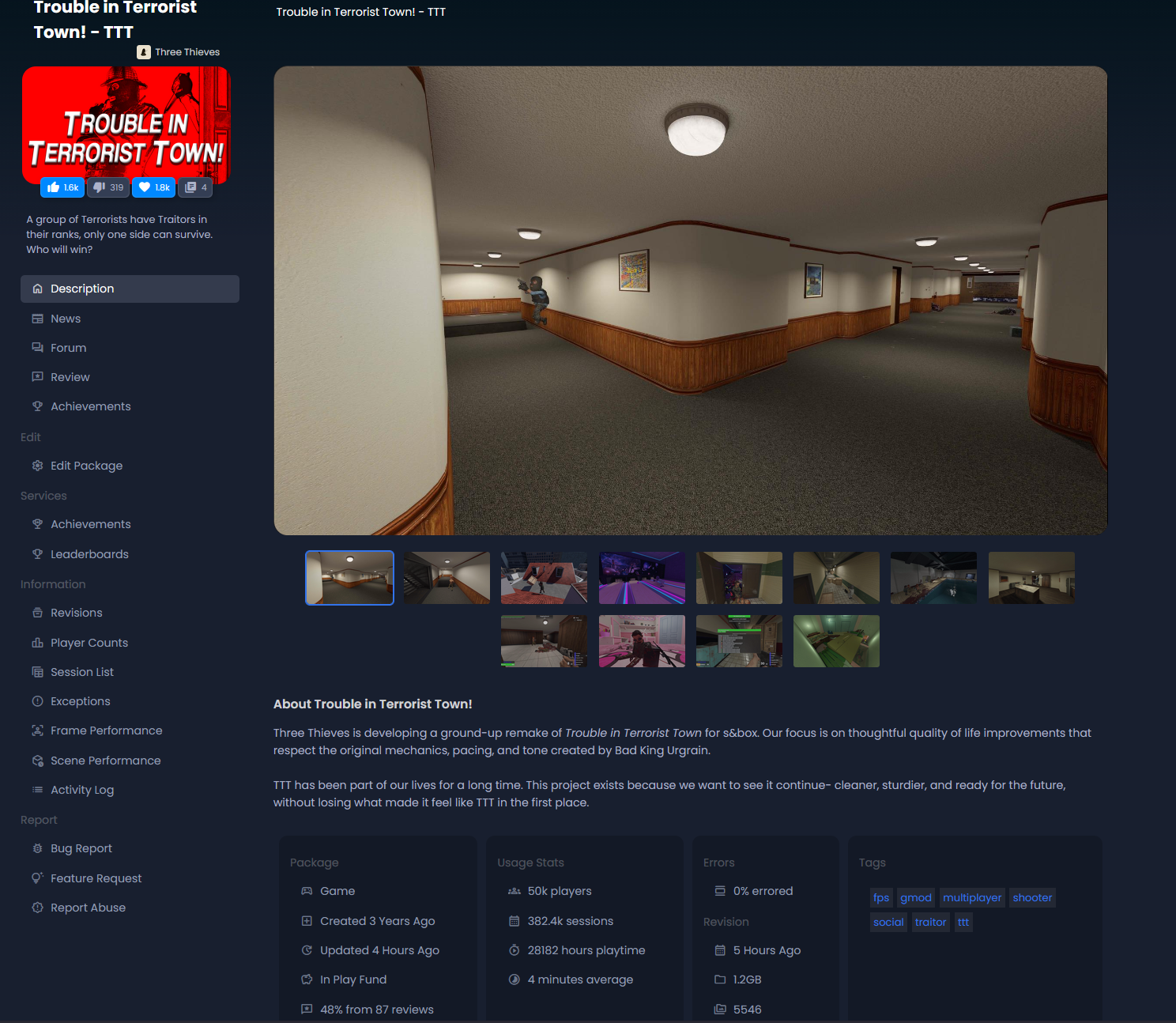
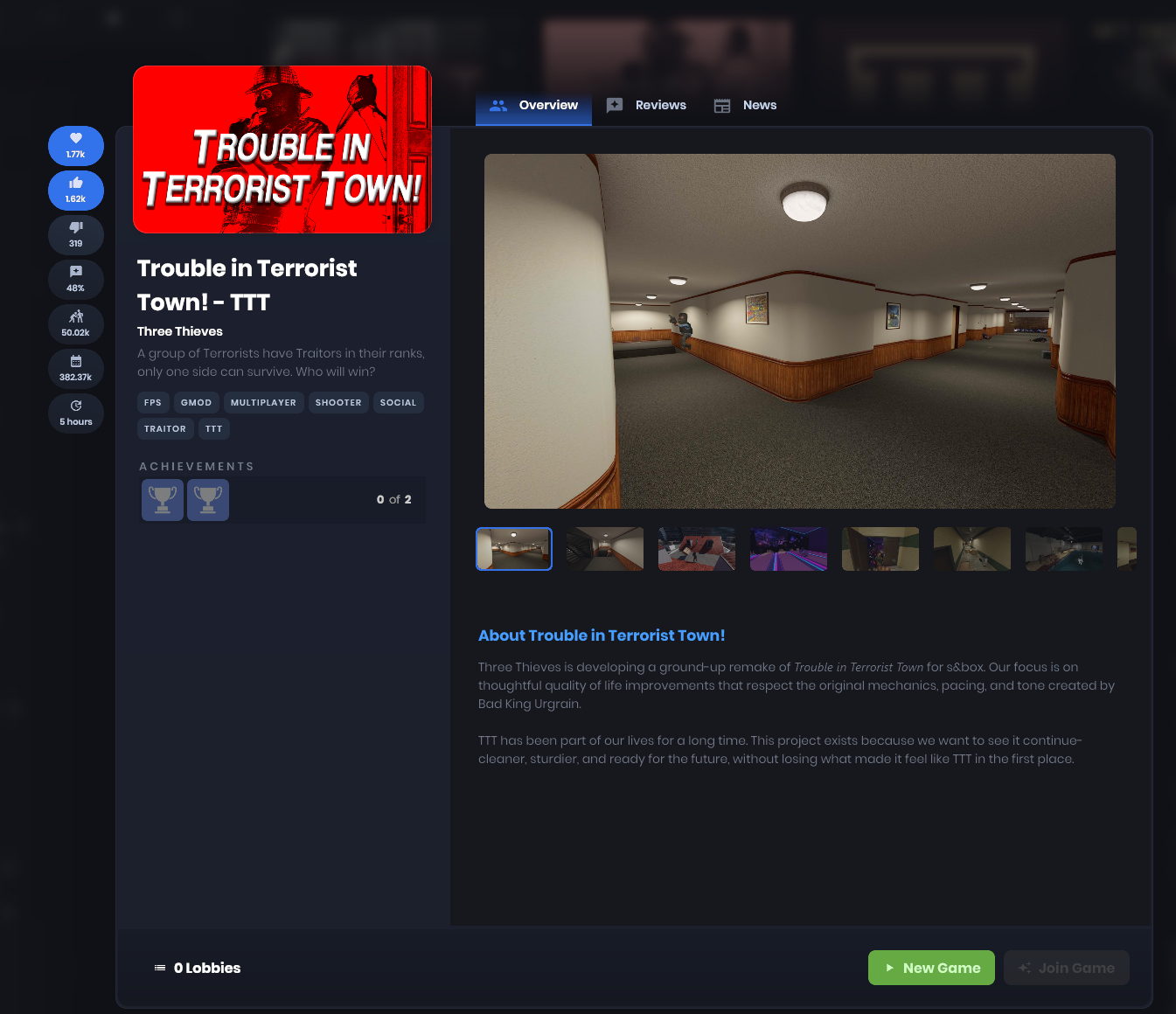
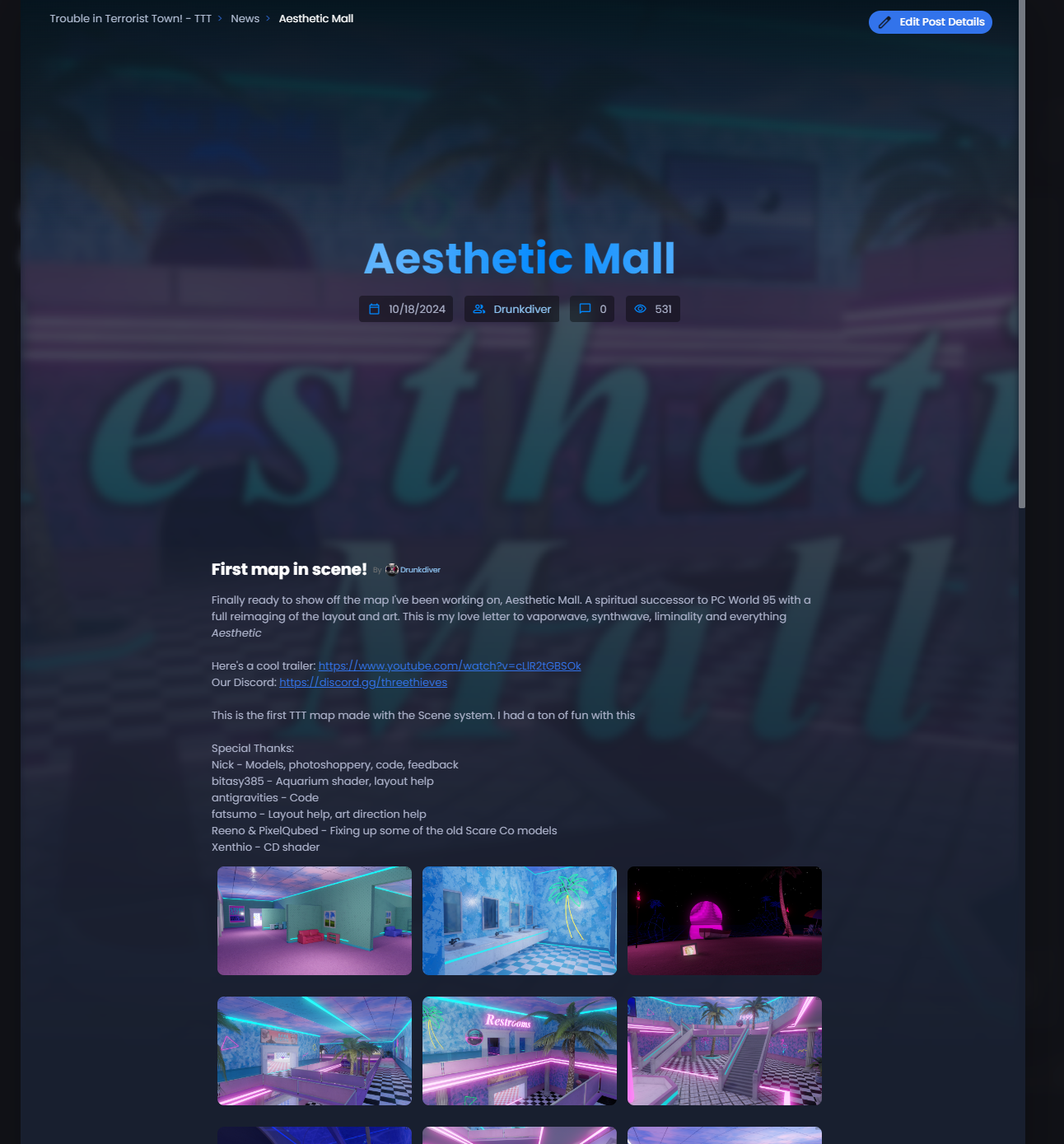
Just for your game to be seen, you have to start up a server and idle in it with a 2nd PC just to increase your chances for people to see your lobby and potentially join, and then keep that train going for how long you can last (make sure it has to be Multiplayer too).
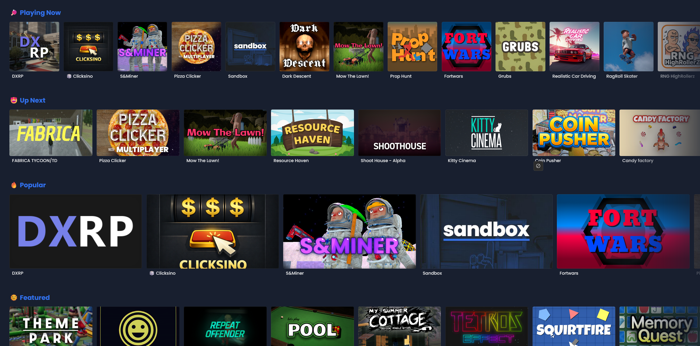
The way the main Games page is laid out right now is an absolute mess.
It’s visual noise. Total hierarchy collapse. Everything is the same size, the same weight, the same level of importance. My eyes don’t know where to land. I can’t tell what’s popular, what’s good or what's new. It’s just tiles. Endless tiles.
The game titles are tiny. The thumbnails all scream at once. Some are all text, some are logos and some are screenshots - there’s zero consistency. Nothing tells me why I should click one thing over another.
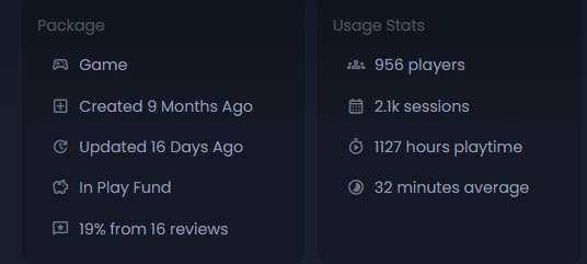
We don't have any relevant stats like active player count and approval rating on the game cards themselves - which makes it harder to spot quality.
The end result is that discoverability doesn’t feel earned. It feels like luck. Or endurance. Or being online at the right hour with the right lobby name.
And that sucks, because it punishes genuinely interesting projects and rewards to whoever can idle the longest.
PS: I don’t think the problem is a lack of good games. I think the problem is that the platform makes it almost impossible to tell they exist.
Add a random games page where it recommends random games, place ads to show off some games on the main menu, or sides of the play games page that show other users videos for their games, lower the games with more downloads/bad ratings, several simple things can help boost the algorithm for smaller and more polished games to do better
edited:
, Oh yeah forgot to mention, currently I always check the waywo page on discord to see up and coming games, maybe something like waywo implemented in to the actual game itself would be cool to find games, but instead of what are you working on it's just a built in forms type of page or something where users can talk about the game itself, currently there's one built in to the website, i think it shouldn't be implemented into the game itself as well
I agree that the way the elements are organized isn’t very attractive at the moment.
I also agree that the featured games should be at the top and much more prominent. They should be the first thing that catches the user’s eye.
As for the other games, displaying them all at the same size can be a bit overwhelming, and it’s easy to lose track of what to focus on since everything looks the same.
I think they should be differentiated first by size, like games no featured looks small normal, featured games looks bigger, most played games middle.
I also believe the game titles should be much larger, as they currently feel too small and leave a lot of empty space.
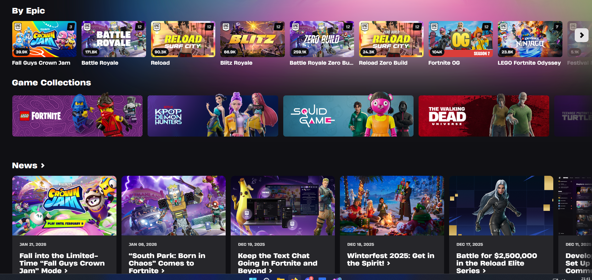
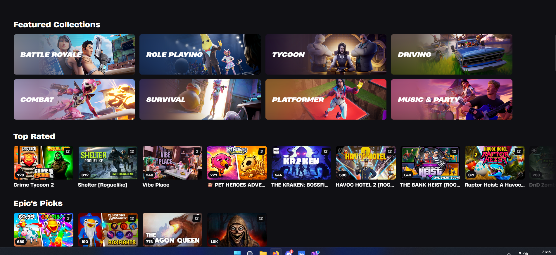
The one from Epic games looks really good, you can see the difference they don't look the same. Like here on the screen, instead of “Game Collection,” I can see the most played games, and in the “Featured Collection” section, all the featured games are grouped together, which makes it much more visually attractive.
I’m not saying to copy this UI design, but just to take some inspiration from it because it looks interesting. It’s always good to have examples and sources of inspiration.
Pretty much agree with this post. As we approach release in the coming next two months *(unless s&box somehow gets delayed)*, I think this is something that should be thought about more.
Another thing that's been in my mind for a while is how much being in the featured category changes things in terms of visibility? Does it have a decent uptick, or none at all? How does this factor into play fund earnings? Etc etc.
Please don't take inspiration from UEFN, you have to pay to promote your game. At the end of the day you can't ignore the players choice, if they play shitty brainrot idle slop it's because most gamers don't realize they're the ones being played, not the game. Only thing Facepunch could do is encourage unique games and discourage ones with dark patterns or low effort.
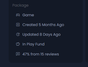
A game with 19% positive reviews. That gets shows... ON THE FIRST DAHM PAGE
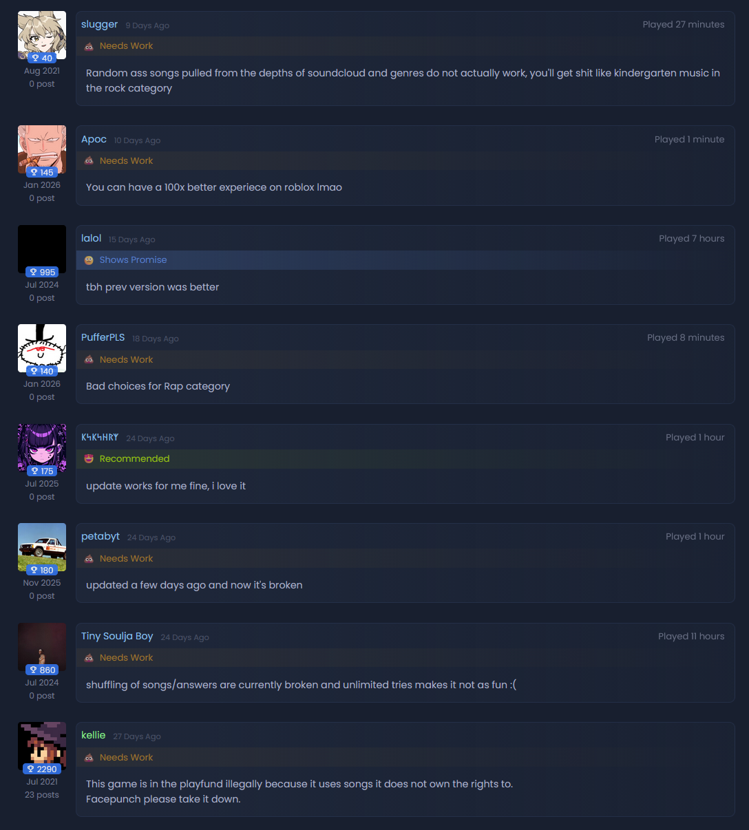
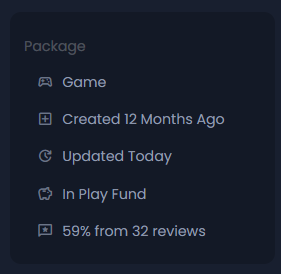
https://sbox.game/glag/guess_the_song Then a different situation. We have a game with Quite good reviews. (On average even the best games after a few months get 40-60% from reviews because games breaks for like a week) But if we look at recent reviews (past month)... Only 2 Positive?... ... Another situation A game got bad reviews from months ago when it was broken. (I made a bunch of prop hunt maps.. and I HAVE A BIAS) https://sbox.game/bolt/seekers Having some kind of system that a developer can use to indicated that the game is fixed.... like developer response .. HMM like steam.
What does reviews need? 1) If they are helpful they need to be shown on top. (like steam) 2) Recent reviews should be shown too. Because games change. And a game with mostly negative could be already fixed and have 3 months of good reviews. 3) Developer response (like steam to positive or negative reviews )
.. and actually taking in account of the game reviews while recommending it.
We have that already, just use the NEWS module for your game in sbox.game and @everyone in your community on the updates.
This is not comparable to a direct response to a comment in the reviews section, especially bcs a guy who left a negative comment during a broken update for example, if you inform that your game is now fixed in the NEWS section they will never see it bcs they will never receive a notification, nothing beat a direct response to a review imo.
I think having large categorys and then below like two rows of that go into top rated/most popular or whatwever for speciific games. I think having 50 random games of different genres can be overwelhming rather than leading the player to a game genre they want to play and giving then showing them games within the category.
Having some kind of system that a developer can use to indicated that the game is fixed.... like developer response .. HMM like steam.
We have that already, just use the NEWS module for your game in sbox.game and @everyone in your community on the updates.
Okay. Good if it worked that way. But. the website doesn't show news on the main page. (It's on it's own page that people need to look at) In game it is even worse.. we only have one indicator. Last updated. The small 5 hours. Would be nice if news showed on the main page. Such way any user could see any cool things added last.
And is it only for me the when you view a news in S&box it's laggy as heck>? (The fps is the same but the experience of just scrolling down is so bad.. it feels like 5 fps.)
Another issue is news are so tucked and hidden away that it's impossible to keep up with a game's updates, maybe some kind of notification system with a seperate patch notes system (as news always felt bulky and heavy for me and pointless for very small updates)