I'm starting development on a hardcore FPS survival simulator. The goal is to convey realism: a complex healthcare, food, and water supply system, as well as survival in heat and cold on a large map.
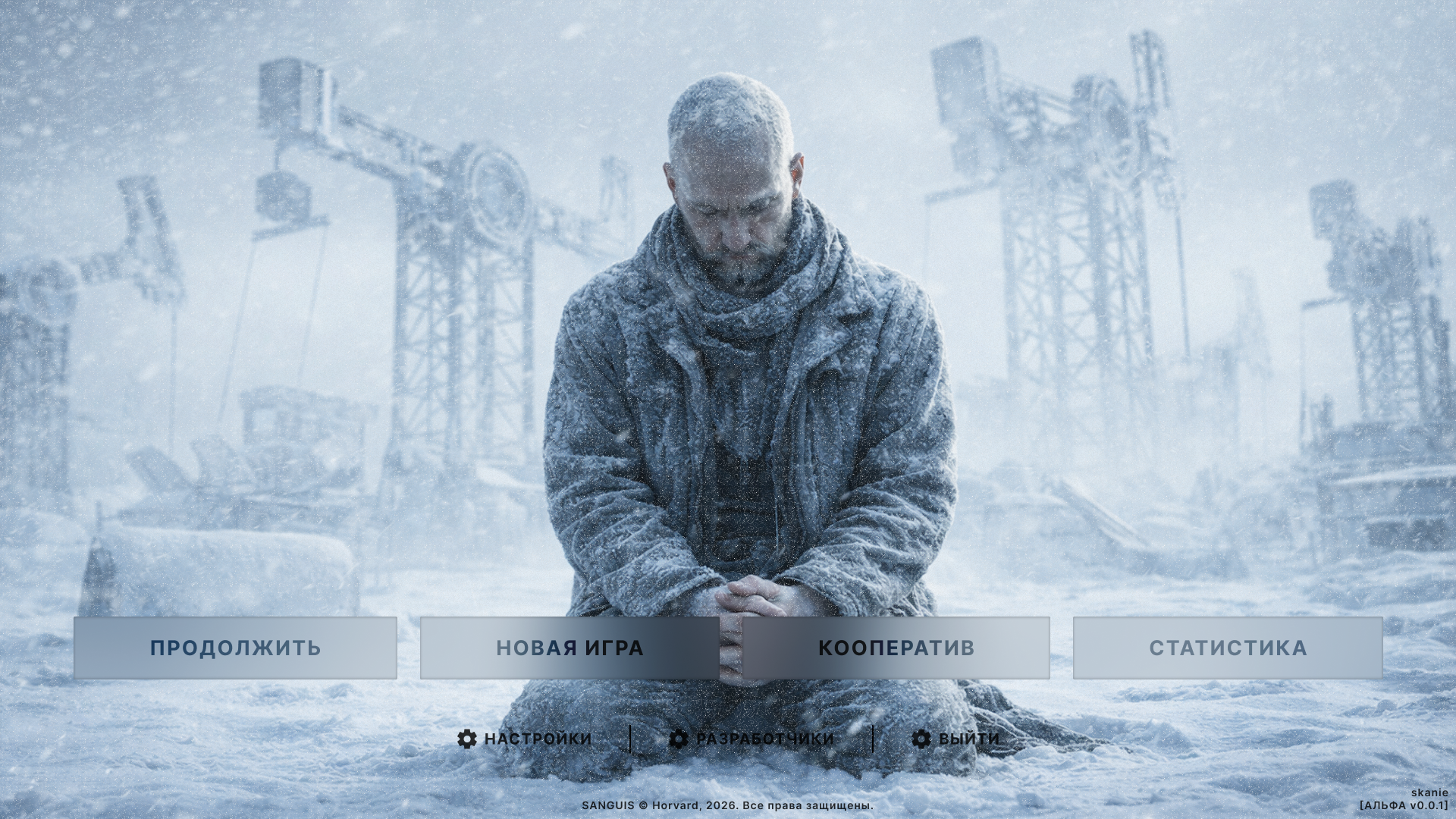
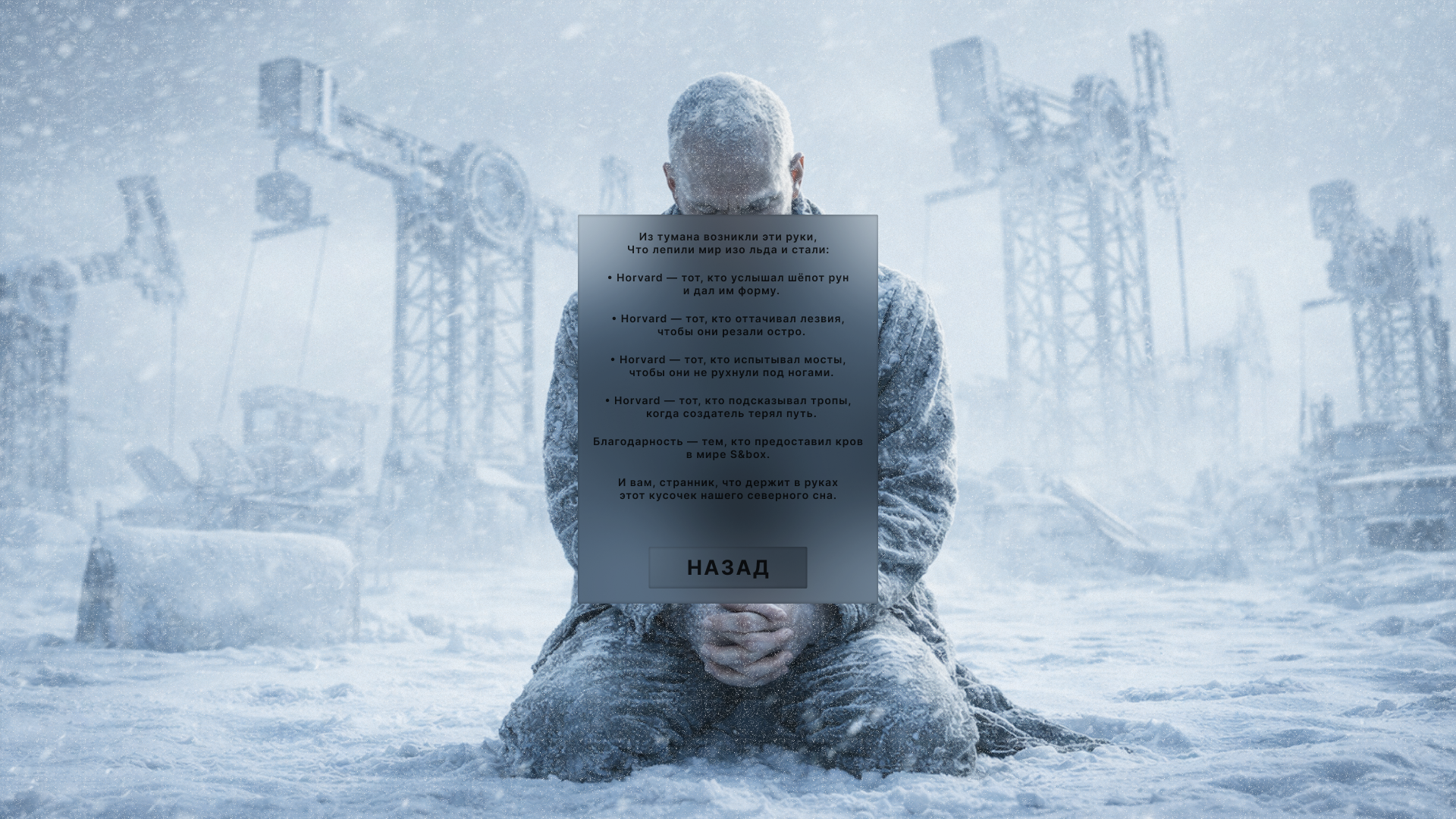
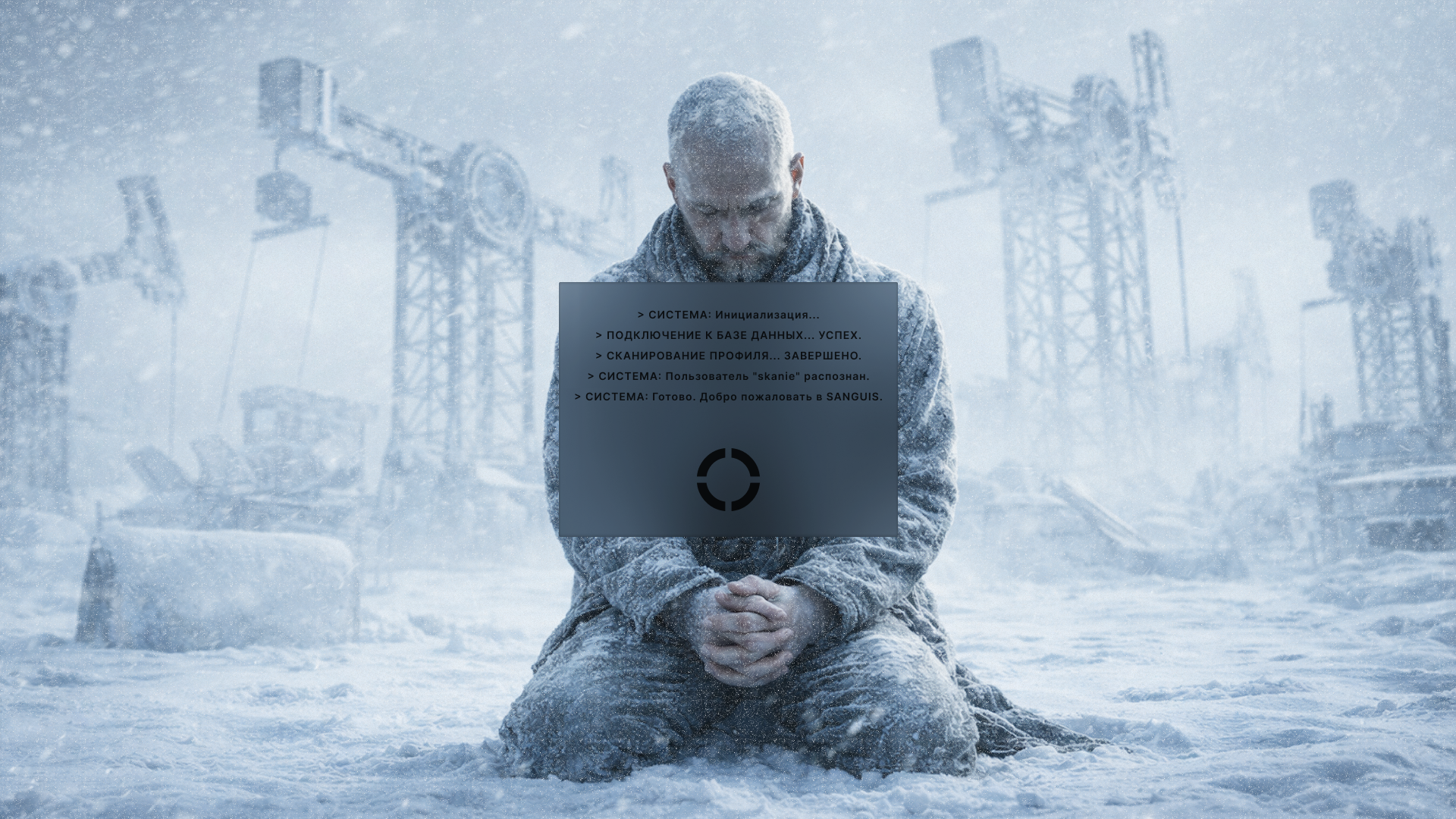
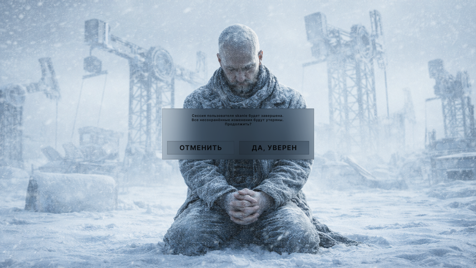
This is a very early stage. I'm currently working on the user interface and would love to hear your first impressions of this menu.
Don't be aggressive, I'm not a very experienced designer :)
I like the glassy look and the color scheme. A few criticisms:
The dark text of the buttons has poor contrast with the gray backgrounds.
The animations are too slow, which will make the UI feel frustratingly sluggish. Try to keep all animations under 0.2 seconds if possible.
You seem to be using "multiply" or some other non-normal blend modes on the buttons. This is a cool effect, but I think it may be contributing to the contrast problems. I'd be interested to see whether you can fix the contrast issues while keeping the fancy blend mode.