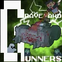
Graveyard Gunners
Released
Drive by Shoot 🔫🚘 various Monsters for the Highscore! 👑
ui/hud.razor.scss
HUD {
    position: absolute;
    top: 0;
    left: 0;
    right: 0;
    bottom: 0;
    font-family: Poppins;
    font-size: 24px;
    text-stroke: 10px black;

    > .vitals {
        position: absolute;
        bottom: 10%;
        right: auto;
        left: 10%;
        font-size: 64px;
        flex-direction: column;
        align-items: flex-end;
        font-weight: bold;
        color: grey;
    }


    .health-dial-almost {
        position: absolute;
        left: -1.5%;
        bottom: -12%;
        width: 36vw;
        height: 25vw;
        background-image: url( "sprites/health-dial-almost.svg" );
        background-size: contain;
        background-repeat: no-repeat;
        background-position: center;

        &.low-health {
            animation: shake-tacho-animation 0.4s ease-in-out;
            animation-iteration-count: infinite;
        }

        &.super-low-health {
            animation: shake-tacho-animation 0.1s ease-in-out;
            animation-iteration-count: infinite;
        }
    }

    .health-needle {
        position: absolute;
        // Setzt die Nadel horizontal genau in die Mitte
        left: 3.5%;
        bottom: -15%;
        // Dimensionen deiner Nadel
        height: 28vw;
        width: 17vw;
        // Verschiebt die Nadel um die Hälfte ihrer eigenen Breite nach links, damit sie perfekt zentriert ist.
        // Zudem wird sie um ihre eigene Länge (100%) nach oben verschoben, damit ihr unteres Ende auf dem Drehpunkt liegt.
        transition: transform 0.3s ease-out;
        // WICHTIG: Definiert den Drehpunkt für das C#-Skript.
        // bottom center sorgt dafür, dass sich die Nadel am unteren Ende dreht.
        background-image: url( "sprites/health-needle.svg" );
        background-size: contain;
        background-repeat: no-repeat;
        background-position: center;

        &.damaged {
            animation: shake-needle-animation 0.2s ease-in-out;
        }
    }

    .ammocount {
        position: absolute;
        bottom: 2%;
        left: 21.5%;
        display: flex;
        flex-direction: column;
        align-items: flex-end;
        font-weight: bold;
        font-size: 3vw;
        color: orange;

        &.used {
            animation: rocket-grow-animation 0.2s;
            animation-iteration-count: 1;
        }
    }


    > .score {
        position: absolute;
        top: 4.5%;
        right: 0.5%;
        display: flex;
        flex-direction: column;
        align-items: flex-end;
        font-weight: bold;
        color: white;


        &.center {
            animation: score-center 1s forwards;
            animation-iteration-count: 1;
        }

        .gained-score {
            position: absolute;
            font-family: Digit Tech 7;
            font-size: 2vw;
            color: #4cff00; // Optional: Grün für gewonnene Punkte
            pointer-events: none; // Damit es nicht mit der Maus interagiert
            z-index: 2;
            // Die Animation: 0.6 Sekunden lang, wird am Ende langsamer (ease-out)
            // 'both' sorgt dafür, dass das Element am Ende unsichtbar bleibt und die Animation von Anfang an angewendet wird
            animation: score-fall 2s ease-out forwards;
        }

        .current-score {
            font-family: Digit Tech 7;
            font-size: 4vw;
        }

        .multiplier {
            transform-origin: right;
            font-size: 70px;
            font-style: italic;
            transition: transform 0.1s ease-out, color 0.1s linear;
            margin-top: -45px;
        }
    }

    > .timer {
        position: absolute;
        left: 47%;
        top: 0%;
        display: flex;
        font-family: Digit Tech 7;
        flex-direction: column;
        align-items: flex-start;
        font-weight: bold;
        color: darkgray;
        font-size: 2.5vw;

        .timer-house {
            position: absolute;
            left: -123%;
            top: -200%;
            width: 26vw;
            height: 19vw;
            background-image: url( "sprites/timer-house.svg" );
            background-size: contain;
            background-repeat: no-repeat;
            background-position: center;
        }

        p {
            display: flex;
            align-items: center; // Richtet Zahlen und Doppelpunkt vertikal mittig aus
        }

        .separator {
            font-family: 'Poppins', sans-serif; // Überschreibt die Schriftart nur für den Doppelpunkt
            padding: 0 4px; // Optional: Fügt minimalen Abstand links/rechts hinzu, falls nötig
        }
    }

    .crosshair {
        position: absolute;
        top: 50%;
        left: 50%;
        transform: translate(-50%, -50%);
        width: 3vw; // Breite des Fadenkreuzes
        height: 3vw; // Höhe des Fadenkreuzes
        background-image: url( "sprites/crosshair.png" );
        background-size: contain;
        background-repeat: no-repeat;
        background-position: center;

        &.on-target {
            background-image: url( "sprites/crosshair-enemy.png" );
        }

        &.on-shot {
            animation: crosshair-shot 0.1s ease-out;
            animation-iteration-count: 1;
        }
    }

    .hitmarker {
        position: absolute;
        top: 50%;
        left: 50%;
        transform: translate(-50%, -50%);
        width: 2vw; // Breite des Fadenkreuzes
        height: 2vw; // Höhe des Fadenkreuzes
        background-size: contain;
        background-repeat: no-repeat;
        background-position: center;

        &.active {
            background-image: url( "sprites/crosshair-hitmarker.png" );
        }
    }

    .multiplier-dial {
        position: absolute;
        right: -5%;
        top: 1%;
        width: 28vw;
        height: 19vw;
        background-image: url( "sprites/multiplier-dial-semi-score.svg" );
        background-size: contain;
        background-repeat: no-repeat;
        background-position: center;

        &.on-fire {
            animation: shake-tacho-animation 0.1s ease-in-out;
            animation-iteration-count: infinite;
        }
    }

    .multiplier-needle {
        position: absolute;
        // Setzt die Nadel horizontal genau in die Mitte
        left: 22.5%;
        bottom: 33.5%;
        // Dimensionen deiner Nadel
        height: 15vw;
        width: 15vw;
        // Verschiebt die Nadel um die Hälfte ihrer eigenen Breite nach links, damit sie perfekt zentriert ist.
        // Zudem wird sie um ihre eigene Länge (100%) nach oben verschoben, damit ihr unteres Ende auf dem Drehpunkt liegt.
        transition: transform 0.1s ease-out;
        // WICHTIG: Definiert den Drehpunkt für das C#-Skript.
        // bottom center sorgt dafür, dass sich die Nadel am unteren Ende dreht.
        background-image: url( "sprites/rechteck.svg" );
        background-size: contain;
        background-repeat: no-repeat;
        background-position: center;
    }
}

@keyframes hitmarker-fade {
    0% {
        opacity: 1;
    }

    100% {
        opacity: 0;
    }
}
@keyframes crosshair-shot {
    0% {
        transform: translate(-50%, -50%) scale(1.3f);
    }

    100% {
        transform: translate(-50%, -50%) scale(1f);
    }
}

@keyframes score-fall {
    0% {
        opacity: 0;
        transform: translateY(200px) scale(0.8f);
    }

    20% {
        opacity: 1;
        transform: scale(1.5f);
    }

    100% {
        opacity: 0;
        transform: translateY(20px) scale(1f) rotate(10deg); // Fällt nach unten
    }
}

@keyframes score-center {
    0% {
        color: white;
        transform: translateY(100) scale(0.8);
    }

    20% {
        color: white;
        opacity: 1;
    }

    100% {
        color: red;
        opacity: 1;
        transform: translateY(25vw) translateX(-40vw) scale(3) rotate(8deg); // Fällt nach unten
    }
}
    // Globale Keyframes für das Wackeln
    @keyframes shake-animation {
        0% {
            transform: rotate(0deg);
        }

        25% {
            transform: rotate(-5deg); // Leichte Drehung nach links
        }

        50% {
            transform: rotate(5deg); // Leichte Drehung nach rechts
        }

        75% {
            transform: rotate(-5deg);
        }

        100% {
            transform: rotate(0deg);
        }
    }
    // Globale Keyframes für das Wackeln
    @keyframes shake-needle-animation {
        0% {
            transform: translateY(0);
        }

        25% {
            transform: translateY(10);
        }

        50% {
            transform: translateY(0);
        }

        75% {
            transform: translateY(-10);
        }

        100% {
            transform: translateY(0);
        }
    }
    // Globale Keyframes für das Wackeln vom Tacho
    @keyframes shake-tacho-animation {
        0% {
            transform: rotate(0deg);
        }

        25% {
            transform: rotate(-5deg); // Leichte Drehung nach links
        }

        75% {
            transform: rotate(5deg); // Leichte Drehung nach rechts
        }

        100% {
            transform: rotate(0deg);
        }
    }
    // Globale Keyframes für das Wackeln vom Tacho
    @keyframes rocket-grow-animation {
        0% {
            transform: scale(1.3f);
        }

        25% {
            transform: scale(1.3f); // Leichte Drehung nach links
        }

        75% {
            transform: scale(1.1); // Leichte Drehung nach rechts
        }

        100% {
            transform: scale(1);
        }
    }