Promising! Game looks interesting to play, but it's just confusing at the moment.
Definitely original, also performance is good overall since it's a 2D game.
List of personal issues :
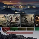
MAIN MENU
--
- settings button doesnt look like settings, just an old golden wheel of some kind (also it's a pretty big button in my opinion)
- war chests are interesting - Felt a bit slow to open, also opening second one required me going back to the menu I don't know why.
The war chest button in the main menu has a background with left/right white borders, also the text "war chest" is a bit hard to read
- The "join a friend" thing, I believe there's a native way in s&box to play private games with friends ? not sure.
- This one probably might not be easy UI-wise but it's a bit annoying having menus with all different sizes
- Something easier, sometimes the "back" menu is in red (good) sometimes it's not, sometimes it's smaller, also war council doesnt have any.
It's a bit like the thing I mentioned just above, each menu look similar which is good but there's no "size uniformity", dunno if it's needed?
Either way warpath needs a fix, it's way too wide. make the text fit in two lines instead of one would look way better already
- The new text under Warring Kingdoms title is great, no longer feels like AI.
- I'm not fond of the username/change icon menu taking the entire width of the screen, it almost feels like it's more important than the rest of the game
- First time I launch the game I'm greeted with 11 big buttons, then quit/community buttons. You have a lot of stuff that's great, but as a newbie I'm just lost on what to do.
Make a deck first? Practice with AI because I've never played before? Change settings ? Open chests because I have two available? Click on help to see what it contains? etc..
- In the settings by default the difficulty is set to veteran which feels like very hard, when actually it's normal difficulty.
Recruit/Warlord are good once you understand it. Maybe it'd be better to stick to something simple like easy, normal, hard?
- Card glossary is good, takes 2-3 seconds to load which is a bit disappointing.
-"How to play" it's early on in development so maybe too early, but an actual tutorial would be much better than just text
STORY (what I decided to start first after checking what the main menu buttons do) :
--
- Just lost on what to do once the game actually starts. Saying that once else I will repeat myself often
- Again the first menu feel wider than what they should. Personal opinion mostly I would say
- Second menu made me find out that the elements in the first menu don't have appropriate font
(exemple "Skirmish at the Crossroads" have good font, "The Yellow Sky" before does not")
- No idea which starter to pick first, which one is better suited for a newbie/rookie so I picked first one. (Wei)
- Clicking on deck at bottom left does nothing, dunno if it was supposed to open my deck or not?
- Maybe move the "battle chronicle" thing all the way to the top? when you click to minimize it, it moves down and it feels werid.
- Add ability to drag and drop cards? Some players would find that more intuitive but maybe it's because I never had a tutorial first.
- Music too low by default, I increased my system volume and got earraped by the sound effects xd
then I noticed ingame you set music volume to 10%. It needs more music also, not just a generic one.
--
The improved the UI (compared to the first screenshots you sent me in PM) so gj on that
I added the games to my favourites, I'll gladly try it again once it feels welcoming for a newbie :)
GraphicsGameplayOriginalityPerformanceReplayabilityConfusing