Property Attributes
You can add attributes to your Component's properties in C# to change how they look in the editor/inspector.
[Hide]
Hides the property from the editor. Will still be a property, and will still save and load - but won't be visible.
[RequireComponent]
Added to a property containing a component. The component will be created if it doesn't exist.
[Group( "Helpers" )]
Will create a group box and add this property to that group. Mark multiple properties to add them to the same group.
[ToggleGroup( "UseHelpers" )]
A group that has a checkbox to turn it on and off. The name should match the name of a bool property to hold the state.
[Title( "My New Title" )]
Change the title of the property in editor, instead of using the property name.
[Feature( "Helpers" )]
Adds this property to a separate feature tab. All other properties will be in a tab called General.
[FeatureEnabled( "Helpers" )]
Should be used on a bool property. This allows you to turn the feature on and off by removing or adding the tab.
[Order( 100 )]
Change the order of this property in the editor. Their position in the source usually orders them.
[ShowIf( "PropertyName", 3 )]
Only show this property if another property is equal to the value.
[HideIf( "PropertyName", 3 )]
Hide this property if another property is equal to the value.
[Range( 0, 100 )]
When used on a number property, the control widget will have a min and max value provided, with an optional argument to clamp the value (enabled by default, so the user cannot manually input a number outside of the range) and another to show a slider instead of a number field (enabled by default)
[Step( 10 )]
When used on a number property, the control widget will only increment by the step amount provided when clicked and dragged.
[Space]
Add a space above the property.
[Header( "My Header" )]
Add a header above the property.
[ReadOnly]
Don't allow changing this property.
[Flags]
Indicates that an enum can be treated as a set of flags. Allows for selecting multiple flags at once from the dropdown instead of just selecting one.
[InlineEditor]
Tell the editor to try to display inline editing for this property, rather than hiding it behind a popup.
(useful for custom Classes/Structs)
[WideMode]
Fill the width of the editor with the widget and put the label above instead of to the left of the ControlWidget. Can optionally hide/remove the label entirely.
[Validate( nameof( IsValid ), "Warning Message", LogLevel.Warn )]

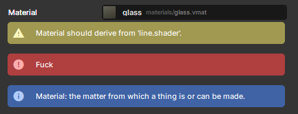
Specifies a method in the same class to use for validation. The validation result will be shown in the inspector.
[Advanced]
Some properties are not meant for the average user, hide the property unless the user really wants to see it.
[KeyProperty]
For use in custom Classes/Structs, marks the property as the key property - which means that it can represent the whole object in a single line while offering an advanced mode to view the entire object.
String-Specific
[Placeholder( "Your mother's maiden name" )]
When used on a string property, will show this text when it's empty.
[TextArea]
When used on a string property, show a multiline text area instead of a single-line text edit.
[FilePath]
When used on a string property, creates a File Picker allowing you to select any file, with an optional Extension you can use to specify certain file type(s).
[ImageAssetPath]
When used on a string property, creates a ResourceControlWidget allowing you to select an image file, setting the string's value to the path of the image.
[MapAssetPath]
When used on a string property, creates a ResourceControlWidget allowing you to select a vmap file, setting the string's value to the path of the map.
[FontName]
When used on a string property, creates a Font dropdown allowing you to easily select a font by it's name.
[InputAction]
When used on a string property, creates an Input dropdown comprised of all Inputs configured in your Project Settings, allowing you to easily select an Input by it's name.
Curve-Specific
[TimeRange]
Used to specify a default or clamped time/x-range on a curve
[ValueRange]
Used to specify a default or clamped value/y-range on a curve
ActionGraph-Specific
[SingleAction]
When used on any ActionGraph-compatible property, it will only show a single action to edit instead of a list that allows you to create multiple
Created 26 Oct 2024
Updated 13 Apr 2026