Border Shape
border-shape generalises border-radius from rounded corners to an arbitrary polygon or a circle. Panels don't have to be rectangles.
.tag
{
  border-shape: polygon( 0% 0%, 100% 0%, 90% 100%, 0% 100% );
}
Shapes are drawn with signed distance fields, so edges are antialiased and a normal border traces the shape instead of the box. Hit testing follows the shape too - the corners you cut out stop being clickable.
Values
| Value | Description |
|---|---|
none |
The default. The panel is a rounded rectangle, as usual. |
polygon( x y, x y, ... ) |
Between 3 and 8 points. |
circle( radius at x y ) |
Both parts are optional. |
polygon()
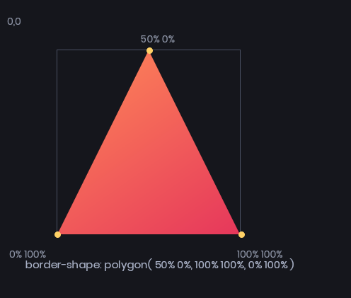
Each point is an x y pair of Length values, measured from the top left of the border box. Percentages resolve against the panel's own width and height, so a shape written in percentages fits whatever size the panel ends up.
.triangle { border-shape: polygon( 50% 0%, 100% 100%, 0% 100% ); }
.hexagon  { border-shape: polygon( 25% 0%, 75% 0%, 100% 50%, 75% 100%, 25% 100%, 0% 50% ); }
Points can mix units and use calc():
border-shape: polygon( 0% 0%, 100% 0%, calc(100% - 12px) 100%, 12px 100% );
Concave shapes are fine - the notch in a chevron stays outside the panel.
A polygon can have at most 8 points. Anything with fewer than 3 or more than 8 is rejected and the property is ignored.
circle()
border-shape: circle();                  /* biggest circle that fits, centred */
border-shape: circle( 45% );             /* explicit radius, still centred */
border-shape: circle( at 25% 60% );      /* moved off centre */
border-shape: circle( 42px at 60px 45px );
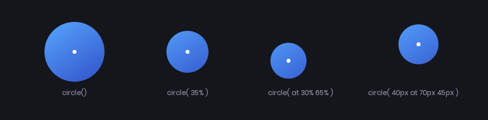
The centre defaults to 50% 50%, and both coordinates must be given together if you give either. A percentage centre resolves against width and height like a polygon point does.
Leave the radius out and you get the closest-side circle - the largest one that fits from that centre. A percentage radius resolves against the box's normalized diagonal, sqrt(w² + h²) / sqrt(2), matching web circle().
What it affects
A border shape changes what the panel itself paints, in the same way border-radius does:
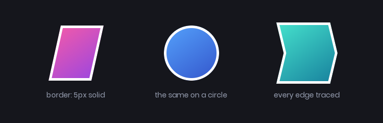
- Background - colors, gradients and images are clipped to the shape.
- Borders - a uniform
borderfollows every edge of the shape. - Hit testing -
:hover, clicks andPanel.IsInsideall use the shape, on the CPU, matching what you see. - Filters -
filter: drop-shadow(...)shadows the shape, not the box.
box-shadow is the exception - it's still drawn as a rounded rectangle from your border-radius, so it will poke out from under a shaped panel. Use filter: drop-shadow(...) instead, which follows the shape.
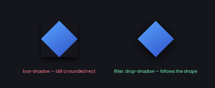
.diamond
{
  border-shape: polygon( 50% 0%, 100% 50%, 50% 100%, 0% 50% );
  border: 4px solid white;
  background-color: #3150c8;
  filter: drop-shadow( 0px 4px 8px #05040acc );
}
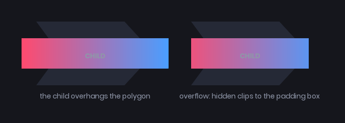
It does not shape descendants. Children lay out and draw against the normal rectangular box, and overflow: hidden clips them to the padding box rather than to the shape. Text inside a circle() panel will happily overhang it, so give shaped panels enough padding for their content.
border-shape replaces border-radius while it's set - the two don't combine. Set it back to none if you want your corner radii back.
border-shape can't be transitioned or animated. It snaps between values, so a :hover rule that changes the shape changes it instantly. Animate transform, background-color or border-color alongside it instead.
Some shapes to steal
/* Breadcrumb / chevron */
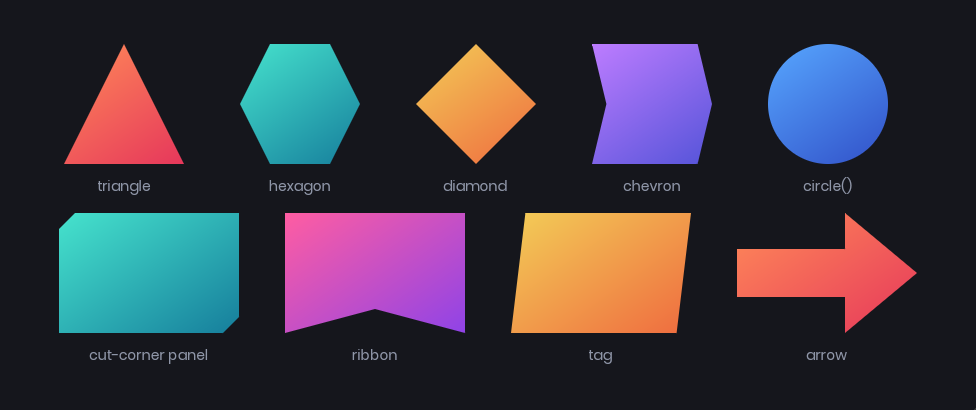
.crumb { border-shape: polygon( 0% 0%, 88% 0%, 100% 50%, 88% 100%, 0% 100%, 12% 50% ); }

/* Cut-corner sci-fi panel */
.hud-panel { border-shape: polygon( 16px 0%, 100% 0%, 100% calc(100% - 16px), calc(100% - 16px) 100%, 0% 100%, 0% 16px ); }

/* Ribbon end */
.ribbon { border-shape: polygon( 0% 0%, 100% 0%, 100% 100%, 50% 80%, 0% 100% ); }

/* Slanted tag */
.tag { border-shape: polygon( 8% 0%, 100% 0%, 92% 100%, 0% 100% ); }

/* Arrow */
.arrow { border-shape: polygon( 0% 30%, 60% 30%, 60% 0%, 100% 50%, 60% 100%, 60% 70%, 0% 70% ); }

/* Avatar bubble */
.avatar { border-shape: circle(); }
Percentage shapes stretch with the panel, pixel shapes keep a fixed bevel however wide the panel gets. Mixing the two with calc() - as in the cut-corner panel above - gives you a shape that scales in one axis and stays crisp in the other.
Styling in code
The resolved shape is on the panel's styles as BorderShape:
myPanel.Style.Set( "border-shape", "polygon( 50% 0%, 100% 100%, 0% 100% )" );

if ( myPanel.ComputedStyle.BorderShape.Kind == BorderShapeKind.Circle )
{
  // ...
}