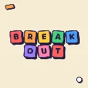
Breakout
Released
Bounce, break, repeat. Clear the bricks, chase the high score, don't drop the ball.
ui/leaderboardpanel.razor.scss
@import "_theme.scss";

LeaderboardPanel {
    width: 100%;
    height: 85%;
    flex-direction: column;
    background-color: $white;
    border: 6px solid $ink;
    border-radius: 30px;
    box-shadow: 12px 12px 0 $ink;
    padding: 38px 40px 42px;
    color: $ink;
    font-family: $font-display;

    .sb-head {
        flex-direction: row;
        align-items: center;
        gap: 16px;
        margin-bottom: 20px;
        flex-shrink: 0;
    }

    .star {
        width: 64px;
        height: 64px;
        background-color: $gold;
        border: 5px solid $ink;
        border-radius: 18px;
        box-shadow: 5px 5px 0 $ink;
        align-items: center;
        justify-content: center;
        font-size: 64px;
        color: $ink;
        transform: rotate( -6deg );
        padding-bottom: 8px;
    }

    .sb-title {
        font-family: $font-display;
        font-weight: 800;
        font-size: 42px;
        color: $ink;
    }

    .tabs {
        flex-direction: row;
        flex-wrap: wrap;
        gap: 12px;
        margin-bottom: 20px;
        flex-shrink: 0;
    }

    .tab {
        pointer-events: all;
        font-family: $font-body;
        font-weight: 700;
        font-size: 18px;
        letter-spacing: 1px;
        color: $ink;
        background-color: $cream;
        border: 4px solid $ink;
        border-radius: 14px;
        box-shadow: 4px 4px 0 $ink;
        padding: 9px 18px;
        cursor: pointer;
        transition: all 0.08s ease-out;

        &:hover {
            sound-in: "ui.button.over";
        }

        &:active {
            sound-in: "ui.button.press";
        }
    }

        .tab:hover {
            transform: translate( -2px, -2px );
            box-shadow: 6px 6px 0 $ink;
        }

        .tab.active {
            color: $white;
            background-color: $blue;
            transform: translate( -3px, -3px );
            box-shadow: 7px 7px 0 $ink;
        }

    .sb-list {
        flex-direction: column;
        gap: 12px;
        flex-grow: 1;
        overflow-y: visible;

    }

    .board-empty {
        font-family: $font-body;
        font-weight: 600;
        font-size: 22px;
        color: rgba( $ink, 0.55 );
        padding: 16px 0;
    }

    .row {
        flex-direction: row;
        align-items: center;
        gap: 20px;
        padding: 12px 22px;
        background-color: $white;
        border: 5px solid $ink;
        border-radius: 20px;
        box-shadow: 6px 6px 0 $ink;
        flex-shrink: 0;
    }

        .row.you,
        .row.me {
            background-color: $highlight;
        }

        .row.you {
            margin-bottom: 10px;
        }

    .medal {
        width: 54px;
        height: 54px;
        border: 4px solid $ink;
        border-radius: 14px;
        align-items: center;
        justify-content: center;
        font-family: $font-display;
        font-weight: 800;
        font-size: 28px;
        color: $ink;
    }

    .avatar {
        width: 54px;
        height: 54px;
        border: 4px solid $ink;
        border-radius: 50%;
        background-color: $sand;
        background-size: cover;
        background-position: center;
        background-repeat: no-repeat;
        flex-shrink: 0;
    }

    .name {
        flex-grow: 1;
        font-family: $font-display;
        font-weight: 800;
        font-size: 28px;
        color: $ink;
        text-overflow: ellipsis;
        overflow: hidden;
        white-space: nowrap;
    }

    .right {
        flex-direction: row;
        align-items: center;
        gap: 12px;
    }

    .country {
        font-family: $font-body;
        font-weight: 800;
        font-size: 15px;
        color: $ink;
        background-color: $sand;
        border: 3px solid $ink;
        border-radius: 9px;
        padding: 3px 9px;
    }

    .val {
        font-family: $font-display;
        font-weight: 800;
        font-size: 32px;
        color: $ink;
        width: 150px;
        justify-content: flex-end;
        text-align: right;
    }
}