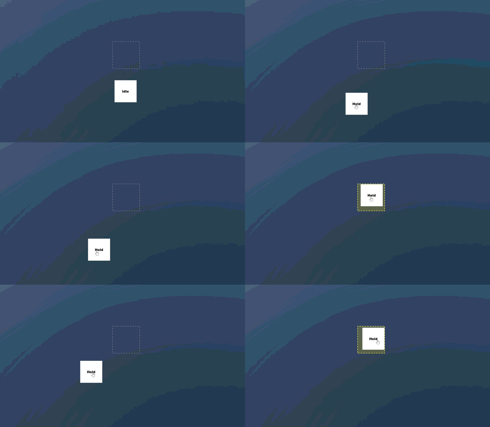
Drag and drop cards UI 

A beginner friendly walk through for making drag and drop-able cards. This feature can be used and expanded to various different features, I actually used it in my card game I made here for game jam III. Everything will be as minimally styled and opinionated as possible so you can clearly see how everything works.


What you will build 

  • A card that can be dragged around the screen tracking the players mouse while its being held. 
  • A zone that can detect when the card is within it.

Prerequisites 

  • Foundational understanding of how Razor, specifically parent/child components.
  • Foundational understanding of HTML and CSS. 
  • A new and empty game scene or project. 

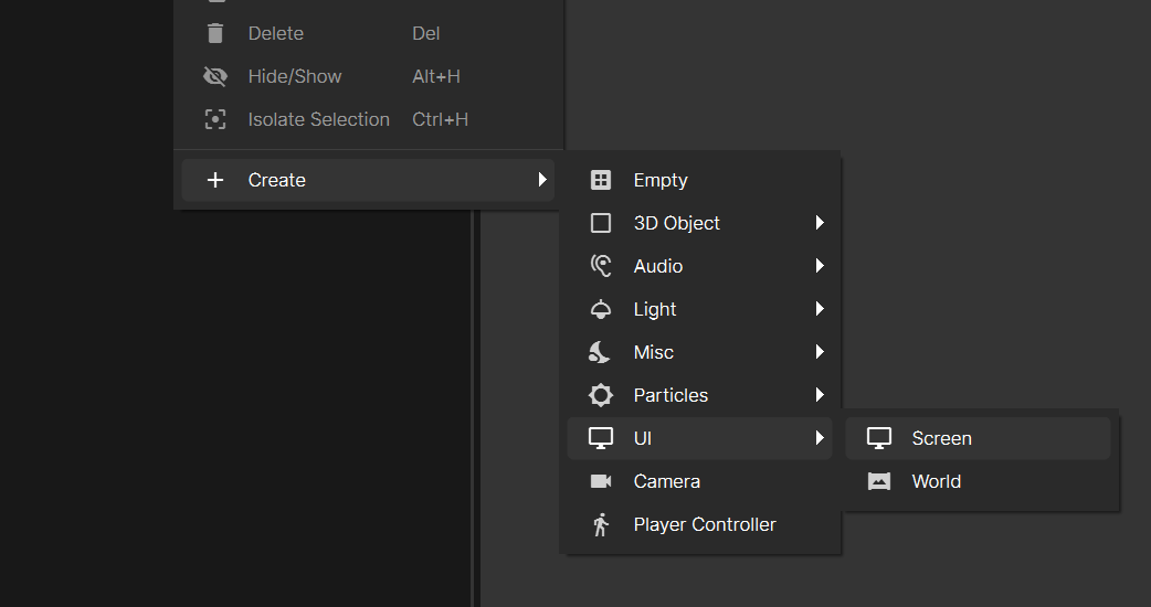
1. Setting up razor components and screen panel 

Create a new screen panel ( tutorial on this can be found here, if you need more guidance on screen panels and components)
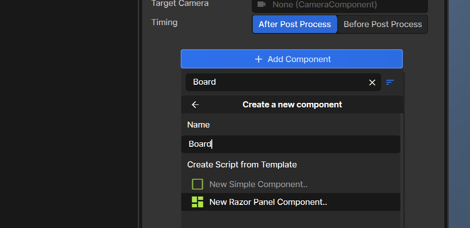
Add a new razor component to that screen panel called "Board" 
 

2. Create child components and add to board. 

Create 2 additional razor components: PlayerCard.razor, PlayerCard.razor.scss, DropZone.razor and DropZone.razor.scss inside your code folder. 

Once created we want to build out our board which will hold both the drop zone and player cards as children. Please add the following to our Board component: 

 
@using Sandbox;
@using Sandbox.UI;
@inherits PanelComponent
@namespace Sandbox

<root>
    <DropZone />
    <div class="hand">
        <HandCard />
    </div>
</root>
 
Along with the following styles: 
 
BoardUI {
  width: 100%;
  height: 100%;
  display: flex;
  flex-direction: column;
  align-items: center;
  pointer-events: all;
  margin-top: 15rem;

  .hand {
    position: relative;
    display: flex;
    justify-content: center;
    margin-top: 50px;
  }
}
 

3. Setup our Drop zone component 

Next we will add the following code to our DropZone.razor component. 
 
@using Sandbox;
@using Sandbox.UI;
@inherits Panel
@namespace Sandbox

<root></root>

@code {
    public static DropZone Hovered;
    public static bool Dragging;

    public override void Tick()
    {
        bool isHoveringOver = Dragging && Box.Rect.IsInside( Mouse.Position );

        SetClass( "active", isHoveringOver );

        if ( isHoveringOver )
        {
            Hovered = this;
        }
        else
        {
            Hovered = null;
        }

    }
}
 
And our styles to the Dropzone.razor.scss 
 
DropZone {
  width: 150px;
  height: 150px;
  border: 2px dashed gray;

  &.active {
    border-color: yellow;
    background-color: rgba(yellow, 0.2);
  }
}
 

How the above works
  • Checks if the mouse's position is within the bounds of our drop zone. 
  • Exposes a Dragging bool which our PlayerCard will check as true when are are dragging it. 
  • Thus when both of the above is true we will set isHoveringOver to the current Drop zone component. This works when you have various drop zones. 

4. Setup our Player Card component 


Next we will add the following to our PlayerCard.razor component: 

 
@using Sandbox;
@using Sandbox.UI;
@inherits Panel
@namespace Sandbox

<root class="@(Held ? "held" : "")">
    @(Held ? "Held" : "Idle")
</root>

@code {
    bool Held;
    Vector2 grabPosition;

    protected override void OnMouseDown( MousePanelEvent e )
    {
        Held = true;
        grabPosition = ScreenPositionToPanelPosition( Mouse.Position );
        DropZone.Dragging = true;
    }

    protected override void OnMouseUp( MousePanelEvent e )
    {
        DropZone.Dragging = false;
        Held = false;
    }

    public override void Tick()
    {
        if ( !Held )
        {
            return;
        }
        else
        {
            var local = Parent.ScreenPositionToPanelPosition( Mouse.Position ) * ScaleFromScreen;
            Style.Left = Length.Pixels( local.x - grabPosition.x * ScaleFromScreen );
            Style.Top = Length.Pixels( local.y - grabPosition.y * ScaleFromScreen );
        }
    }
}
 

And our styles to PlayerCard.razor.scss

 
PlayerCard{
  position: absolute;
  width: 120px;
  height: 120px;
  display: flex;
  align-items: center;
  justify-content: center;
  background-color: white;
  color: black;
  font-weight: bolder;
  font-size: large;
  cursor: pointer;
  pointer-events: all;

  &.held {
    z-index: 10;
  }
}
 

How the above works
  •  We will update both the held boolean of our current card and the dragging boolean of all the drop zones. This is done so we know what card we are holding and so we can check if we are dragging our card within the bounds of one of our drop-zones. 
  • Track the drag position every frame if the card  is being held. 
  • Remove drag and held when the player lets go of the card. 

5. Play test 

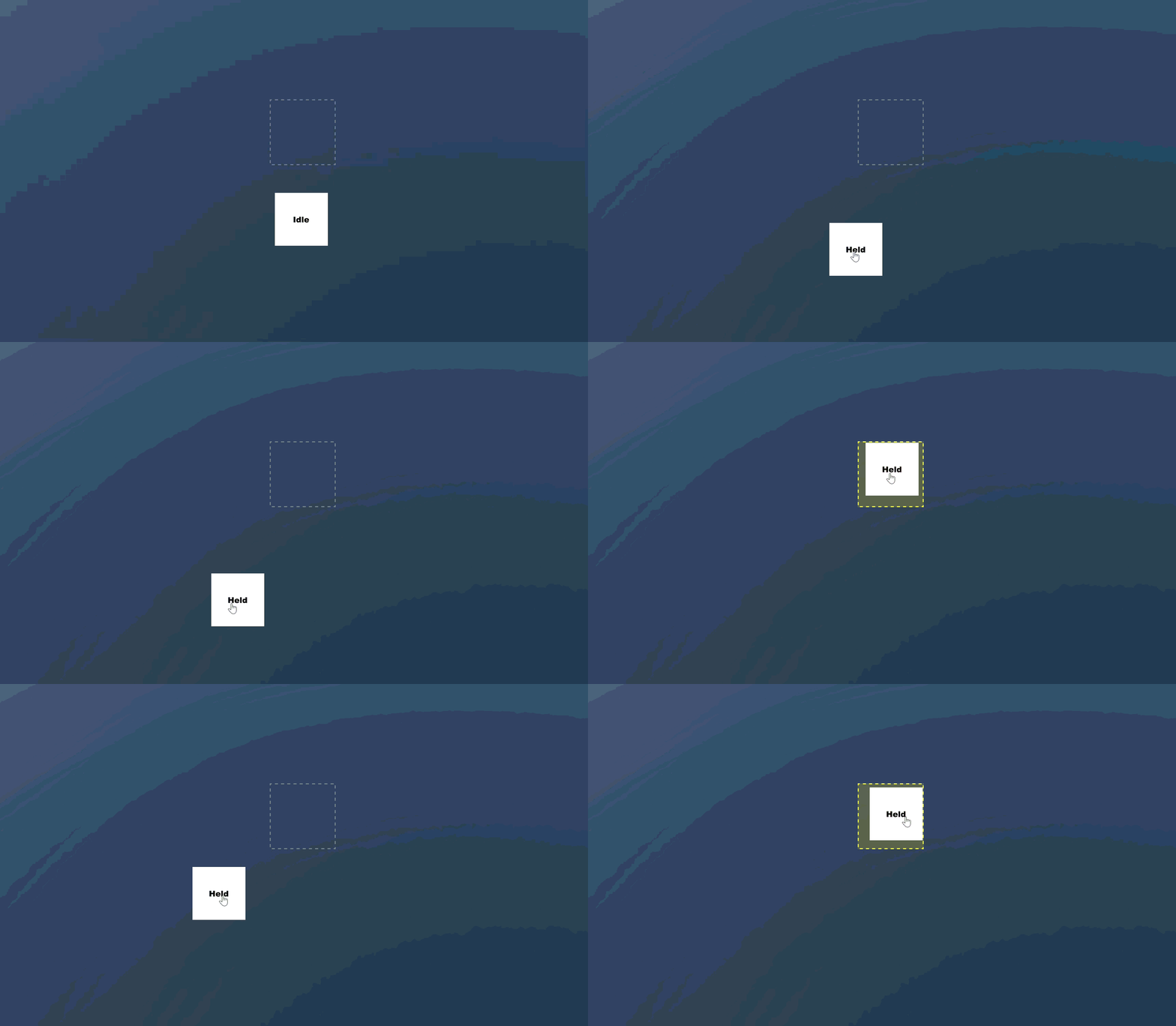
Now that you have done this all you need to do is play test. This can operate as your basis for setting up any type of drag and drop functionality that involves UI.

You should be able to see the following:
 I'm planning to try make 1 tutorial per day, I know that a lot of new people have issues with the lack of tutorials and documentation. So hopefully this make it easier for new people to get straight into it but also avoid just AI slopping it out.

I really like the s&box platform so I'm hoping creating a lot of tutorials that will assist in the success of s&box thus a good investment of my skills. 

Please give me feedback on the tutorials, any is appreciated thanks.