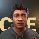
Character Editor
Released
A Character Editor using a Unified Game Character derived from the base s&box human models
characterkit/charactercreatorpanel.razor.scss
CharacterCreatorPanel {
 position: absolute; width: 100%; height: 100%; align-items: center; justify-content: center; pointer-events: all; background-color: #18130dcc; font-family: Inter; color: #ecf2fa;
 .material-icons { font-family: Material Icons; font-size: 19px; flex-shrink: 0; }
 button.creatorbutton { margin: 0; min-height: 38px; padding: 9px 13px; gap: 8px; border: 1px solid #5f5447; border-radius: 7px; background-color: #3e352b; color: #faf6ef; font-family: Inter; font-size: 13px; cursor: pointer; }
 button.creatorbutton:hover { background-color: #54483a; border-color: #eccfa3; color: white; }
 button.creatorbutton.primary { background-color: #f2d6ab; border-color: #ffe8c5; color: #322719; font-weight: 600; }
 button.creatorbutton.primary:hover { background-color: #ffeacc; }
 button.creatorbutton.quiet { background-color: transparent; border-color: transparent; color: #c6bba9; }
 button.creatorbutton.quiet:hover { background-color: #40372d; color: #fff9ef; }
 button.creatorbutton.chosen { border-color: #efd3a9; background-color: #5c4b38; color: #fff8ed; }
 .creatorwindow { width: 91%; height: 89%; flex-direction: column; background-color: #1f1a14fc; border: 1px solid #50473d; border-radius: 12px; overflow: hidden; }
 .creatorheader { min-height: 82px; flex-shrink: 0; padding: 18px 27px; align-items: center; justify-content: space-between; border-bottom: 1px solid #4d453a; }
 .creatorheader > div { flex-direction: column; gap: 7px; }
 .creatorbreadcrumb { font-size: 12px; color: #c3b5a1; align-items: center; gap: 7px; }
 .creatorbreadcrumb .material-icons { font-size: 14px; }
 .creatortitle { font-size: 27px; font-weight: 600; color: #fffaf3; }
 .creatorbody { flex-grow: 1; min-height: 0; }
 .creatorcontrols { width: 52%; flex-shrink: 0; min-height: 0; padding: 24px 26px 14px; flex-direction: column; border-right: 1px solid #4d453a; }
 .identityfields { gap: 16px; flex-shrink: 0; }
 .namefield { flex-grow: 1; flex-basis: 0; min-width: 0; flex-direction: column; gap: 9px; }
 .fieldlabel { font-size: 12px; font-weight: 600; color: #ddd3c4; flex-shrink: 0; }
 TextEntry.charactername, TextEntry.playthroughname { min-height: 41px; padding: 10px 11px; font-size: 13px; border: 1px solid #665949; border-radius: 6px; background-color: #2c241a; color: #fffaf3; flex-shrink: 0; }
 TextEntry.charactername:focus, TextEntry.playthroughname:focus { border-color: #f5dcb6; }
 .creatortabs { padding: 22px 0 14px; gap: 6px; flex-shrink: 0; border-bottom: 1px solid #4d453a; }
 button.creatortab { min-height: 35px; flex-grow: 1; flex-basis: 0; font-size: 12px; padding: 8px 6px; }
 .creatoroptions { min-height: 0; flex-grow: 1; flex-direction: column; overflow-y: auto; padding: 18px 2px 12px; }
 .optionheading { font-size: 19px; font-weight: 600; color: #fcf7ef; flex-shrink: 0; }
 .optiondescription { font-size: 12px; line-height: 20px; color: #c2b49e; margin-top: 7px; flex-shrink: 0; }
 .presetgrid { flex-wrap: wrap; gap: 10px; margin-top: 17px; align-content: flex-start; flex-shrink: 0; }
 button.presetchoice { width: 31%; min-height: 144px; flex-shrink: 0; padding: 8px; flex-direction: column; gap: 7px; }
 .presetportrait { width: 100%; height: 100px; position: relative; overflow: hidden; background-color: #4f4334; border-radius: 5px; flex-shrink: 0; }
 .presetportrait CharacterCreatorPreview { position: absolute; width: 100%; height: 100%; }
 .presetlabel { font-size: 12px; color: #f5ebdc; }
 .bodychoices { margin: 16px 0 22px; gap: 10px; flex-shrink: 0; }
 button.bodychoice { flex-grow: 1; flex-basis: 0; }
 .skingrid { margin-top: 12px; flex-wrap: wrap; gap: 9px; align-content: flex-start; flex-shrink: 0; }
 button.skinchoice { width: 47%; min-height: 81px; padding: 12px; flex-direction: column; gap: 7px; flex-shrink: 0; font-size: 12px; }
 .skinchoice .material-icons { font-size: 26px; color: #ddc8a8; }
 .choicegrid { margin-top: 12px; flex-wrap: wrap; gap: 7px; flex-shrink: 0; align-content: flex-start; }
 button.hairchoice, button.facialchoice { min-height: 34px; font-size: 11px; padding: 8px 10px; flex-shrink: 0; }
 .colorlabel { margin-top: 24px; }
 .colorchoices { gap: 7px; margin-top: 11px; flex-wrap: wrap; flex-shrink: 0; }
 .skinchannel { flex-direction: column; gap: 6px; margin-top: 13px; flex-shrink: 0; }
 .skincolorpreview { align-items: center; gap: 10px; margin-top: 11px; font-size: 12px; color: #ddd3c4; flex-shrink: 0; }
 .makeupstrength { margin-top: 16px; }
 .makeupcustomtoggle { margin-top: 14px; align-self: flex-start; }
 .markinglayers { margin-top: 14px; gap: 8px; flex-shrink: 0; align-items: flex-start; }
 .markinglist { gap: 6px; flex-wrap: wrap; flex-grow: 1; flex-basis: 0; }
 button.markinglayer { min-height: 30px; padding: 6px 9px; font-size: 11px; }
 button.addmarking { align-self: flex-start; min-height: 32px; padding: 6px 10px; font-size: 11px; }
 .markingempty { margin-top: 25px; padding: 24px; background-color: #322a1f; border-radius: 8px; flex-direction: column; align-items: center; gap: 8px; flex-shrink: 0; }
 .markingempty .material-icons { font-size: 28px; color: #ddc6a2; }
 .markingempty .optiondescription { text-align: center; }
 .markingeditorheading { margin-top: 10px; align-items: center; justify-content: space-between; color: #d3c4af; font-size: 12px; flex-shrink: 0; }
 button.deletemarking, button.inspectmarking { min-height: 28px; padding: 5px 8px; font-size: 11px; }
 .markingsections { margin-top: 6px; gap: 7px; flex-shrink: 0; }
 button.markingsection { flex-grow: 1; min-height: 31px; padding: 6px 10px; font-size: 12px; }
 .markingdesigns, .markinglocations { gap: 7px; flex-wrap: wrap; margin-top: 12px; flex-shrink: 0; }
 button.markingstyle, button.markinglocation { width: 31%; min-height: 31px; padding: 7px; font-size: 11px; justify-content: center; }
 .markinglocationlabel { margin-top: 20px; }
 .markingplacement { flex-wrap: wrap; gap: 7px 20px; flex-shrink: 0; }
 .markingplacement .skinchannel { width: 46%; }
 button.resetmarkingplacement { margin-top: 17px; align-self: flex-start; font-size: 11px; }
 .makeupresets { margin-top: 6px; align-items: center; justify-content: space-between; flex-shrink: 0; }
 .makeupresets button { font-size: 11px; }
 .makeupcustomgrid { gap: 12px; flex-shrink: 0; }
 .makeupcustomgrid .skinchannel { flex-grow: 1; flex-basis: 0; min-width: 0; }
 button.colorchoice { width: 30%; min-height: 34px; font-size: 11px; justify-content: flex-start; padding: 7px; }
 .colorswatch { width: 18px; height: 18px; border: 1px solid #ffffff44; border-radius: 9px; flex-shrink: 0; }
 .shapecategories { margin-top: 14px; gap: 5px; flex-shrink: 0; }
 button.shapecategory { min-height: 30px; padding: 6px 9px; font-size: 11px; }
 .shapegrid { gap: 14px 24px; margin-top: 15px; flex-shrink: 0; flex-wrap: wrap; align-content: flex-start; }
 .shaperow { width: 46%; flex-direction: column; gap: 5px; flex-shrink: 0; }
 .fitnesshint { font-size: 10px; color: #c2b49e; }
 .shapelabel { justify-content: space-between; align-items: center; font-size: 12px; color: #e1d8ca; }
 .shapeactions { align-items: center; gap: 5px; }
 button.resetslider { min-height: 22px; width: 22px; height: 22px; padding: 2px; border-radius: 4px; justify-content: center; }
 button.resetslider .material-icons { font-size: 15px; }
 .shapevalue { color: #bfab8c; font-size: 11px; }
 SliderControl.shapeslider { width: 100%; min-height: 21px; flex-shrink: 0; }
 SliderControl.shapeslider .track { background-color: #4c4031; border-radius: 4px; }
 SliderControl.shapeslider .thumb { background-color: #feeacb; border-radius: 6px; }
 button.resetshape { margin-top: 20px; align-self: flex-start; font-size: 11px; }
 .creatorutility { min-height: 44px; flex-shrink: 0; align-items: center; gap: 6px; border-top: 1px solid #4d453a; padding-top: 10px; }
 .creatorutility button { font-size: 11px; min-height: 33px; }
 .creatorpresentation { flex-grow: 1; min-width: 0; position: relative; background-color: #3a3024; }
 .previewheading { position: absolute; left: 27px; top: 24px; right: 27px; flex-direction: column; gap: 7px; z-index: 1; pointer-events: none; }
 .previewname { font-size: 26px; font-weight: 600; color: #f1f8ff; }
 .previewcaption { font-size: 11px; color: #d0bfa5; }
 CharacterCreatorPreview.mainpreview { position: absolute; left: 0; right: 0; top: 92px; bottom: 175px; width: 100%; height: auto; pointer-events: all; cursor: grab; overflow: hidden; background-size: 100% 100%; background-repeat: no-repeat; }
 .previewcontrols { position: absolute; bottom: 122px; left: 0; width: 100%; align-items: center; justify-content: center; gap: 5px; }
 .previewcontrols button { font-size: 11px; padding: 8px 9px; }
 button.previewzoom, button.bodyview { background-color: #4b3f30; }
 .previewzoomrow { position: absolute; left: 38px; right: 38px; bottom: 77px; align-items: center; gap: 15px; color: #dbcdb9; font-size: 11px; }
 .previewrecenter { position: absolute; left: 0; right: 0; bottom: 33px; justify-content: center; }
 .recenterpreview { font-size: 11px; padding: 7px 12px; }
 SliderControl.customzoom { flex-grow: 1; min-height: 21px; }
 .previewhint { position: absolute; left: 0; bottom: 15px; width: 100%; justify-content: center; color: #ad9b80; font-size: 10px; pointer-events: none; }
 .creatorfooter { min-height: 83px; flex-shrink: 0; padding: 16px 24px; align-items: center; gap: 18px; border-top: 1px solid #4d453a; background-color: #29221a; }
 .creatorsummary { flex-direction: column; gap: 7px; max-width: 46%; flex-shrink: 0; }
 .summarytitle { font-size: 16px; font-weight: 600; color: #f5ece0; }
 .summarycopy { font-size: 13px; color: #d5c8b4; align-items: center; gap: 10px; }
 .summaryseparator { width: 1px; height: 12px; background-color: #8b7d67; flex-shrink: 0; }
 .creatorfeedback { margin-left: auto; max-width: 40%; font-size: 12px; line-height: 18px; color: #e2b499; white-space: normal; }
 button.startplaythrough { flex-shrink: 0; min-height: 46px; padding: 12px 20px; font-size: 14px; }

 // The creator is a full-screen stage: one editing rail and a borderless character.
 background-color: #151810dd;
 background-image: linear-gradient(90deg, #10110ffc, #1b211480);
 .creatorwindow { width: 100%; height: 100%; border: 0; border-radius: 0; background-color: transparent; overflow: hidden; }
 .creatorheader { position: absolute; left: 32px; right: 32px; top: 24px; height: 72px; min-height: 0; padding: 0; border: 0; z-index: 3; pointer-events: none; }
 .creatorheader button { pointer-events: all; }
 .creatorbreadcrumb { color: #b6a37b; font-size: 13px; letter-spacing: 1px; }
 .creatortitle { font-family: Roboto; font-size: 34px; font-weight: 400; color: #f0dfbd; letter-spacing: 1px; }
 .creatorbody { position: absolute; width: 100%; height: 100%; pointer-events: none; }
 .creatorcontrols { position: absolute; left: 32px; top: 117px; bottom: 104px; width: 33%; padding: 22px; border: 1px solid #a487493d; border-top: 1px solid #b79758; background-color: #141510ec; pointer-events: all; z-index: 2; }
 .identityfields { gap: 14px; }
 .namefield { gap: 6px; }
 .fieldlabel { font-size: 13px; color: #bbaa88; font-weight: 400; }
 TextEntry.charactername, TextEntry.playthroughname { border-radius: 2px; min-height: 40px; background-color: #090b09aa; border-color: #9c835644; font-size: 14px; color: #eadfc9; padding: 10px; }
 .creatortabs { padding: 17px 0 0; gap: 0; flex-wrap: wrap; border-bottom: 1px solid #a48a4e50; }
 button.creatortab { width: 25%; flex-basis: auto; flex-grow: 0; min-height: 37px; border: 0; border-radius: 0; background-color: transparent; color: #a79c83; font-size: 12px; padding: 10px 3px; justify-content: center; border-bottom: 2px solid transparent; }
 button.creatortab.chosen { color: #ecd29a; background-color: #c7a66a0b; border-bottom: 2px solid #c9a76a; }
 button.creatortab:hover { background-color: #9b855316; color: #f1dfbd; }
 .creatoroptions { padding: 20px 0 12px; }
 .creatoroptions.voiceoptions { overflow-y: hidden; }
 .optionheading { font-family: Roboto; font-weight: 400; font-size: 25px; color: #e6d4b1; }
 .optiondescription { color: #a49d87; font-size: 13px; line-height: 21px; margin-top: 7px; white-space: normal; }
 button.creatorbutton { border-radius: 3px; background-color: #28271ef2; border-color: #a38a5144; color: #d9cdb3; }
 button.creatorbutton:hover { background-color: #3a3322; border-color: #b79a61; color: #fff0ce; }
 button.creatorbutton.chosen { background-color: #51452b66; border-color: #c3a363; color: #f5dfaf; }
 button.creatorbutton.quiet { color: #b3a181; background-color: transparent; border-color: transparent; }
 button.creatorbutton.quiet:hover { color: #f0d6a5; background-color: #ad8d4a16; }
 // Tabs have a shared baseline; choices and commands retain their own outlines.
 .markingsections { margin-top: 16px; gap: 0; border-bottom: 1px solid #ab8a4b77; }
 button.markingsection { border: 0; border-radius: 0; background-color: transparent; color: #a89e88; border-bottom: 2px solid transparent; min-height: 39px; font-size: 14px; justify-content: center; padding: 10px; }
 button.markingsection.chosen { background-color: #b496530b; border-color: transparent; border-bottom: 2px solid #d4ae62; color: #efdaa9; }
 button.markingsection:hover { background-color: #b4965310; color: #f0dab0; }
 .markinglayers { flex-direction: column; }
 .markinglist { width: 100%; flex-basis: auto; flex-grow: 0; }
 button.markinglayer { border-radius: 2px; font-size: 12px; }
 button.addmarking { background-color: transparent; border-style: dashed; border-color: #b3985b55; font-size: 12px; }
 .markingempty { background-color: transparent; border: 1px solid #a58b4333; border-radius: 0; }
 .markingeditorheading { margin-top: 14px; }
 button.markingstyle, button.markinglocation { width: 31%; font-size: 12px; min-height: 38px; }
 .markinglocationlabel { color: #c2ae85; letter-spacing: 1px; }
 .markingplacement .skinchannel { width: 100%; }
 .presetgrid { gap: 12px; margin-top: 18px; }
 button.presetchoice { width: 47%; min-height: 174px; padding: 0; gap: 0; border-radius: 2px; background-color: #15170f; }
 .presetportrait { height: 138px; background-color: #36372b66; border-radius: 0; }
 .presetlabel { padding: 9px 10px; width: 100%; justify-content: center; color: #d5c4a1; font-size: 13px; }
 .shapecategories { gap: 4px; flex-wrap: wrap; }
 button.shapecategory, button.makeuplayer, button.skinpalette { font-size: 12px; min-height: 33px; padding: 7px 9px; }
 .shapegrid { gap: 14px 12px; }
 .shaperow { width: 47%; }
 .creatoroptions > .shaperow { width: 100%; margin-bottom: 8px; }
 TextEntry.wardrobesearch { width: 100%; min-height: 38px; margin: 12px 0; padding: 9px 12px; color: #f4e5c7; background-color: #302b20; border: 1px solid #776740; border-radius: 4px; flex-shrink: 0; }
 .shapelabel { color: #d2c5a9; font-size: 13px; }
 .shapevalue { color: #b29b66; }
 .fitnesshint { color: #968e78; }
 SliderControl .track { background-color: #514937; }
 SliderControl .inner { background-color: #ac8f50; }
 SliderControl .thumb { background-color: #e0c48a; border-radius: 20px; }
 .creatorutility { border-color: #a4894333; gap: 6px; padding-top: 10px; }
 .creatorpresentation { position: absolute; left: 37%; right: 0; top: 0; bottom: 0; width: auto; height: auto; background-color: transparent; border: 0; pointer-events: none; }
 CharacterCreatorPreview.mainpreview { top: 0; bottom: 0; left: 0; right: 0; width: 100%; height: 100%; pointer-events: all; border: 0; background-color: transparent; }
 .previewheading { left: 25px; right: 55px; top: 39px; gap: 3px; z-index: 2; }
 .previewname { font-family: Roboto; font-size: 34px; font-weight: 400; color: #dfcd9f; text-shadow: 0 2px 4px #000a; }
 .previewcaption { color: #c5b68e; font-size: 12px; }
 .previewcontrols { left: 10%; width: 80%; bottom: 171px; gap: 5px; pointer-events: all; z-index: 3; }
 .previewcontrols button { font-size: 13px; padding: 9px 11px; min-height: 38px; background-color: #13150fc9; }
 .previewzoomrow { left: 22%; right: 22%; bottom: 131px; color: #bfae87; pointer-events: all; z-index: 3; }
 .previewrecenter { bottom: 86px; pointer-events: all; z-index: 3; }
 button.recenterpreview { font-size: 12px; background-color: #141610b0; padding: 9px 14px; }
 .previewhint { bottom: 63px; color: #ac9e7e; font-size: 11px; z-index: 3; }
 .creatorfooter { position: absolute; left: 32px; right: 32px; bottom: 19px; height: 60px; min-height: 0; padding: 0; border: 0; background-color: transparent; z-index: 4; pointer-events: none; }
 .creatorfooter button { pointer-events: all; }
 .creatorsummary { max-width: 33%; }
 .summarytitle { font-family: Roboto; font-size: 20px; font-weight: 400; color: #d9c392; }
 .summarycopy { color: #a79d86; font-size: 12px; white-space: normal; }
 .summaryseparator { background-color: #a3895155; }
 .creatorfeedback { color: #efbb93; }
 button.startplaythrough { margin-left: auto; min-height: 48px; padding: 13px 28px; border-radius: 2px; border: 1px solid #d6b978; background-color: #46361beb; color: #f4dfae; font-size: 16px; }
 button.startplaythrough:hover { background-color: #695127; border-color: #ecd299; color: #fff0ce; }

 button.creatorbutton.creatortab { background-color: transparent; border: 0; border-radius: 0; border-bottom: 2px solid transparent; }
 button.creatorbutton.creatortab.chosen { color: #ecd29a; background-color: #c7a66a0b; border-bottom: 2px solid #c9a76a; }
 button.creatorbutton.creatortab:hover { background-color: #9b855316; color: #f1dfbd; }
 button.creatorbutton.primary.startplaythrough { background-color: #46361beb; border-color: #d6b978; color: #f4dfae; }
 button.creatorbutton.primary.startplaythrough:hover { background-color: #695127; color: #fff0ce; }
 SliderControl .inner { background-color: transparent; }
 SliderControl .track-active { background-color: #c4a25e; }
 SliderControl.shapeslider .thumb { background-color: #e0c48a; }

 .previewcontrols { left: auto; right: 30px; width: 185px; bottom: 176px; flex-wrap: wrap; justify-content: center; }
 .previewcontrols button { padding: 8px 9px; font-size: 12px; }
 .previewzoomrow { left: auto; right: 36px; width: 177px; bottom: 134px; gap: 8px; }
 .previewrecenter { left: auto; right: 25px; width: 195px; bottom: 91px; }
 .previewhint { left: auto; right: 28px; width: 190px; bottom: 62px; font-size: 10px; text-align: center; white-space: normal; }

 .creatoridentity { width: 33%; flex-direction: column; pointer-events: all; }
 .creatoridentity .identityfields { width: 100%; }
 .creatoridentity .fieldlabel { font-size: 11px; }
 .creatoridentity TextEntry { min-height: 35px; padding: 8px; }
 .creatorcontrols .creatortabs { padding-top: 0; }
 button.markingstyle { flex-direction: column; min-height: 61px; gap: 4px; padding: 8px 4px; }
 button.markingstyle .material-icons { font-size: 22px; color: #c5ae7b; }

 .slidercontrol .inner .track { background-color: #494735; }
 .slidercontrol .inner .track .track-active { background-color: #b99c60; }
 .slidercontrol .inner .track .thumb { background-color: #e0c48a; border-radius: 20px; }
 .markinglayers { flex-direction: row; align-items: center; }
 .markinglist { width: auto; flex-basis: 0; flex-grow: 1; }
 .markingeditorheading { margin-top: 8px; }
 .markingsections { margin-top: 10px; }
 .previewcontrols { bottom: 208px; width: 244px; flex-direction: column; flex-wrap: nowrap; align-items: stretch; gap: 5px; }
 .previewviewrow { width: 100%; flex-direction: row; flex-wrap: nowrap; align-items: center; gap: 4px; }
 .previewviewrow button { flex-shrink: 0; height: 38px; min-height: 38px; max-height: 38px; justify-content: center; padding: 7px 6px; }
 .previewviewrow .rotateleft, .previewviewrow .rotateright { width: 32px; }
 .previewviewrow .bodyview, .previewviewrow .previewzoom { width: 82px; }
 .previewcontrols .clothingtoggle { width: 100%; justify-content: center; min-height: 30px; padding: 5px 8px; }
 .previewzoomrow { right: 30px; width: 244px; }
 .previewrecenter { right: 30px; width: 244px; }
 .previewhint { right: 30px; width: 244px; }
 .previewzoomrow { bottom: 166px; }
 .previewrecenter { bottom: 123px; }
 .previewhint { bottom: 94px; }
 .presetportrait CharacterCreatorPreview { background-size: 100% 100%; background-repeat: no-repeat; }
 .blendtabs { width: 100%; flex-wrap: wrap; gap: 4px; margin-bottom: 12px; flex-shrink: 0; }
 .blendtabs .blendtab { padding: 6px 9px; font-size: 12px; }
 .blendtabs .chosen { background-color: #58492b; border-color: #d6b978; color: #f4dfae; }
 .regionstatus { width: 100%; align-items: center; justify-content: space-between; gap: 8px; margin-bottom: 14px; color: #b8aa8e; font-size: 12px; flex-shrink: 0; }
 .regionstatus > span { flex-grow: 1; flex-basis: 0; }
 .photoblendcard { width: 100%; flex-direction: column; flex-shrink: 0; gap: 8px; padding: 12px; margin: 4px 0 12px 0; background-color: #25291deb; border: 1px solid #71613b; border-radius: 4px; }
 .photoblendheader { width: 100%; align-items: center; gap: 12px; }
 .photoblendname { flex-grow: 1; flex-basis: 0; color: #e0c48a; font-size: 15px; }
 .photoblendheader .delete-photo-face { flex-shrink: 0; width: 30px; min-height: 30px; padding: 4px; justify-content: center; }
 .photoblendcard .optiondescription { margin: 0; font-size: 11px; }
 .overallblendrow { width: 100%; flex-direction: column; flex-shrink: 0; gap: 8px; padding: 12px; margin-bottom: 14px; background-color: #24404366; border: 1px solid #73b9bd88; border-radius: 4px; }
 .overallblendrow .shapelabel { color: #b7e2e4; }
 .overallblendrow .optiondescription { margin: 0; font-size: 11px; color: #96b6b8; }
 .overallblendrow .slidercontrol .inner .track .track-active { background-color: #6babad; }
 .overallblendrow .slidercontrol .inner .track .thumb { background-color: #b1e6e7; }
}
.thumbnailgrid {
 gap: 8px;
 button.wardrobechoice, button.hairchoice, button.facialchoice {
  width: 31%;
  flex-direction: column;
  align-items: center;
  padding: 8px;
  min-height: 120px;
  .thumbnailframe { width: 100%; height: 84px; overflow: hidden; align-items: center; justify-content: center; }
  .itemthumbnail { width: 100%; height: 100%; background-size: contain; background-repeat: no-repeat; background-position: center; transition: transform .15s ease; }
  .thumbnailplaceholder { font-size: 32px; opacity: .5; }
  .itemlabel { margin-top: 6px; font-size: 11px; text-align: center; }
  &:hover .itemthumbnail { transform: scale(1.15); }
 }
}
.cloudwardrobe { flex-direction: column; flex-shrink: 0; margin-top: 24px; padding-top: 16px; border-top: 1px solid rgba(220,200,150,.25); }
.cloudwardrobe {
 .thumbnailframe { position: relative; }
 .wardrobechoice.loading { border-color: #e0c48a; opacity: 1; }
 .clothingloading { position: absolute; left: 0; top: 0; width: 100%; height: 100%; background-color: #15170fbb; flex-direction: column; align-items: center; justify-content: center; gap: 4px; color: #f1dbab; font-size: 12px; }
 .loadingspinner { font-size: 28px; animation: clothing-spin 1s linear infinite; }
}
@keyframes clothing-spin { from { transform: rotate(0deg); } to { transform: rotate(360deg); } }