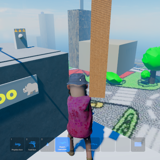
Sand Theft Kart Oh
Released
ui/controls/resourceselectpopup.razor.scss
@import "/UI/Popup.scss";

ResourceSelectPopup .inner
{
    width: 800px;
    height: 800px;

    .popup-header h2
    {
        flex-grow: 1;
    }

    .sort-buttons
    {
        flex-shrink: 0;
        flex-direction: row;
        gap: 2px;
        border-radius: 6px;
        overflow: hidden;

        .sort-button
        {
            font-size: 1.1rem;
            padding: 0.4rem 0.8rem;
            color: rgba( white, 0.5 );
            background-color: rgba( white, 0.05 );
            cursor: pointer;

            &:hover
            {
                color: white;
                background-color: rgba( white, 0.12 );
            }

            &.active
            {
                color: white;
                background-color: #08f5;
            }
        }
    }
}

ResourceSelectPopup .inner .grid
{
    width: 100%;
    flex-grow: 1;
    gap: 1rem;
    background-color: #222a;
    padding: 1rem;
    border-radius: 10px;
}

ResourceSelectPopup .inner .grid .item
{
    width: 100%;
    height: 100%;
    color: #aaa;
    pointer-events: all;
    border-radius: 10px;
    margin: 0.25rem;
    cursor: pointer;
    position: relative;
    flex-direction: column;
    padding: 1rem;
    font-size: 1rem;
    background-color: #0088ff02;

    .icon
    {
        height: 100px;
        font-size: 60px;
        overflow: hidden;
        justify-content: center;
        align-items: center;
        flex-shrink: 0;
        background-position: center;
        background-size: contain;
        background-repeat: no-repeat;
    }

    .title
    {
        font-weight: 700;
        font-size: 1.5rem;
        color: white;
        flex-shrink: 0;
    }

    .desc
    {
        overflow: hidden;
    }

    &:hover
    {
        background-color: #08f5;
    }

    &.active
    {
        background-color: #08f5;
    }
}

ResourceSelectPopup .inner .popup-footer
{
    flex-direction: row;
    justify-content: flex-end;
    padding: 0.5rem 0;
    flex-shrink: 0;
    gap: 0.5rem;

    .clear-button
    {
        padding: 0.6rem 2rem;
        background-color: rgba( white, 0.1 );
        color: rgba( white, 0.7 );
        font-weight: 700;
        font-size: 1.2rem;
        border-radius: 6px;
        cursor: pointer;
        pointer-events: all;

        &:hover
        {
            background-color: rgba( white, 0.2 );
            color: white;
        }
    }

    .select-button
    {
        padding: 0.6rem 2rem;
        background-color: #08f;
        color: white;
        font-weight: 700;
        font-size: 1.2rem;
        border-radius: 6px;
        cursor: pointer;
        pointer-events: all;

        &:hover
        {
            background-color: #09f;
        }
    }
}