MONOLITH
Released
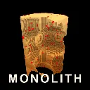
A monolith of solid cubes hangs in the void. Take it apart.
ui/hud.razor.scss
// Devil Daggers palette: near-black ground, ember orange, blood red. No blues.
$accent: #ff7a1c;
$accent-dim: #a8410c;
$charge: #ffd34a;
$panel-bg: rgba(6, 4, 3, 0.94);
$text: #f0dcc8;
$muted: #8a6a58;

.hud
{
	position: absolute;
	width: 100%;
	height: 100%;
	font-family: Consolas, monospace;
	color: $text;
	pointer-events: none;

	&.panel-open
	{
		pointer-events: all;
	}

	// Photo mode. Opacity rather than display:none so layout, hit testing and every OnUpdate
	// behind it carry on exactly as they were: the overlay comes off the glass, the game does
	// not change.
	&.photo-hidden { opacity: 0; }

	// ------------------------------------------------------------ top progress bar

	.topbar
	{
		position: absolute;
		top: 24px;
		left: 50%;
		transform: translateX( -50% );
		width: 620px;
		flex-direction: column;
		align-items: center;

		.tier
		{
			font-size: 16px;
			letter-spacing: 6px;
			color: $accent;
			margin-bottom: 6px;
		}

		.bar
		{
			width: 100%;
			height: 10px;
			background-color: rgba(255, 255, 255, 0.08);
			border: 1px solid rgba(255, 255, 255, 0.15);
			overflow: hidden;

			.fill
			{
				height: 100%;
				background-color: $accent;
				transition: width 0.25s ease-out;
			}
		}

		.counts
		{
			margin-top: 6px;
			font-size: 13px;
			color: $muted;
			gap: 8px;

			.remaining { color: $text; }
			.pct { color: $accent-dim; margin-left: 12px; }
		}
	}

	// ------------------------------------------------------------ stage cleared banner

	.cleared
	{
		position: absolute;
		top: 34%;
		left: 50%;
		transform: translateX( -50% );
		flex-direction: column;
		align-items: center;
		text-align: center;

		.big
		{
			font-size: 52px;
			letter-spacing: 10px;
			color: $charge;
			text-stroke: 2px rgba(0, 0, 0, 0.55);
		}

		.next
		{
			margin-top: 10px;
			font-size: 18px;
			letter-spacing: 5px;
			color: $accent;
		}
	}

	// ------------------------------------------------------------ wallet

	.wallet
	{
		position: absolute;
		top: 24px;
		left: 24px;
		flex-direction: column;
		background-color: rgba(8, 11, 16, 0.55);
		padding: 14px 18px;
		border-left: 2px solid $accent;

		.dust
		{
			flex-direction: column;
			margin-bottom: 8px;

			.label { font-size: 11px; letter-spacing: 4px; color: $muted; }
			.value { font-size: 30px; color: $accent; }
		}

		.line
		{
			justify-content: space-between;
			gap: 18px;
			font-size: 13px;

			.label { color: $muted; }
		}
	}

	// ------------------------------------------------------------ residue callout

	.residue
	{
		position: absolute;
		top: 96px;
		left: 50%;
		transform: translateX( -50% );
		flex-direction: column;
		align-items: center;
		font-size: 22px;
		letter-spacing: 6px;
		color: $charge;

		.sub
		{
			font-size: 12px;
			letter-spacing: 3px;
			color: $muted;
			margin-top: 4px;
		}
	}

	// ------------------------------------------------------------ crosshair

	.crosshair
	{
		position: absolute;
		left: 50%;
		top: 50%;
		width: 10px;
		height: 10px;
		margin-left: -5px;
		margin-top: -5px;
		border: 2px solid rgba(255, 255, 255, 0.35);
		border-radius: 50%;
		transition: all 0.08s ease-out;

		&.on-target
		{
			border-color: $accent;
			width: 18px;
			height: 18px;
			margin-left: -9px;
			margin-top: -9px;
		}
	}

	// The burn warning. A border that closes in from the screen edge, so it registers in
	// peripheral vision while you are aiming at something else entirely.
	.burn
	{
		position: absolute;
		top: 0px;
		left: 0px;
		width: 100%;
		height: 100%;
		border: 26px solid rgba( 255, 60, 20, 0.55 );
	}

	.burn-word
	{
		position: absolute;
		bottom: 22%;
		left: 50%;
		transform: translateX( -50% );
		font-size: 26px;
		letter-spacing: 12px;
		color: #ff5a2a;
		text-stroke: 2px rgba( 0, 0, 0, 0.6 );
	}

	.hint
	{
		position: absolute;
		bottom: 22px;
		left: 50%;
		transform: translateX( -50% );
		font-size: 12px;
		color: $muted;

		b { color: $text; }
	}

	// ------------------------------------------------------------ upgrade panel

	// Catches clicks that miss the panel, so the play field dismisses the menu. Lower z-index
	// than .panel so the panel itself still gets its own clicks.
	.panel-backdrop
	{
		position: absolute;
		top: 0px;
		left: 0px;
		width: 100%;
		height: 100%;
		z-index: 0;
	}

	.panel
	{
		position: absolute;
		top: 0px;
		right: 0px;
		width: 468px;
		height: 100%;
		background-color: $panel-bg;
		border-left: 2px solid $accent;
		flex-direction: column;
		padding: 0px;
		z-index: 1;

		// A header BAND rather than a row of text floating in the same space as the content.
		// This is most of what separated the panel from the welcome sheets: the sheets have a
		// clear title zone and the panel had four words and a number sharing a margin.
		.panel-head
		{
			align-items: center;
			padding: 20px 24px 0px 24px;
			margin-bottom: 0px;
			gap: 18px;
			background-color: rgba( 0, 0, 0, 0.35 );
			border-bottom: 1px solid rgba( 255, 122, 28, 0.22 );

			// The tabs used to wrap: at 17px with 4px of tracking, four labels plus the dust
			// readout overflowed the panel and "UPGRADES" broke across two lines mid-word.
			// Nothing in this row may wrap or shrink.
			flex-wrap: nowrap;

			.title
			{
				font-size: 13px;
				letter-spacing: 3px;
				color: $muted;
				white-space: nowrap;
				flex-shrink: 0;
				padding-bottom: 12px;
				border-bottom: 2px solid rgba( 0, 0, 0, 0 );
				transition: all 0.12s ease-out;

				&:hover { color: $text; }

				&.on
				{
					color: $accent;
					border-bottom-color: $accent;
				}
			}

			// The wallet, given the weight of a readout instead of the weight of a footnote.
			// It is the number every decision on this panel is measured against.
			.dust-inline
			{
				font-size: 16px;
				color: $accent;
				margin-left: auto;
				margin-bottom: 12px;
				letter-spacing: 1px;
				white-space: nowrap;
				flex-shrink: 0;
			}
		}

		.boards
		{
			flex-direction: column;
			flex-grow: 1;
			overflow-y: scroll;
			padding: 18px 24px 24px 24px;
			gap: 18px;
		}

		.upgrades
		{
			flex-direction: column;
			flex-grow: 1;
			overflow-y: scroll;
			padding: 16px 24px 24px 24px;
			gap: 10px;
		}
	}

	.board
	{
		flex-direction: column;

		.board-title
		{
			font-size: 13px;
			letter-spacing: 4px;
			color: $accent-dim;
			padding-bottom: 6px;
			border-bottom: 1px solid rgba(255, 255, 255, 0.08);
			margin-bottom: 6px;
		}

		.board-note
		{
			font-size: 12px;
			color: $muted;
			padding: 8px 0px;

			&.error { color: $charge; }
		}

		.rank-row
		{
			align-items: baseline;
			padding: 4px 6px;
			font-size: 13px;
			gap: 10px;

			.rank { color: $muted; width: 44px; }
			.who { flex-grow: 1; }
			.score { color: $accent-dim; }

			&.me
			{
				background-color: rgba(255, 122, 28, 0.14);
				.who { color: $accent; }
				.score { color: $accent; }
			}
		}
	}

	.refresh
	{
		align-self: center;
		padding: 8px 20px;
		margin-top: 4px;
		font-size: 12px;
		letter-spacing: 4px;
		color: $muted;
		border: 1px solid rgba(255, 255, 255, 0.12);

		&:hover { color: $accent; border-color: $accent-dim; }
	}

	.charge
	{
		position: absolute;
		bottom: 52px;
		left: 50%;
		transform: translateX( -50% );
		font-size: 14px;
		letter-spacing: 3px;
		color: $muted;

		b { color: $text; }

		flex-direction: column;
		align-items: center;
		gap: 7px;

		&.ready { color: $accent; b { color: $accent; } }
		&.armed { color: #ff5a3c; b { color: #ff5a3c; } }
		&.window { color: $charge; b { color: $charge; } }
		&.caught { color: #7dff9b; b { color: #7dff9b; } }

		.live { flex-direction: column; align-items: center; }
		.ready-line { color: $accent; }

		.depth
		{
			width: 230px;
			height: 4px;
			margin-top: 5px;
			background-color: rgba(255, 255, 255, 0.10);

			.fill { height: 100%; background-color: #ff5a3c; }
		}

		.reload
		{
			flex-direction: column;
			align-items: center;

			// The bar is the reload; the bright slice inside it is the target you aim for.
			.bar
			{
				position: relative;
				width: 290px;
				height: 11px;
				background-color: rgba(255, 255, 255, 0.08);
				border: 1px solid rgba(255, 255, 255, 0.16);

				.window
				{
					position: absolute;
					top: 0px;
					height: 100%;
					background-color: rgba(255, 211, 74, 0.55);
					border-left: 1px solid $charge;
					border-right: 1px solid $charge;
				}

				.playhead
				{
					position: absolute;
					top: -3px;
					width: 3px;
					height: 17px;
					background-color: #ffffff;
				}

				.fill
				{
					position: absolute;
					top: 0px;
					left: 0px;
					height: 100%;
					background-color: rgba(255, 122, 28, 0.75);
				}
			}

			// The minigame is bigger and brighter than the passive cooldown bar: it wants
			// your attention for two seconds, then gets out of the way.
			&.attempt .bar
			{
				width: 360px;
				height: 15px;
				border-color: $charge;
			}
		}

		.sub { font-size: 11px; letter-spacing: 2px; color: $muted; margin-top: 4px; }
	}

	// Projected position of the buried charge. Nothing in the world can show this, because the
	// charge is inside solid rock by design.
	.charge-marker
	{
		position: absolute;
		width: 0px;
		height: 0px;
		flex-direction: column;
		align-items: center;

		.ring
		{
			position: absolute;
			left: -17px;
			top: -17px;
			width: 34px;
			height: 34px;
			border: 2px solid #ff5a3c;
			border-radius: 50%;
		}

		.label
		{
			position: absolute;
			top: 22px;
			left: -60px;
			width: 120px;
			text-align: center;
			font-size: 11px;
			letter-spacing: 2px;
			color: #ff5a3c;
		}
	}

	.charge-offscreen
	{
		position: absolute;
		top: 58%;
		left: 50%;
		transform: translateX( -50% );
		font-size: 14px;
		letter-spacing: 4px;
		color: #ff5a3c;
	}

	// AN UPGRADE CARD.
	//
	// The note was that these read as a specification rather than as a game. Structurally the
	// problem was that name, level, description, effect and cost were five pieces of text at
	// four sizes stacked in a box, so there was no shape to scan and every row demanded to be
	// read in full. The fix is hierarchy, not more words: a bar down the left edge that lights
	// when you can afford it, the name given real size, the cost pulled out as its own chip on
	// the right, and the prose demoted to the quietest thing in the card.
	.upgrade
	{
		flex-direction: column;
		flex-shrink: 0;
		background-color: rgba(255, 255, 255, 0.028);
		border: 1px solid rgba(255, 255, 255, 0.06);
		border-left: 3px solid rgba(255, 255, 255, 0.10);
		transition: all 0.1s ease-out;

		// The pad selection. A mouse player never sees this: a highlight that does not follow
		// the cursor would just be confusing next to a hover state.
		&.selected
		{
			border-color: $accent;
			border-left-color: $charge;
			background-color: rgba( 255, 150, 40, 0.14 );
		}

		.body { flex-direction: column; padding: 13px 15px; }

		// Same rule as .primer: a wrapped line in a flex column needs an explicit width and
		// flex-shrink: 0 or it collapses and overdraws the row beneath it.
		.desc
		{
			width: 100%;
			flex-shrink: 0;
			line-height: 16px;
			word-break: break-word;
		}

		.row { flex-shrink: 0; }

		.buymax
		{
			justify-content: center;
			padding: 5px 0px;
			font-size: 11px;
			letter-spacing: 3px;
			color: $accent;
			background-color: rgba(255, 122, 28, 0.10);
			border-top: 1px solid rgba(255, 122, 28, 0.28);

			b { color: $text; }
			&:hover { background-color: rgba(255, 122, 28, 0.26); }
		}

		.row { justify-content: space-between; align-items: center; }

		// A title row with a mark on it. The glyph is what stops eight cards of dense text from
		// reading as one wall: you learn the shapes after a run or two and stop reading names.
		.head
		{
			width: 100%;
			flex-shrink: 0;
			align-items: center;
			gap: 11px;
		}

		.glyph
		{
			width: 22px;
			height: 22px;
			flex-shrink: 0;
			border: 2px solid rgba( 255, 255, 255, 0.22 );
			background-color: rgba( 255, 255, 255, 0.05 );
		}

		// One per upgrade, drawn only from borders and background so nothing needs importing.
		// Deliberately not literal pictures: they are marks to recognise, not illustrations.
		.glyph.drillspeed { background-color: #ffc75c; border-color: #fff0c0; }
		.glyph.blastradius { background-color: #ff6a1a; border-color: #ffb27a; border-radius: 11px; }
		.glyph.chargechance { background-color: #ff2a10; border-color: #ff9a80; border-radius: 4px; }
		.glyph.chargeradius { background-color: transparent; border-color: #ff5a3c; border-radius: 11px; }
		.glyph.dustyield { background-color: #b8763a; border-color: #ffd9a8; }
		.glyph.drones { background-color: transparent; border-color: #ffd34a; border-bottom-width: 7px; }
		.glyph.demolition { background-color: #ff8a3a; border-color: #ffd0a8; border-radius: 4px; }
		.glyph.dronerate { background-color: #ffd34a; border-color: #fff4c8; border-radius: 11px; }

		.name
		{
			font-size: 16px;
			letter-spacing: 1px;
			color: $text;
			flex-grow: 1;
		}

		// The level as a numbered badge rather than the words "Lv 3". At a glance you want the
		// number, and the label was costing three characters of width on every single row.
		.level
		{
			flex-shrink: 0;
			min-width: 26px;
			padding: 2px 7px;
			font-size: 12px;
			text-align: center;
			color: $muted;
			background-color: rgba( 255, 255, 255, 0.06 );
			border: 1px solid rgba( 255, 255, 255, 0.10 );
		}

		.desc
		{
			font-size: 11px;
			line-height: 15px;
			color: $muted;
			margin: 0px 0px 8px 0px;
			opacity: 0.72;
		}

		.foot
		{
			width: 100%;
			flex-shrink: 0;
			justify-content: space-between;
			align-items: center;
			padding-top: 8px;
			border-top: 1px solid rgba( 255, 255, 255, 0.06 );
		}

		.current { font-size: 12px; letter-spacing: 1px; color: $accent-dim; }

		// The price, as a chip. It is the thing you are deciding about, so it gets an edge and
		// a background of its own instead of being the last words on a line.
		.cost
		{
			font-size: 13px;
			letter-spacing: 1px;
			color: $muted;
			padding: 4px 10px;
			border: 1px solid rgba(255, 255, 255, 0.10);
			flex-shrink: 0;
		}

		&.affordable
		{
			border-color: rgba(255, 122, 28, 0.35);
			border-left-color: $accent;
			background-color: rgba(255, 122, 28, 0.06);

			.cost
			{
				color: $accent;
				border-color: rgba(255, 122, 28, 0.55);
				background-color: rgba(255, 122, 28, 0.12);
			}

			&:hover
			{
				background-color: rgba(255, 122, 28, 0.15);
				border-color: $accent;

				.cost { background-color: rgba(255, 122, 28, 0.26); }
			}
		}

		// Earned Marks recede: the list should read as "what is left to do", not a trophy wall.
		&.mark
		{
			.level { color: $muted; }

			&.earned
			{
				opacity: 0.55;
				border-color: rgba(255, 211, 74, 0.30);
				.name { color: $charge; }
				.level { color: $charge; }
			}
		}

		// Core Tree nodes read as gold rather than ember, so the two currencies never blur.
		&.core
		{
			border-color: rgba(255, 211, 74, 0.20);

			.cost { color: $charge; }

			&.affordable
			{
				border-color: $charge;
				background-color: rgba(255, 211, 74, 0.10);
				&:hover { background-color: rgba(255, 211, 74, 0.24); }
			}
		}
	}

	// ------------------------------------------------------------ resonance

	.resonance
	{
		position: absolute;
		top: 50%;
		right: 40px;
		transform: translateY( -50% );
		flex-direction: column;
		align-items: flex-end;

		.stacks
		{
			font-size: 24px;
			letter-spacing: 4px;
			color: $charge;
		}

		.rbar
		{
			width: 170px;
			height: 4px;
			margin-top: 5px;
			background-color: rgba(255, 255, 255, 0.10);

			.fill { height: 100%; background-color: $charge; }
		}

		.count { font-size: 11px; letter-spacing: 2px; color: $muted; margin-top: 4px; }
	}

	.mark-toast
	{
		position: absolute;
		top: 22%;
		left: 50%;
		transform: translateX( -50% );
		flex-direction: column;
		align-items: center;

		.head { font-size: 11px; letter-spacing: 6px; color: $muted; }
		.name { font-size: 26px; letter-spacing: 4px; color: $charge; margin-top: 3px; }
	}

	.markbar
	{
		width: 100%;
		height: 3px;
		margin-top: 6px;
		background-color: rgba(255, 255, 255, 0.09);

		.fill { height: 100%; background-color: $accent-dim; }
	}

	.leeches
	{
		position: absolute;
		top: 132px;
		left: 24px;
		flex-direction: column;
		font-size: 13px;
		letter-spacing: 2px;
		color: #6fdc7a;

		.sub { font-size: 10px; letter-spacing: 1px; color: $muted; margin-top: 2px; }
	}

	.shield-banner
	{
		position: absolute;
		top: 84px;
		left: 50%;
		transform: translateX( -50% );
		flex-direction: column;
		align-items: center;
		font-size: 15px;
		letter-spacing: 4px;
		color: #6fd3ff;

		.sub { font-size: 11px; letter-spacing: 2px; color: $muted; margin-top: 2px; }

		// The break window is the reward for the skill shot, so it reads as a good thing.
		&.broken { color: #9dff9a; }
	}

	// The one piece of text that announces a failure. Centred and large because by the time it
	// shows, the world has already rebuilt and there is nothing left in it to read.
	// Welcome pages and the start screen. A full-screen sheet over a black void.
	.overlay
	{
		position: absolute;
		top: 0px;
		left: 0px;
		width: 100%;
		height: 100%;
		align-items: center;
		justify-content: center;
		background-color: rgba( 0, 0, 0, 0.92 );
	}

	// The pause overlay is deliberately the only one you can see through. The welcome and start
	// sheets are a screen you are ON; pause is a screen you are BEHIND, and leaving the frozen
	// monolith dimly visible is what tells you the game is still there waiting.
	.overlay.transparent { background-color: rgba( 0, 0, 0, 0.72 ); }

	.sheet
	{
		flex-direction: column;
		width: 780px;

		// Three buttons do not need the full reading width the tutorial pages were sized for.
		&.pause { width: 460px; }
		max-height: 88%;
		padding: 32px 36px;
		border: 2px solid $accent;
		background-color: rgba( 12, 8, 6, 0.96 );
		overflow-y: scroll;

		.sheet-eyebrow
		{
			font-size: 11px;
			letter-spacing: 5px;
			color: $muted;
			margin-bottom: 10px;
			flex-shrink: 0;
		}

		.sheet-title
		{
			font-size: 38px;
			letter-spacing: 11px;
			color: $accent;
			flex-shrink: 0;
			text-shadow: 0px 0px 28px rgba( 255, 150, 40, 0.55 );
		}

		.sheet-lead
		{
			width: 100%;
			flex-shrink: 0;
			font-size: 14px;
			line-height: 20px;
			letter-spacing: 1px;
			color: $text;
			margin-top: 10px;
			margin-bottom: 22px;
			word-break: break-word;
		}

		.sheet-rows
		{
			flex-direction: column;
			width: 100%;
			flex-shrink: 0;
			gap: 16px;
		}

		// Each row is an icon and a paragraph. The icons are CSS shapes rather than art, so the
		// welcome screen needs no assets and cannot break on a missing texture.
		.srow
		{
			width: 100%;
			flex-shrink: 0;
			gap: 16px;
			align-items: flex-start;

			.icon
			{
				width: 44px;
				height: 44px;
				flex-shrink: 0;
				border: 2px solid rgba( 255, 255, 255, 0.18 );
			}

			.icon.rock { background-color: #b8763a; border-color: #ffd9a8; }
			.icon.ladder
			{
				background-color: transparent;
				border-color: $accent;
				border-left-width: 10px;
			}
			.icon.bolt
			{
				background-color: #ffc75c;
				border-color: #fff0c0;
				height: 12px;
				margin-top: 16px;
			}
			// NOT `.icon.charge`. There is a `.charge` readout at the bottom of the HUD with
			// `position: absolute`, and since `.icon.charge` never redeclared `position`, the
			// tutorial icon inherited it and left its row entirely: the swatch simply vanished
			// and the text slid left. Two unrelated things wanted the same word.
			.icon.bore { background-color: #ff6a1a; border-color: #ffb27a; border-radius: 22px; }
			.icon.volatile { background-color: #ff2a10; border-color: #ff9a80; }
			.icon.spotter
			{
				background-color: #ffe14d;
				border-color: #fff6bb;
				border-radius: 22px;
			}
			.icon.sentinel { background-color: #ff5a2a; border-color: #ffb59a; border-radius: 8px; }
			.icon.anchor { background-color: #6fdd52; border-color: #c6ffb8; border-radius: 4px; }
			.icon.barrier
			{
				background-color: transparent;
				border-color: #ff5f8f;
				border-width: 4px;
			}
			.icon.crawler
			{
				background-color: #ff7a2a;
				border-color: #ffd6a8;
				height: 24px;
				margin-top: 12px;
			}
			// The floor page. These are swatches of the actual tile colours, so the page is
			// teaching you a lookup you will use rather than a set of arbitrary badges.
			.icon.rocket
			{
				background-color: #ff8a3a;
				border-color: #ffd0a8;
				border-bottom-width: 10px;
				border-bottom-color: #fff0c0;
			}

			.icon.warn { background-color: #ff9e14; border-color: #ffd08a; }
			// Matches the raised slabs in the arena: brighter than anything else on the page,
			// and the only swatch in the whole tutorial that is not in the ember palette.
			.icon.dead
			{
				background-color: #c766ff;
				border-color: #f0d0ff;
				border-bottom-width: 8px;
				border-bottom-color: #6a1090;
			}
			.icon.air
			{
				background-color: transparent;
				border-color: #8fd8ff;
				border-top-width: 10px;
			}

			.icon.leech { background-color: #7dff9b; border-color: #d8ffe4; border-radius: 22px; }
			.icon.move { background-color: transparent; border-color: #8fd8ff; border-bottom-width: 10px; }

			.stext
			{
				flex-direction: column;
				flex-grow: 1;
				flex-shrink: 1;
				font-size: 12px;
				line-height: 18px;
				color: $muted;
				word-break: break-word;

				b
				{
					font-size: 14px;
					letter-spacing: 2px;
					color: $text;
					margin-bottom: 5px;
				}
			}

			.c-y { color: #ffe14d; }
			.c-o { color: #ff9a2a; }
			.c-r { color: #ff3a2a; }

			// `.stext` is a flex COLUMN, so an inline span inside a paragraph is not inline at
			// all: it becomes a full-width row of its own. The lock ramp was rendering as
			// "yellow" / "," / "orange" / ", then" down six lines with the punctuation stranded.
			//
			// Rather than fight that, the three colours get an explicit row. It reads better as a
			// ramp than it ever did as a sentence.
			.ramp
			{
				width: 100%;
				flex-shrink: 0;
				flex-direction: row;
				align-items: center;
				gap: 8px;
				margin-top: 6px;
				margin-bottom: 6px;
				font-size: 11px;
				letter-spacing: 1px;

				.arrow { color: rgba( 255, 255, 255, 0.3 ); }
			}
		}

		.sheet-actions
		{
			width: 100%;
			flex-shrink: 0;
			gap: 12px;
			margin-top: 26px;
			justify-content: flex-end;

			&.column { flex-direction: column; justify-content: flex-start; }
		}

		// A settings row: name on the left, state on the right. A row rather than a button
		// because the label has to be readable at a glance without pressing anything, which is
		// the whole job of a mute switch.
		.toggle
		{
			width: 100%;
			flex-direction: row;
			align-items: center;
			justify-content: space-between;
			padding: 11px 22px;
			font-size: 13px;
			letter-spacing: 3px;
			color: $muted;
			border: 1px solid rgba( 255, 255, 255, 0.12 );
			cursor: pointer;
			transition: all 0.1s ease-out;

			&:hover
			{
				border-color: $accent;
				background-color: rgba( 255, 150, 40, 0.14 );
			}

			&.selected
			{
				border-color: $accent;
				background-color: rgba( 255, 150, 40, 0.16 );
				.name { color: $text; }
			}

			.state
			{
				font-size: 12px;
				letter-spacing: 2px;

				&.on { color: $accent; }
				&.off { color: rgba( 255, 255, 255, 0.28 ); }
			}
		}

		.sheet-btn
		{
			flex-direction: column;
			align-items: center;
			justify-content: center;
			padding: 13px 26px;
			font-size: 14px;
			letter-spacing: 4px;
			color: $text;
			border: 1px solid rgba( 255, 255, 255, 0.24 );
			cursor: pointer;
			transition: all 0.1s ease-out;

			&:hover
			{
				border-color: $accent;
				background-color: rgba( 255, 150, 40, 0.16 );
			}

			&.ghost { color: $muted; border-color: rgba( 255, 255, 255, 0.12 ); }

			// Pad highlight. Written after .ghost so a highlighted ghost button still reads as
			// highlighted rather than keeping the dimmer border.
			&.selected
			{
				color: $text;
				border-color: $accent;
				background-color: rgba( 255, 150, 40, 0.16 );
			}

			&.big { width: 100%; padding: 18px 22px; font-size: 17px; }

			// A fresh save cannot dent the Monolith. Shown, explained, and declined rather than
			// hidden: hiding it would make the shared half of the game invisible on day one.
			&.locked
			{
				color: $muted;
				border-color: rgba( 255, 255, 255, 0.08 );
				&:hover { border-color: rgba( 255, 90, 60, 0.5 ); background-color: rgba( 255, 60, 40, 0.08 ); }
			}

			.sub
			{
				width: 100%;
				flex-shrink: 0;
				font-size: 10px;
				letter-spacing: 1px;
				line-height: 15px;
				color: $muted;
				margin-top: 7px;
				text-align: center;
				word-break: break-word;
			}
		}
	}

	// The end of a hundred stage climb. Deliberately the biggest thing in the game.
	.ladder-done
	{
		position: absolute;
		top: 18%;
		left: 50%;
		transform: translateX( -50% );
		width: 620px;
		flex-direction: column;
		align-items: center;
		padding: 34px 30px;
		background-color: rgba( 0, 0, 0, 0.86 );
		border: 2px solid $accent;

		.done-title
		{
			font-size: 40px;
			letter-spacing: 12px;
			color: $accent;
			text-shadow: 0px 0px 30px rgba( 255, 150, 40, 0.6 );
		}

		.done-sub
		{
			font-size: 12px;
			letter-spacing: 5px;
			color: $muted;
			margin-top: 6px;
		}

		.done-time
		{
			font-size: 54px;
			letter-spacing: 4px;
			color: #ffffff;
			margin-top: 22px;
		}

		.done-rank
		{
			font-size: 13px;
			letter-spacing: 3px;
			color: $charge;
			margin-top: 6px;
			margin-bottom: 26px;
		}

		.done-actions
		{
			width: 100%;
			gap: 14px;
			align-items: stretch;
		}

		.done-btn
		{
			flex-grow: 1;
			flex-basis: 0px;
			flex-direction: column;
			align-items: center;
			padding: 16px 12px;
			font-size: 15px;
			letter-spacing: 4px;
			color: $text;
			border: 1px solid rgba( 255, 255, 255, 0.22 );
			cursor: pointer;
			transition: all 0.1s ease-out;

			&:hover
			{
				border-color: $accent;
				background-color: rgba( 255, 150, 40, 0.14 );
			}

			.sub
			{
				width: 100%;
				flex-shrink: 0;
				font-size: 10px;
				letter-spacing: 1px;
				line-height: 14px;
				color: $muted;
				margin-top: 8px;
				text-align: center;
				word-break: break-word;
			}
		}
	}

	// Controller prompt row. Glyphs sit inline with their labels, so the bar reads the same as
	// the keyboard version rather than becoming a row of floating icons.
	// Control legend inside the upgrade panel. Sits under the tabs so it reads as belonging to
	// the panel rather than to the world behind it.
	.pad-hints
	{
		align-items: center;
		flex-wrap: nowrap;
		gap: 4px;
		padding: 10px 24px 0px 24px;
		margin-bottom: 0px;
		font-size: 10px;
		letter-spacing: 1px;
		color: $muted;

		image
		{
			width: 18px;
			height: 18px;
			flex-shrink: 0;
		}

		span
		{
			margin-right: 10px;
			flex-shrink: 0;
			white-space: nowrap;
		}
	}

	.hint.pad
	{
		align-items: center;
		gap: 6px;

		image
		{
			width: 22px;
			height: 22px;
			flex-shrink: 0;
		}

		span
		{
			margin-right: 12px;
			flex-shrink: 0;
		}
	}

	.stage-lost
	{
		position: absolute;
		top: 34%;
		left: 0px;
		width: 100%;
		flex-direction: column;
		align-items: center;
		pointer-events: none;

		.lost-title
		{
			font-size: 46px;
			letter-spacing: 14px;
			color: #ff3a2a;
			text-shadow: 0px 0px 26px rgba( 255, 40, 30, 0.75 );
		}

		.lost-sub
		{
			font-size: 13px;
			letter-spacing: 3px;
			color: $muted;
			margin-top: 10px;
		}
	}

	.hollow-banner
	{
		position: absolute;
		top: 62px;
		left: 50%;
		transform: translateX( -50% );
		font-size: 12px;
		letter-spacing: 5px;
		color: #b98cff;
	}

	.hollow
	{
		flex-direction: column;
		padding: 10px 12px;
		margin-bottom: 10px;
		border: 1px solid rgba(185, 140, 255, 0.24);
		background-color: rgba(185, 140, 255, 0.05);

		flex-shrink: 0;

		.row { justify-content: space-between; flex-shrink: 0; }
		.name { font-size: 14px; letter-spacing: 3px; color: #b98cff; }
		.level { font-size: 11px; color: $muted; }

		.desc
		{
			width: 100%;
			flex-shrink: 0;
			font-size: 11px;
			line-height: 16px;
			color: $muted;
			margin: 4px 0px 8px 0px;
			word-break: break-word;
		}

		.hollow-btn
		{
			flex-direction: column;
			flex-shrink: 0;
			padding: 6px 8px;
			margin-bottom: 5px;
			border: 1px solid rgba(255, 255, 255, 0.08);

			.hname { font-size: 12px; letter-spacing: 2px; color: $muted; flex-shrink: 0; }

			.sub
			{
				width: 100%;
				flex-shrink: 0;
				font-size: 10px;
				line-height: 14px;
				color: $muted;
				margin-top: 3px;
				word-break: break-word;
			}

			&.on
			{
				border-color: rgba(185, 140, 255, 0.5);
				.hname { color: #b98cff; }
				&:hover { background-color: rgba(185, 140, 255, 0.16); }
			}

			&.cleared .hname { color: #7dff9b; }
			&.active { border-color: #b98cff; background-color: rgba(185, 140, 255, 0.18); }
		}
	}

	.slag
	{
		flex-direction: column;
		padding: 10px 12px;
		margin-bottom: 10px;
		border: 1px solid rgba(125, 255, 155, 0.22);
		background-color: rgba(125, 255, 155, 0.05);

		flex-shrink: 0;

		.row { justify-content: space-between; flex-shrink: 0; }
		.name { font-size: 14px; letter-spacing: 3px; color: #7dff9b; b { color: #ffffff; } }
		.level { font-size: 12px; color: $muted; }

		.desc
		{
			width: 100%;
			flex-shrink: 0;
			font-size: 11px;
			line-height: 16px;
			color: $muted;
			margin-top: 4px;
			word-break: break-word;
		}

		.slag-actions { gap: 8px; margin-top: 9px; align-items: stretch; }

		.slag-btn
		{
			flex-grow: 1;
			flex-basis: 0px;
			flex-direction: column;
			align-items: center;
			padding: 7px 6px;
			font-size: 11px;
			letter-spacing: 2px;
			color: $muted;

			// The Fracture and Reroll blurbs are full sentences now. Without these they
			// collapsed onto one line and ran over the Hollow Runs block below.
			.sub
			{
				width: 100%;
				flex-shrink: 0;
				line-height: 14px;
				word-break: break-word;
			}
			border: 1px solid rgba(255, 255, 255, 0.10);

			.sub { font-size: 9px; letter-spacing: 1px; color: $muted; margin-top: 3px; }

			&.on
			{
				color: #7dff9b;
				border-color: rgba(125, 255, 155, 0.5);
				&:hover { background-color: rgba(125, 255, 155, 0.16); }
			}
		}
	}

	// Explains what a currency IS before offering anything to spend it on. Cores, Slag and
	// Marks were three unlabelled systems sharing one panel, which is why they read as noise.
	// Explains what a currency IS before offering anything to spend it on.
	//
	// Every rule below about width and shrinking is load-bearing. Multi-line text in a flex
	// column collapses to a single line's worth of height unless it is told not to shrink, and
	// the overflow then draws straight over the next block: that is what made the Cores and
	// Marks tabs render as overlapping mush.
	.primer
	{
		flex-direction: column;
		width: 100%;
		flex-shrink: 0;
		padding: 12px 16px;
		margin-bottom: 14px;
		background-color: rgba( 0, 0, 0, 0.25 );
		border-left: 2px solid $accent-dim;
		opacity: 0.9;

		.ptitle
		{
			width: 100%;
			flex-shrink: 0;
			font-size: 11px;
			letter-spacing: 3px;
			line-height: 18px;
			margin-bottom: 6px;
			color: $accent;
		}

		.ptext
		{
			width: 100%;
			flex-shrink: 0;
			font-size: 12px;
			line-height: 18px;
			margin-bottom: 8px;
			color: $muted;
			word-break: break-word;
		}
	}

	// The concrete before/after for the NEXT purchase. This is the line that makes a buy
	// decision possible without doing the arithmetic yourself.
	//
	// Promoted to the second most prominent thing in a card, after the name. It used to be
	// smaller than the description, which buried the only sentence that answers the question
	// the player is actually asking.
	.gain
	{
		width: 100%;
		flex-shrink: 0;
		font-size: 13px;
		line-height: 18px;
		color: $charge;
		margin: 9px 0px 7px 0px;
		word-break: break-word;
	}

	.cores-head
	{
		justify-content: center;
		align-items: baseline;
		padding: 14px 0px 16px 0px;
		margin-bottom: 12px;
		font-size: 12px;
		letter-spacing: 3px;
		color: $muted;
		border-bottom: 1px solid rgba( 255, 122, 28, 0.18 );

		b { color: $charge; font-size: 26px; letter-spacing: 0px; }
	}

	.travel
	{
		margin-top: 14px;
		padding: 12px;
		flex-direction: column;
		align-items: center;
		text-align: center;
		border: 1px solid $accent-dim;
		background-color: rgba(255, 122, 28, 0.08);

		.title { font-size: 15px; letter-spacing: 4px; color: $accent; }
		.sub { font-size: 11px; color: $muted; margin-top: 4px; }

		&:hover { background-color: rgba(255, 122, 28, 0.22); }

		&.back
		{
			border-color: rgba(255, 255, 255, 0.14);
			background-color: rgba(255, 255, 255, 0.04);
			.title { color: $text; }
		}
	}

	.collapse
	{
		margin-top: 10px;
		padding: 14px;
		flex-direction: column;
		align-items: center;
		border: 1px solid rgba(255, 255, 255, 0.1);
		opacity: 0.5;

		.title { font-size: 16px; letter-spacing: 5px; }
		.sub { font-size: 12px; color: $muted; margin-top: 4px; }

		&.ready
		{
			opacity: 1;
			border-color: $charge;
			background-color: rgba(255, 177, 74, 0.1);

			.title { color: $charge; }

			&:hover { background-color: rgba(255, 177, 74, 0.22); }
		}
	}
}