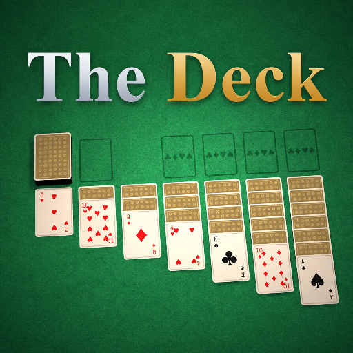
The Deck
Released
Your one-stop shop for all things card games.
ui/communitybrowser.razor.scss
@import "Theme.scss";

CommunityBrowser
{
    position: absolute;
    top: 0;
    left: 0;
    width: 100%;
    height: 100%;
    flex-direction: column;
    align-items: stretch;
    pointer-events: none;
    backdrop-filter: blur(15px);

    transform-origin: 50% 50%;
    animation: cg-launch-in .4s ease-out;

    // Back button: absolute in the top-left corner, kept out of the topbar so it can't disturb the brand's
    // row layout (an absolute child inside the centred column drops the first brand word in s&box's flexbox).
    .back
    {
        position: absolute;
        left: $deadzone;
        top: $deadzone;
        font-family: $sans;
        font-size: 15px;
        font-weight: 800;
        color: $text-dim;
        padding: 10px 16px;
        border-radius: $r-sm;
        background-color: rgba(19, 27, 23, .6);
        cursor: pointer;
        pointer-events: all;
        transition: all .12s ease;

        &:hover { color: $gold-bright; background-color: rgba(25, 34, 29, .95); }
    }

    // --- The hall ----------------------------------------------------------
    // Fills the height below the Back button; the controls stay pinned and only the grid scrolls.
    .hall
    {
        align-self: center;
        width: 100%;
        max-width: 1180px;
        flex-grow: 1;
        min-height: 0;       // let the inner grid own the overflow instead of stretching the hall
        flex-direction: column;
        align-items: stretch;
        margin-top: 124px;   // clears the absolute Back button in the top-left corner
        margin-bottom: $deadzone;

        .controls
        {
            flex-direction: row;
            align-items: center;
            justify-content: space-between;
            gap: 18px;
            flex-shrink: 0;   // the search + sort row never compresses or scrolls away
            pointer-events: all;

            .search
            {
                flex-direction: row;
                align-items: center;
                gap: 10px;
                flex-grow: 1;
                max-width: 460px;
                padding: 0 16px;
                background-color: $panel;
                border: 0.15px solid $line;
                border-radius: $r-md;
                @include elevate-btn;

                .ico
                {
                    font-family: "Material Icons";
                    font-size: 20px;
                    color: $text-mut;
                }

                TextEntry
                {
                    flex-grow: 1;
                    padding: 13px 0;
                    font-family: $sans;
                    font-size: 15px;
                    color: $text;
                    background-color: transparent;
                }
            }

            .sorts
            {
                flex-direction: row;
                gap: 6px;

                .sort
                {
                    font-family: $sans;
                    font-size: 12px;
                    font-weight: 800;
                    letter-spacing: .5px;
                    color: $text-dim;
                    padding: 10px 16px;
                    border-radius: $r-sm;
                    background-color: rgba(19, 27, 23, .6);
                    cursor: pointer;
                    transition: all .12s ease;

                    &:hover { color: $gold-bright; }

                    &.active
                    {
                        color: $on-gold;
                        background: linear-gradient(to bottom, $gold-bright, $gold-deep);
                        @include elevate-primary;
                    }
                }
            }
        }

        .cg-note,
        .cg-error
        {
            margin-top: 40px;
            align-self: center;
            font-family: $sans;
            font-size: 15px;
            font-weight: 500;
        }

        .cg-note { color: $text-mut; }
        .cg-error { color: $red-text; }

        .grid
        {
            width: 100%;
            margin-top: 28px;
            flex-grow: 1;
            min-height: 0;
            overflow-y: scroll;        // scroll the games when they overflow; the controls above stay put
            align-content: flex-start; // pack rows from the top
            pointer-events: all;
            flex-direction: row;
            flex-wrap: wrap;
            gap: 22px;
            padding-bottom: 8px;
        }
    }

    // Results render as <GameCard> (self-styled). The browser shows a denser grid, so narrow them and stop
    // them growing to fill the row - everything else (frame, art, byline) comes from the component.
    GameCard
    {
        width: 274px;
        flex-grow: 0;
    }
}

@keyframes cg-launch-in {
    from { opacity: 0; transform: scale(0.95); }
    to   { opacity: 1; transform: scale(1); }
}