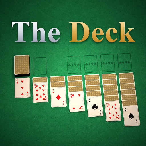
The Deck
Released
Your one-stop shop for all things card games.
ui/gamehud.razor.scss
@import "Theme.scss";

GameHud {
	position: absolute;
	top: 0;
	left: 0;
	width: 100%;
	height: 100%;

	flex-direction: column;
	justify-content: space-between; // status at the top, command bar at the bottom
	align-items: center;

	pointer-events: none; // only buttons opt back in (via .cg-* classes)

	.top {
		flex-direction: column;
		align-items: flex-start;
		align-self: flex-start; // pin to the top-left rather than centring with the rest of the HUD
		gap: 8px;
		margin-top: $deadzone;
		margin-left: $deadzone;

		// Rounded status container, with the turn-timer bar across its bottom.
		.statuscard {
			flex-direction: column;
			align-items: stretch;
			background-color: $panel;
			border: 0.15px solid $line;
				border-radius: $r-md;
			overflow: hidden;
			@include elevate;

			.cg-status {
				padding: 11px 30px;
			}

			.timerbar {
				position: relative; // containing block for the fill
				height: 4px;
				background-color: rgba(255, 255, 255, .08);

				// Absolutely positioned so its inline width is honoured (a flex child would stretch full-width).
				.fill {
					position: absolute;
					top: 0;
					left: 0;
					height: 100%;
					background-color: $gold;
					transition: width 1s linear; // drains smoothly between the ~1/s repaints
				}
			}
		}

		// Secondary line under the card (e.g. the poker pot): a small muted label and a big white value.
		.subtitle {
			flex-direction: row;
			align-items: center;
			gap: 9px;
			text-shadow: 0 2px 8px black;

			.sub-label {
				font-family: $font;
				font-size: 13px;
				font-weight: 800;
				letter-spacing: 2px;
				text-transform: uppercase;
				color: $text-mut;
			}

			.sub-value {
				font-family: $font;
				font-size: 30px;
				font-weight: 800;
				color: #fff;
			}
		}
	}

	.bottom {
		flex-direction: column;
		align-items: center;
		gap: 14px;
		margin-bottom: $deadzone;
	}

	// System controls (Forfeit) - tucked in the top-right corner, away from the action buttons.
	.system {
		position: absolute;
		top: $deadzone;
		right: $deadzone;
		flex-direction: row;
		gap: 8px; // space the How-to-play and Leave buttons apart
	}

	// Modal scrim + centred panel (the forfeit confirm and the end-of-game overlay). Both fade the scrim in
	// and scale the dialog up as they appear, and play the reverse on `.closing` before they're removed.
	.cg-modal {
		position: absolute;
		top: 0;
		left: 0;
		width: 100%;
		height: 100%;
		align-items: center;
		justify-content: center;
		background-color: rgba(0, 0, 0, .6);
		pointer-events: all;

		animation: cg-modal-fade-in .35s ease-out;
		&.closing { animation: cg-modal-fade-out .3s ease-in forwards; pointer-events: none; }

		.dialog {
			flex-direction: column;
			align-items: center;
			gap: 18px;
			padding: 32px 36px;
			max-width: 560px;

			animation: cg-modal-scale-in .35s ease-out;

			.cg-body {
				text-align: center;
			}

			.row {
				flex-direction: row;
				align-items: stretch;
				gap: 10px;
				margin-top: 6px;
			}
		}

		&.closing .dialog { animation: cg-modal-scale-out .3s ease-in forwards; }

		// End-of-game overlay: a bigger, centred title with a win/loss tone.
		.dialog.end {
			.cg-eyebrow,
			.cg-display { text-align: center; }

			.cg-display { font-size: 64px; }

			&.win .cg-display,
			&.win .cg-eyebrow { color: $green; }

			&.loss .cg-display,
			&.loss .cg-eyebrow { color: $red-text; }
		}
	}

	// Transient centre-screen announcement banner (any game can flash one via CardGame.Announce).
	// Centred vertically so it reads clearly over the table; plays a one-shot pop-in/fade-out.
	.announce {
		position: absolute;
		top: 32%;
		left: 0;
		right: 0;
		justify-content: center;
		align-items: center;
		pointer-events: none;

		.banner {
			padding: 16px 30px;
			background-color: $panel;
			border: 2px solid $gold;
			border-radius: 12px;
			font-family: $font;
			font-size: 30px;
			font-weight: 900;
			letter-spacing: 1px;
			text-align: center;
			color: #fff;
			text-shadow: 0px 2px 6px rgba(0, 0, 0, 0.6);
			@include elevate;

			// ~matches AnnounceSeconds on the game; the element is removed when the timer ends.
			animation: cg-announce 2.6s ease-out forwards;
		}
	}

	// Shown on a client while a game's cloud package is still downloading.
	.loading-cover
	{
		position: absolute;
		top: 0;
		left: 0;
		width: 100%;
		height: 100%;
		align-items: center;
		justify-content: center;
		background-color: rgba(8, 13, 11, .55);
		backdrop-filter: blur(6px);
	}
}

@keyframes cg-announce {
	0%   { opacity: 0; transform: scale(0.8) translateY(-12px); }
	10%  { opacity: 1; transform: scale(1.0) translateY(0px); }
	80%  { opacity: 1; transform: scale(1.0) translateY(0px); }
	100% { opacity: 0; transform: scale(1.04) translateY(-8px); }
}

@keyframes cg-modal-fade-in  { from { opacity: 0; } to { opacity: 1; } }
@keyframes cg-modal-fade-out { from { opacity: 1; } to { opacity: 0; } }
@keyframes cg-modal-scale-in  { from { transform: scale(0.85); } to { transform: scale(1); } }
@keyframes cg-modal-scale-out { from { transform: scale(1); } to { transform: scale(0.9); } }