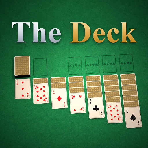
The Deck
Released
Your one-stop shop for all things card games.
ui/gamelauncher.razor.scss
@import "Theme.scss";
GameLauncher
{
position: absolute;
top: 0;
left: 0;
width: 100%;
height: 100%;
flex-direction: row;
align-items: stretch;
pointer-events: all;
backdrop-filter: blur(5px);
background-color: rgba(0, 0, 0, .45);
// Just a fade for the full-screen scrim - it must stay at 100% size the whole time, or the blur
// shrinks in from scale(0.95) and exposes a sliver of unblurred screen at the edges.
animation: cg-launch-fade .4s ease-out;
// --- Sidebar -------------------------------------------------------------
.sidebar
{
width: 210px;
flex-shrink: 0;
height: 100%;
flex-direction: column;
align-items: stretch;
gap: 16px;
padding: 28px 22px;
background-color: rgba(6, 12, 9, .8);
border-right: 0.15px solid $line;
// The scale-in "pop" lives on the content, not the full-screen scrim above.
transform-origin: 50% 50%;
animation: cg-launch-in .4s ease-out;
// Only the game list scrolls - "Browse Games" sits pinned below it, always visible.
.tiles
{
flex-grow: 1;
min-height: 0;
flex-direction: column;
align-items: stretch;
gap: 14px;
overflow-y: scroll;
overflow-x: unset;
}
.tile
{
flex-shrink: 0;
height: 138px;
flex-direction: column;
align-items: stretch;
gap: 8px;
padding: 10px;
background-color: $panel-2;
border: 0.15px solid $line;
border-radius: $r-md;
cursor: pointer;
pointer-events: all;
transition: all .12s ease;
&:hover
{
border-color: $line-soft;
filter: brightness(1.15);
}
.art
{
flex-grow: 1;
position: relative;
align-items: center;
justify-content: center;
border-radius: $r-sm;
background-color: $panel-3;
overflow: hidden;
.shot
{
position: absolute;
top: 0;
left: 0;
width: 100%;
height: 100%;
background-position: center;
object-fit: cover;
}
}
.pip
{
font-size: 32px;
line-height: 1;
color: $text-off;
&.red
{
color: rgba(178, 51, 48, .55);
}
&.black
{
color: rgba(28, 37, 48, .55);
}
}
.label
{
font-family: $sans;
font-size: 11px;
font-weight: 700;
letter-spacing: .2px;
color: $text-mut;
text-align: center;
overflow: hidden;
white-space: nowrap;
text-overflow: ellipsis;
}
// The focused game - the "your seat" gold treatment.
&.selected
{
background-color: rgba(34, 28, 16, .92);
border-color: $gold;
.art
{
background-color: $card-face;
}
.pip
{
&.red
{
color: $card-red;
}
&.black
{
color: $card-black;
}
}
.label
{
color: $text;
}
}
// Sits outside .tiles, pinned below the scrolling list - the escape hatch into the full games browser.
&.browse
{
background-image: linear-gradient(to bottom, $gold-bright, $gold-deep);
border-color: transparent;
.art
{
background-color: transparent;
}
// Reset uppercase + tracking, same as every other icon glyph in the theme - both
// break the ligature lookup and it falls back to rendering literal letters.
.ico
{
font-family: "Material Icons";
font-size: 34px;
letter-spacing: 0;
text-transform: lowercase;
color: $on-gold;
}
.text
{
font-weight: 800;
letter-spacing: 1px;
text-transform: uppercase;
color: $on-gold;
}
// Matches .cg-btn.primary's press feedback - brighten on hover, dim + settle on click.
&:hover
{
filter: brightness(1.12);
border-color: transparent;
}
&:active
{
filter: brightness(0.94);
border-color: transparent;
transform: translateY(1px);
}
}
}
}
// --- Hero ------------------------------------------------------------------
.hero
{
flex-grow: 1;
min-width: 0;
height: 100%;
flex-direction: column;
justify-content: space-between;
align-items: flex-start;
padding: $deadzone;
pointer-events: all;
transform-origin: 50% 50%;
animation: cg-launch-in .4s ease-out;
.brand
{
flex-direction: column;
align-items: flex-start;
gap: 10px;
.marks
{
flex-direction: row;
align-items: flex-start;
gap: 8px;
}
.mark
{
font-family: $serif;
font-size: 48px;
font-weight: 700;
color: linear-gradient( 45deg, #ffffff, #d4d9df 48%, #97a0ab );
text-shadow: 0 0px 4px rgba(0,0,0,0.8);
&.gold
{
color: linear-gradient( 45deg, #f8edc2, $gold-bright 38%, $gold 66%, $gold-deep );
}
}
.tagline
{
font-family: $sans;
font-size: 14px;
font-weight: 500;
color: $text-dim;
}
}
.focus
{
flex-direction: column;
align-items: flex-start;
gap: 14px;
max-width: 620px;
.tags
{
gap: 16px;
flex-direction: row;
}
.mode
{
// .cg-tag defaults to align-self: center (for centring over card art elsewhere) -
// here it sits in a left-aligned column, so pin it to the start instead.
align-self: flex-start;
text-shadow: none;
}
.title
{
font-family: $serif;
font-size: 68px;
font-weight: 700;
line-height: 1;
color: $text;
text-shadow: 0 2px 10px rgba(0,0,0,.5);
}
.desc
{
font-family: $sans;
font-size: 15px;
font-weight: 400;
line-height: 1.6;
color: $text-dim;
}
.meta
{
flex-direction: row;
align-items: center;
gap: 18px;
.item
{
flex-direction: row;
align-items: center;
gap: 7px;
font-family: $sans;
font-size: 13px;
font-weight: 600;
color: $text-mut;
.ico
{
font-family: "Material Icons";
font-size: 16px;
letter-spacing: 0;
text-transform: none;
color: $text-mut;
}
}
}
.actions
{
flex-direction: row;
align-items: center;
gap: 14px;
margin-top: 4px;
// Full pill buttons for the hero's primary actions, rounder than the standard $r-sm
// buttons used elsewhere (menus, modals) - matches the main-menu concept art.
.cg-btn
{
padding: 15px 32px;
border-radius: 999px;
}
}
.cg-note
{
margin-top: 4px;
}
// Stand-in for the .meta players line while a cloud game's package is still downloading+mounting -
// Package alone doesn't carry an authoritative player count, so this waits on the real GameDefinition.
.sk
{
background-color: $panel-3;
border-radius: $r-sm;
animation: cg-skeleton-pulse 1.1s ease-in-out infinite;
}
.sk-meta { width: 120px; height: 16px; }
}
}
// --- Bottom-right column - open tables for the focused game, then its stats -------------------------
.side
{
position: absolute;
right: $deadzone;
bottom: $deadzone;
width: 330px;
flex-direction: column;
align-items: stretch;
gap: 12px;
// Shared card chrome for both the sessions list and the stats card below it.
.sessions,
.stats
{
flex-direction: column;
align-items: stretch;
background-color: $panel-deep;
border: 0.15px solid $line;
border-radius: $r-lg;
overflow: hidden;
transform-origin: 50% 50%;
animation: cg-launch-in .4s ease-out;
@include elevate-panel;
}
// Same uppercase eyebrow style marks both cards; only Sessions gets a refresh button.
.sessions-head,
.stats-head
{
flex-direction: row;
align-items: center;
justify-content: space-between;
min-height: 48px; // matches the refresh button's box, so Stats' text-only header isn't shorter
padding: 12px 16px;
border-bottom: 0.15px solid $line;
.cg-btn
{
padding: 4px;
.ico { font-size: 13px; }
}
}
// Zebra stripe - shared so a session row and a stats row alternate the same way. Scoped to .rows
// (not just .row) so the header row sharing a parent with the stats rows doesn't throw off the
// odd/even count.
.rows .row:nth-child(even)
{
background-color: rgba(255, 255, 255, .009);
}
.sessions
{
.rows
{
flex-direction: column;
align-items: stretch;
max-height: 180px; // ~3 rows before it scrolls
overflow-y: scroll;
}
.row
{
flex-direction: row;
align-items: center;
justify-content: space-between;
gap: 10px;
min-height: 49px; // full row height (padding + tallest bit), not just the content area
padding: 12px 16px;
border-bottom: 0.15px solid $line;
&:last-child
{
border-bottom-width: 0;
}
&.empty
{
justify-content: center;
font-family: $sans;
font-size: 13px;
color: $text-dim;
}
.who
{
flex-direction: row;
align-items: center;
gap: 8px;
min-width: 0;
.dot
{
width: 7px;
height: 7px;
border-radius: 50%;
background-color: $green;
flex-shrink: 0;
}
.name
{
font-family: $sans;
font-size: 13px;
font-weight: 700;
color: $text;
overflow: hidden;
white-space: nowrap;
text-overflow: ellipsis;
}
// Marks a table hosted by one of your Steam friends - these sort to the top of the list.
.ico.friend
{
font-family: "Material Icons";
font-size: 14px;
color: $gold;
flex-shrink: 0;
}
}
.join
{
flex-direction: row;
align-items: center;
gap: 8px;
flex-shrink: 0;
.meta
{
font-family: $sans;
font-size: 12px;
color: $text-mut;
}
.cg-btn
{
padding: 6px 14px;
font-size: 11px;
}
}
// Placeholder rows while the debounced query is still in flight, so the card doesn't pop
// in empty then jump once real rows land.
&.skeleton
{
.sk
{
background-color: rgba(236, 230, 214, .16);
border-radius: $r-sm;
animation: cg-skeleton-pulse 1.1s ease-in-out infinite;
}
.sk-dot { width: 7px; height: 7px; border-radius: 50%; }
.sk-name { width: 90px; height: 12px; }
.sk-btn { width: 54px; height: 24px; }
}
}
}
.stats
{
.rows
{
flex-direction: column;
align-items: stretch;
}
.row
{
flex-direction: row;
align-items: center;
justify-content: space-between;
padding: 14px 20px;
border-bottom: 0.15px solid $line;
&:last-child
{
border-bottom-width: 0;
}
.k
{
font-family: $sans;
font-size: 13px;
font-weight: 500;
color: $text-dim;
}
.v
{
font-family: $serif;
font-size: 18px;
font-weight: 700;
color: $text;
}
}
}
}
}
@keyframes cg-launch-fade {
from { opacity: 0; }
to { opacity: 1; }
}
@keyframes cg-launch-in {
from { opacity: 0; transform: scale(0.95); }
to { opacity: 1; transform: scale(1); }
}
@keyframes cg-skeleton-pulse {
0%, 100% { opacity: .5; }
50% { opacity: 1; }
}