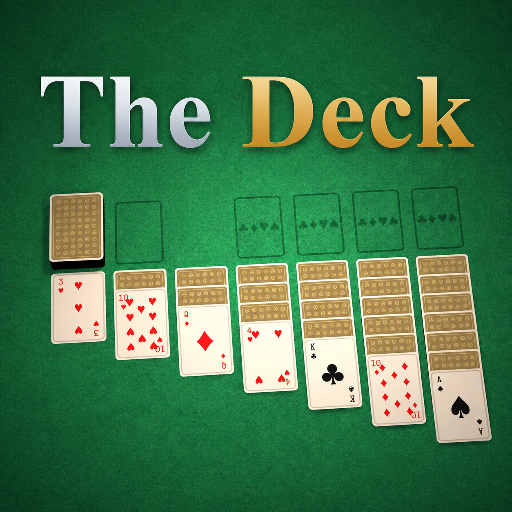
The Deck
Released
Your one-stop shop for all things card games.
ui/gamecard.razor.scss
@import "Theme.scss";

// A game card. The parent grid sets its width (launcher 360px, browser 274px); everything else -
// the frame, the cloud thumbnail, the verified badge - lives here so the launcher and browser stay identical.
GameCard
{
    width: 360px;          // default (launcher); the browser narrows this. Fixed (no grow) so cards keep a
    flex-grow: 0;          // uniform size and art aspect ratio instead of stretching to fill partial rows.
    flex-direction: column;
    align-items: stretch;
    background-color: $panel;
    border: 0.15px solid $line;
    border-radius: $r-lg;
    overflow: hidden;      // the card art and corners clip to the rounded frame
    cursor: pointer;
    pointer-events: all;
    transition: all .12s ease;
    @include elevate;

    &:hover
    {
        border-color: rgba(216, 181, 107, .5);
        transform: translateY(-4px);
        box-shadow: 0 18px 38px rgba(0,0,0,.5);

        .play { color: $gold-bright; }
    }

    // Header: a 16:9 panel carrying the cloud thumbnail, or a fallback suit mark when there's none.
    .art
    {
        height: 202px;
        position: relative;
        align-items: center;
        justify-content: center;
        background-image: linear-gradient(to bottom, $art-top, $art-bottom);
        overflow: hidden;

        .shot
        {
            position: absolute;
            top: 0;
            left: 0;
            width: 100%;
            height: 100%;
            object-fit: cover;
            background-position: center;
            border-top-left-radius: $r-lg;
            border-top-right-radius: $r-lg;
        }

        // No thumbnail: a faint suit mark so the header isn't blank.
        .noart
        {
            font-size: 72px;
            color: rgba(246, 242, 230, .14);
        }

        // Covers the art while this package mounts + starts.
        .loading
        {
            position: absolute;
            top: 0;
            left: 0;
            width: 100%;
            height: 100%;
            align-items: center;
            justify-content: center;
            background-color: rgba(8, 13, 11, .8);
            font-family: $sans;
            font-size: 14px;
            font-weight: 800;
            letter-spacing: 1px;
            text-transform: uppercase;
            color: $gold;
        }
    }

    // Body: title + play affordance, the author/verified byline, muted stats.
    .info
    {
        flex-direction: column;
        align-items: stretch;
        gap: 9px;
        padding: 18px 20px 20px;

        .row
        {
            flex-direction: row;
            align-items: baseline;
            justify-content: space-between;

            // Game titles can run long - keep them on one line so the card height stays uniform.
            .name
            {
                font-family: $serif;
                font-size: 23px;
                font-weight: 700;
                color: $text;
                text-overflow: ellipsis;
                overflow: hidden;
                white-space: nowrap;
            }

            .play
            {
                font-family: $sans;
                font-size: 13px;
                font-weight: 800;
                color: $gold;
                flex-shrink: 0;
                transition: color .12s ease;
            }
        }

        // Author line + an optional "verified" badge for first-party (Facepunch) games.
        .byline
        {
            flex-direction: row;
            align-items: center;
            gap: 4px;

            .tagline
            {
                font-family: $sans;
                font-size: 11px;
                font-weight: 800;
                letter-spacing: 1.5px;
                text-transform: uppercase;
                color: $gold;
            }

            .verified
            {
                flex-direction: row;
                align-items: center;
                gap: 3px;
                font-family: $sans;
                font-size: 10px;
                font-weight: 800;
                letter-spacing: 1px;
                text-transform: uppercase;
                color: $gold-bright;

                .ico
                {
                    font-family: "Material Icons";
                    font-size: 14px;
                    letter-spacing: 0;
                    text-transform: none;   // ligature name is case-sensitive - uppercase breaks the glyph
                    color: $gold-bright;
                }
            }
        }

        .stats
        {
            flex-direction: row;
            align-items: flex-start;
            gap: 7px;
            font-family: $sans;
            font-size: 12px;
            font-weight: 500;
            color: $text-mut;

            // The blurb fallback can be a full sentence - let it wrap, but cap it at two lines
            // (s&box has no line-clamp, so max-height + hidden overflow does the clipping) so the
            // card height stays roughly uniform.
            span
            {
                overflow: hidden;
                white-space: normal;
                line-height: 1.35;
                max-height: 33px;
            }
        }
    }
}