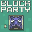
Block Party
Released
●1
Outmaneuver murderous blocks in this platformer with leaderboards, replays, daily challenges, and a level editor.
UI/PixelCheckbox.razor
@using System
@using Sandbox
@using Sandbox.UI
@inherits Panel
@namespace BlockParty
@attribute [StyleSheet( "PixelCheckbox.razor.scss" )]

@* A minimal, fully self-styled on/off checkbox for the blocky/CutePixel aesthetic (square box, 4px
   border, filled inner square when checked). s&box stylesheets do NOT cascade into a child Razor
   component's internals, so — exactly like PixelSlider — this component owns its own DOM +
   stylesheet, making it the single source of truth for the checkbox look everywhere it's used.
   Clicking toggles and reports the NEW value via OnValueChanged (the parent owns the state). *@
<root class="pixel-checkbox @(Value ? "checked" : "")">
	<div class="box">
		<div class="check"></div>
	</div>
</root>

@code
{
	[Parameter] public bool Value { get; set; }
	[Parameter] public Action<bool> OnValueChanged { get; set; }

	protected override void OnMouseDown( MousePanelEvent e )
	{
		base.OnMouseDown( e );
		if ( e.MouseButton != MouseButtons.Left ) return; // left-only, like CustomPatternGrid
		OnValueChanged?.Invoke( !Value );
		e.StopPropagation();
	}

	protected override int BuildHash() => Value.GetHashCode();
}