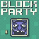
Block Party
Released
●1
Outmaneuver murderous blocks in this platformer with leaderboards, replays, daily challenges, and a level editor.
ui/levelbrowseroverlay.razor.scss
// Editor level-browser overlay. Designed in 1080-reference space (ScreenPanel AutoScreenScale =
// ConsistentHeight — same coordinate space as the editor HUD and the level-select map). Opaque,
// instant (no transitions/animations so it pops in/out immediately). CLAMPED to the central 1080²
// play-square region so it never overlaps / clips the editor's side panels (tools / inspector).

$bg: rgba( 12, 15, 20, 0.98 );
$panel: rgba( 30, 36, 46, 0.98 );
$line: rgba( 255, 255, 255, 0.12 );
$text: rgba( 235, 240, 245, 1 );
$muted: rgba( 170, 180, 190, 1 );
$accent: rgba( 90, 180, 235, 1 );
$on: rgba( 60, 120, 170, 1 );
$mapline: rgba( 79, 154, 160, 1 );
$charmatch: rgba( 130, 205, 145, 1 );  // search/Character text naming a character (keep in sync with LevelEditorHud)
$blockmatch: rgba( 220, 180, 120, 1 ); // search text naming a block type (muted amber, same L/C as $charmatch)

// Match the shared theme's button behavior: labels and icons are visual content, not independent
// mouse targets. Keeping one target prevents s&box from cancelling release after a child boundary.
button > * {
	pointer-events: none;
}

.level-browser {
	// Clamp to the centred 1080-wide play square (its left edge is screen-centre − 540). Full height
	// so it covers the whole square; the side letterboxes (and their panels) stay outside it.
	position: absolute;
	top: 0;
	left: 50%;
	margin-left: -540px;
	width: 1080px;
	height: 100%;
	z-index: 100;
	pointer-events: all;
	align-items: center;
	justify-content: center;
	font-family: "Roboto";
	color: $text;

	.backdrop {
		position: absolute;
		top: 0;
		left: 0;
		width: 100%;
		height: 100%;
		background-color: $bg;
		cursor: blank-hand;
	}

	.window {
		position: relative;
		width: 1032px;
		max-width: 100%;
		height: 1000px;
		max-height: 98%;
		flex-direction: column;
		background-color: $panel;
		border: 2px solid $line;
		padding: 24px;
		gap: 16px;
	}

	.topbar {
		flex-direction: row;
		align-items: center;
		justify-content: space-between;

		.title {
			font-size: 34px;
			font-weight: 700;
			letter-spacing: 3px;
			color: $accent;
		}

		.modes {
			flex-direction: row;
			gap: 10px;

			.mode {
				background-color: rgba( 255, 255, 255, 0.06 );
				border: 1px solid $line;
				padding: 10px 22px;
				font-size: 22px;
				color: $text;
				cursor: blank-hand;

				&:hover { background-color: rgba( 255, 255, 255, 0.14 ); }

				&.on {
					background-color: $on;
					border-color: $accent;
				}

				// The EDIT toggle reads amber when armed so the map's changed click behaviour
				// (replace / add instead of load) is unmistakable.
				&.edit.on {
					background-color: rgba( 170, 110, 35, 1 );
					border-color: rgba( 255, 190, 90, 1 );
				}

				// Back (inner edit picker) reads muted red so it's clearly "abandon this pick",
				// distinct from the Other/Test pool toggles beside it.
				&.back {
					background-color: rgba( 105, 45, 50, 1 );
					border-color: rgba( 200, 115, 115, 0.8 );

					&:hover { background-color: rgba( 150, 60, 65, 1 ); }
				}
			}
		}

		.close {
			width: 56px;
			height: 56px;
			align-items: center;
			justify-content: center;
			background-color: rgba( 255, 255, 255, 0.06 );
			border: 1px solid $line;
			cursor: blank-hand;

			&:hover { background-color: rgba( 190, 70, 70, 0.8 ); }

			.icon {
				font-family: "Material Icons";
				font-size: 34px;
				color: $text;
			}
		}
	}

	// ── search row: the fixed-size filter box at the LEFT (every view), sort toggle at the RIGHT ──────
	.searchbar {
		flex-direction: row;
		justify-content: space-between;
		align-items: center;
		gap: 8px;

		// Fixed footprint: long text scrolls/clips INSIDE the entry, never resizes the box.
		.search-box {
			position: relative;
			width: 340px;
			height: 46px;
			flex-shrink: 0;

			.search-entry {
				width: 100%;
				height: 100%;
				padding: 6px 50px 6px 12px;   // right padding keeps text clear of the X button
				align-items: center;
				background-color: rgba( 0, 0, 0, 0.35 );
				border: 1px solid $line;
				font-size: 20px;
				color: $text;
				caret-color: $accent;
				white-space: nowrap;
				overflow: hidden;

				.content-label {
					white-space: nowrap;
					overflow: hidden;
				}

				&:focus { border-color: $accent; }

				// The text names a character exactly (id or display name) — forced-character match is live.
				&.character-match { color: $charmatch; }

				// The text names a block type exactly ("sad", "wind") — spawns-that-block match is live.
				&.block-match { color: $blockmatch; }
			}

			// Red X in the box's top-right, shown only while there's text (see the razor).
			.search-clear {
				position: absolute;
				top: 0;
				right: 0;
				width: 46px;
				height: 100%;
				align-items: center;
				justify-content: center;
				cursor: blank-hand;

				.icon {
					font-family: "Material Icons";
					font-size: 26px;
					color: rgba( 220, 90, 90, 1 );
				}

				&:hover .icon { color: rgba( 255, 130, 130, 1 ); }
			}
		}

		// Map-mode zoom bar (right side, where the grid views put their sort toggle): − / slider / +
		// with a live percent readout. Scales the whole map layout via inline styles (see the razor).
		.zoombar {
			flex-direction: row;
			align-items: center;
			gap: 8px;
			width: 330px;
			flex-shrink: 0;

			.zoom-btn {
				width: 36px;
				height: 36px;
				flex-shrink: 0;
				align-items: center;
				justify-content: center;
				background-color: rgba( 255, 255, 255, 0.06 );
				border: 1px solid $line;
				cursor: blank-hand;

				&:hover { background-color: rgba( 255, 255, 255, 0.14 ); }

				.icon {
					font-family: "Material Icons";
					font-size: 22px;
					color: $text;
				}
			}

			.zoom-label {
				width: 52px;
				flex-shrink: 0;
				justify-content: flex-end;
				font-size: 17px;
				text-align: right;
				color: $muted;
			}
		}

		.sort {
			background-color: rgba( 255, 255, 255, 0.06 );
			border: 1px solid $line;
			min-width: 84px;
			padding: 6px 10px;
			font-size: 17px;
			align-items: center;
			justify-content: center;
			text-align: center;
			color: $text;
			cursor: blank-hand;

			&:hover { background-color: rgba( 255, 255, 255, 0.14 ); }

			&.on {
				background-color: $on;
				border-color: $accent;
			}
		}
	}

	// ── grid mode: wrap the fixed-size tiles left-to-right / top-to-bottom, vertically scrollable ─────
	.grid {
		position: relative;   // anchors the centred no-results notice
		flex-grow: 1;
		flex-direction: row;
		flex-wrap: wrap;
		align-content: flex-start;
		justify-content: center;
		gap: 20px;
		overflow-y: scroll;
		overflow-x: hidden;

		// Centred notice when a search matches nothing in the current view.
		.no-results {
			position: absolute;
			left: 0;
			top: 0;
			width: 100%;
			height: 100%;
			align-items: center;
			justify-content: center;

			label {
				font-size: 30px;
				letter-spacing: 3px;
				color: $muted;
			}
		}

		.tile {
			flex-direction: column;
			width: 150px;
			align-items: center;
			cursor: blank-hand;
			gap: 4px;

			.face {
				position: relative;
				width: 150px;
				height: 150px;
				overflow: hidden;
				border: 3px solid rgba( 63, 124, 132, 1 );

				// Templates view: the template's pick weight, as a small chip in the preview's
				// top-right corner (kept off the caption line below).
				.weight {
					position: absolute;
					top: 0;
					right: 0;
					padding: 1px 7px 2px 7px;
					font-size: 16px;
					color: $text;
					background-color: rgba( 12, 15, 20, 0.75 );
					pointer-events: none;
					z-index: 2;
				}

				// Templates view: swap glyph in the top-left corner of templates that may also
				// spawn mirrored left-to-right (AllowMirrorX).
				.mirror {
					position: absolute;
					top: 0;
					left: 0;
					padding: 1px 5px 2px 5px;
					font-family: "Material Icons";
					font-size: 17px;
					color: $text;
					background-color: rgba( 12, 15, 20, 0.75 );
					pointer-events: none;
					z-index: 2;
				}

				// Templates view: spike glyph in the bottom-right corner of templates whose spikes
				// always spawn exactly as authored (AuthoredSpikes) instead of rolling per-surface
				// each day.
				.authored-spikes {
					position: absolute;
					right: 0;
					bottom: 0;
					padding: 1px 5px 2px 5px;
					font-family: "Material Icons";
					font-size: 17px;
					color: $text;
					background-color: rgba( 12, 15, 20, 0.75 );
					pointer-events: none;
					z-index: 2;
				}

				// Templates view: red warning in the bottom-left when the template has fewer free
				// spawn slots than the biggest daily block roll (the generator clamps those rolls).
				.slots-warning {
					position: absolute;
					left: 0;
					bottom: 0;
					padding: 1px 5px 2px 5px;
					font-family: "Material Icons";
					font-size: 18px;
					color: rgba( 235, 90, 90, 1 );
					background-color: rgba( 12, 15, 20, 0.75 );
					pointer-events: none;
					z-index: 2;
				}

				.tile-forced-character {
					position: absolute;
					left: 6px;
					bottom: 6px;
					pointer-events: none;

					// Same pre-baked soft glow the character picker uses, so the character's dark
					// outer pixels read against the level preview (see CharacterPicker.razor.scss).
					.icon-glow {
						position: absolute;
						left: -61%;
						top: -60.5%;
						width: 222%;
						height: 221%;
						z-index: 0;
						opacity: 0.3;
						background-image: url( "sprites/ui/icon_glow.png" );
						background-repeat: no-repeat;
						background-size: 100% 100%;
					}

					.sprite {
						position: absolute;
						left: 0;
						top: 0;
						width: 100%;
						height: 100%;
						z-index: 1;
						background-repeat: no-repeat;
						background-position: center;
						background-size: contain;
						image-rendering: pixelated;
						opacity: 0.95;
					}

					// Paired (twins) badge: partner behind up-right and slightly smaller, character
					// in front down-left — same composition as the picker's twins icon.
					&.paired {
						.sprite.rear {
							transform: translate( 11%, -9% ) scale( 0.94 );
						}

						.sprite.front {
							transform: translate( -11%, 9% );
						}
					}
				}
			}

			.caption {
				width: 150px;
				flex-direction: row;
				align-items: flex-start;
				justify-content: center;

				.name, .tag {
					font-size: 18px;
					line-height: 22px;
				}

				.name {
					flex-shrink: 1;
					min-width: 0;
					text-align: center;
					white-space: nowrap;
					overflow: hidden;
					text-overflow: ellipsis;
					color: $text;
				}

				.tag {
					flex-shrink: 0;
					margin-right: 6px;
					color: rgba( 145, 155, 165, 1 );
				}

				&.tagged .name {
					text-align: left;
				}
			}

			&:hover {
				.face { border-color: #ffffff; box-shadow: 0px 0px 18px 2px rgba( 255, 255, 255, 0.6 ); }
			}
		}
	}

	// ── map mode: the map canvas (sized inline) inside a scroll region; nodes/lines in map coords ────
	.map-scroll {
		flex-grow: 1;
		overflow: scroll;

		.map {
			position: relative;
			// Keep the canvas at its full (inline) size instead of being shrunk to the scroll viewport,
			// so it can overflow HORIZONTALLY (a wide map with a long side chain) and scroll on X too.
			flex-shrink: 0;

			.line {
				position: absolute;
				background-color: $mapline;
			}

			// EDIT-mode + button: an empty adjacent grid cell a new side level can be added to,
			// rendered near-flush against the node it hangs off.
			.add-cell {
				position: absolute;
				align-items: center;
				justify-content: center;
				background-color: rgba( 255, 255, 255, 0.04 );
				border: 2px solid rgba( 111, 224, 208, 0.45 );
				cursor: blank-hand;
				z-index: 2;

				.icon {
					font-family: "Material Icons";
					font-size: 30px;
					color: rgba( 111, 224, 208, 0.85 );
				}

				&:hover {
					background-color: rgba( 111, 224, 208, 0.25 );
					border-color: #ffffff;

					.icon { color: #ffffff; }
				}

				// Insert-between variant: sits ON a connection line (spine or side), so its face is
				// opaque to mask the line behind it (including the hover tint, pre-blended here).
				&.insert {
					background-color: $panel;

					&:hover { background-color: rgba( 50, 83, 86, 1 ); }
				}
			}

			// EDIT-mode X button straddling a deletable node's top-right corner.
			.delete-node {
				position: absolute;
				align-items: center;
				justify-content: center;
				background-color: rgba( 140, 52, 55, 0.95 );
				border: 2px solid rgba( 220, 125, 125, 0.9 );
				cursor: blank-hand;
				z-index: 3;

				.icon {
					font-family: "Material Icons";
					font-size: 20px;
					color: rgba( 245, 230, 230, 1 );
				}

				&:hover {
					background-color: rgba( 200, 70, 70, 1 );
					border-color: #ffffff;

					.icon { color: #ffffff; }
				}
			}

			// Positioned wrapper (left/top/size set inline).
			.node-wrap {
				position: absolute;
				cursor: blank-hand;

				.node-name {
					position: absolute;
					left: 0;
					right: 0;
					top: -29px;
					height: 25px;
					padding: 2px 6px;
					align-items: center;
					justify-content: center;
					overflow: hidden;
					background-color: #171b22;
					pointer-events: none;
					z-index: 2;

					label {
						width: 100%;
						font-size: 18px;
						line-height: 21px;
						text-align: center;
						white-space: nowrap;
						overflow: hidden;
						text-overflow: ellipsis;
						color: $text;
					}
				}

				// The clipped level preview + coloured frame fills the wrapper.
				.face {
					position: absolute;
					left: 0;
					top: 0;
					width: 100%;
					height: 100%;
					overflow: hidden;
					border: 4px solid rgba( 111, 224, 208, 1 );
					// Mask connector lines even before a windowed preview is mounted.
					background-color: $panel;
					z-index: 1;

					// Forced-character badge in the preview's lower-left, matching the grid tiles
					// (same glow-behind-sprite structure — see the .grid .tile version above).
					.tile-forced-character {
						position: absolute;
						left: 5px;
						bottom: 5px;
						pointer-events: none;

						.icon-glow {
							position: absolute;
							left: -61%;
							top: -60.5%;
							width: 222%;
							height: 221%;
							z-index: 0;
							opacity: 0.3;
							background-image: url( "sprites/ui/icon_glow.png" );
							background-repeat: no-repeat;
							background-size: 100% 100%;
						}

						.sprite {
							position: absolute;
							left: 0;
							top: 0;
							width: 100%;
							height: 100%;
							z-index: 1;
							background-repeat: no-repeat;
							background-position: center;
							background-size: contain;
							image-rendering: pixelated;
							opacity: 0.95;
						}

						// Paired (twins) badge — see the .grid .tile version above.
						&.paired {
							.sprite.rear {
								transform: translate( 11%, -9% ) scale( 0.94 );
							}

							.sprite.front {
								transform: translate( -11%, 9% );
							}
						}
					}

					// Music-override badge in the preview's lower-right (editor map only): red when the
					// same track is set on more than one mapped level. Glyph size re-emitted inline per zoom.
					.music-badge {
						position: absolute;
						right: 0;
						bottom: 0;
						padding: 1px 4px 2px 4px;
						font-family: "Material Icons";
						font-size: 18px;
						color: $text;
						background-color: rgba( 12, 15, 20, 0.75 );
						pointer-events: none;
						z-index: 2;

						&.dupe { color: rgba( 235, 90, 90, 1 ); }
					}
				}

				&:hover {
					.face { border-color: #ffffff; box-shadow: 0px 0px 22px 3px rgba( 255, 255, 255, 0.85 ); }
				}
			}
		}
	}
}