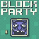
Block Party
Released
Outmaneuver murderous blocks in this platformer with leaderboards, replays, daily challenges, and a level editor.
ui/pixelcheckbox.razor.scss
// Self-contained pixel checkbox styling. Lives on the PixelCheckbox component itself so it reliably
// styles the component's own internals (s&box does NOT cascade a parent stylesheet into a child
// component) — mirrors PixelSlider. Square box + filled inner square when checked, matching the
// blocky/CutePixel aesthetic. This is the single source of truth for the checkbox look game-wide.

$white: #f8f5e6;
$black: #3a404c;

.pixel-checkbox
{
	align-items: center;
	justify-content: center;
	// A parent stylesheet doesn't cascade into this child component, so re-enable pointer events here
	// so the box is always clickable wherever it's placed (same reasoning as PixelSlider).
	pointer-events: all;
	cursor: blank-hand;

	.box
	{
		width: 40px;
		height: 40px;
		align-items: center;
		justify-content: center;
		background-color: $white;
		border: 4px solid $black;
		image-rendering: pixelated;

		// Filled inner square, revealed only when checked.
		.check
		{
			width: 20px;
			height: 20px;
			background-color: $black;
			opacity: 0;
		}
	}

	&.checked .box .check
	{
		opacity: 1;
	}
}