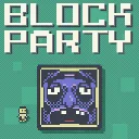
Block Party
Released
●1
Outmaneuver murderous blocks in this platformer with leaderboards, replays, daily challenges, and a level editor.
ui/workshopscreen.razor.scss
// Workshop level browser. Designed in 1080-reference space (ScreenPanel AutoScreenScale =
// ConsistentHeight), living on the dark covered backdrop like the leaderboard. Header/footer match
// HighscoreScreen; the tile grid borrows the level-browser overlay's visual language.
@import "Theme.scss";

$line: rgba( 255, 255, 255, 0.12 );
$muted: rgba( 170, 180, 190, 1 );
$accent: rgba( 90, 180, 235, 1 );
$on: rgba( 60, 120, 170, 1 );

// Labels and icons are visual content, not independent mouse targets (see Theme.scss rationale).
button > * {
	pointer-events: none;
}

WorkshopScreen {
	position: absolute;
	top: 0;
	left: 0;
	width: 100%;
	height: 100%;
	flex-direction: column;
	align-items: center;
	padding: 16px 0 60px;

	font-family: $font;
	font-smooth: never;

	.header {
		font-size: 80px;
		line-height: 0.8;
		color: $white;
		text-shadow: 4px 4px 0 $black;
	}

	// Level-editor entry in the upper-left, mirroring the character slot exactly: the picker trigger
	// is a 100px box (viewport 88 + 12, see CharacterPicker.TriggerWidth) at top 8 / 512 off-centre,
	// so this matches all three (size excludes the square-btn drop shadow). The 40px icon art shows
	// at 1.5x — restrained inside the face, like the picker's character sprite.
	// Nudged down-right by the square-btn shadow offset (6px) so the SHADOW's outer corner sits where
	// the picker's frame does, visually balancing the two corners.
	.editor-slot {
		position: absolute;
		z-index: 1000;
		left: 50%;
		margin-left: -506px;
		top: 14px;
		width: 100px;
		height: 100px;
		border-width: 3px;   // the picker trigger's frame weight, not square-btn's 4px

		.img {
			width: 60px;
			height: 60px;
		}
	}

	// Character picker in the upper-right, like the daily / level-select screens.
	.character-slot {
		position: absolute;
		z-index: 1000;
		right: 50%;
		margin-right: -512px;
		top: 8px;
		align-items: flex-end;
	}

	// ── search row: filter box + sort cycle, centred between the corner slots ───────────────────────
	.searchbar {
		flex-direction: row;
		justify-content: center;
		gap: 12px;
		align-items: center;
		width: 1050px;
		margin: 10px 0 16px;
		pointer-events: all;

		.search-box {
			position: relative;
			width: 340px;
			height: 46px;
			flex-shrink: 0;

			.search-entry {
				width: 100%;
				height: 100%;
				padding: 6px 50px 6px 12px;
				align-items: center;
				background-color: rgba( 0, 0, 0, 0.35 );
				border: 1px solid $line;
				font-size: 24px;
				color: $white;
				caret-color: $accent;
				white-space: nowrap;
				overflow: hidden;

				.content-label {
					white-space: nowrap;
					overflow: hidden;
				}

				&:focus { border-color: $accent; }
			}

			.search-clear {
				position: absolute;
				top: 0;
				right: 0;
				width: 46px;
				height: 100%;
				align-items: center;
				justify-content: center;
				cursor: blank-hand;

				.icon {
					font-family: "Material Icons";
					font-size: 26px;
					color: rgba( 220, 90, 90, 1 );
				}

				&:hover .icon { color: rgba( 255, 130, 130, 1 ); }
			}
		}

		.sort {
			background-color: rgba( 255, 255, 255, 0.06 );
			border: 1px solid $line;
			min-width: 130px;
			padding: 8px 12px;
			font-size: 22px;
			align-items: center;
			justify-content: center;
			text-align: center;
			color: $white;
			cursor: blank-hand;

			&:hover { background-color: rgba( 255, 255, 255, 0.14 ); }

			&.on {
				background-color: $on;
				border-color: $accent;
			}
		}
	}

	// ── tile grid: fixed-size tiles wrapping left-to-right, vertically scrollable ───────────────────
	.grid {
		position: relative;   // anchors the centred notice
		width: 1050px;
		flex-grow: 1;
		flex-direction: row;
		flex-wrap: wrap;
		align-content: flex-start;
		justify-content: center;
		gap: 20px;
		overflow-y: scroll;
		overflow-x: hidden;
		pointer-events: all;

		.notice {
			position: absolute;
			left: 0;
			top: 0;
			width: 100%;
			height: 100%;
			align-items: center;
			justify-content: center;

			label {
				font-size: 38px;
				letter-spacing: 3px;
				color: $muted;
			}
		}

		.tile {
			position: relative;   // anchors the web-link chip over the face's top-right corner
			flex-direction: column;
			width: 190px;
			gap: 4px;

			// The live LevelNodePreview (or the fallback thumbnail PNG) fills the face; clicking it
			// installs + plays.
			.face {
				position: relative;
				width: 190px;
				height: 190px;
				padding: 0;
				overflow: hidden;
				border: 3px solid rgba( 63, 124, 132, 1 );
				background-color: rgba( 0, 0, 0, 0.35 );
				cursor: blank-hand;

				// Fallback: the uploaded workshop thumbnail, for levels too big to embed in metadata.
				.img {
					position: absolute;
					left: 0;
					top: 0;
					width: 100%;
					height: 100%;
					background-repeat: no-repeat;
					background-size: cover;
					background-position: center;
					pointer-events: none;
				}

				// Top-LEFT: the top-right corner belongs to the web-link chip.
				.votes {
					position: absolute;
					top: 0;
					left: 0;
					flex-direction: row;
					align-items: center;
					padding: 2px 7px 3px 6px;
					font-size: 18px;
					color: $white;
					background-color: rgba( 12, 15, 20, 0.75 );
					pointer-events: none;
					z-index: 2;

					// Same white-on-transparent icon PNGs as the square buttons (Theme.scss).
					.icon {
						width: 16px;
						height: 16px;
						margin-right: 4px;
						background-image: url( "ui/icons/icon_thumbsup.png" );
						background-size: 100% 100%;
						background-repeat: no-repeat;
						image-rendering: pixelated;
						background-tint: $white;
					}
				}

				// Forced-character badge in the preview's lower-left, matching the level browser's
				// tiles (glow-behind-sprite structure, see LevelBrowserOverlay.razor.scss).
				.tile-forced-character {
					position: absolute;
					left: 7px;
					bottom: 7px;
					pointer-events: none;
					z-index: 2;

					.icon-glow {
						position: absolute;
						left: -61%;
						top: -60.5%;
						width: 222%;
						height: 221%;
						z-index: 0;
						opacity: 0.3;
						background-image: url( "sprites/ui/icon_glow.png" );
						background-repeat: no-repeat;
						background-size: 100% 100%;
					}

					.sprite {
						position: absolute;
						left: 0;
						top: 0;
						width: 100%;
						height: 100%;
						z-index: 1;
						background-repeat: no-repeat;
						background-position: center;
						background-size: contain;
						image-rendering: pixelated;
						opacity: 0.95;
					}

					// Paired (twins) badge: partner behind up-right and slightly smaller, character
					// in front down-left — same composition as the picker's twins icon.
					&.paired {
						.sprite.rear {
							transform: translate( 11%, -9% ) scale( 0.94 );
						}

						.sprite.front {
							transform: translate( -11%, 9% );
						}
					}
				}

				// Install / failure state, painted over the whole preview.
				.busy {
					position: absolute;
					left: 0;
					top: 0;
					width: 100%;
					height: 100%;
					align-items: center;
					justify-content: center;
					background-color: rgba( 12, 15, 20, 0.75 );
					pointer-events: none;
					z-index: 3;

					label {
						font-size: 20px;
						letter-spacing: 2px;
						color: $white;
					}

					&.failed label { color: rgba( 235, 90, 90, 1 ); }
				}
			}

			// Play-affordance glow on the FACE's own hover only — not .tile:hover — so the web-link
			// chip (and the caption/trophy row) doesn't light up the preview: the glow means
			// "clicking here plays the level".
			.face:hover {
				border-color: #ffffff;
				box-shadow: 0px 0px 18px 2px rgba( 255, 255, 255, 0.6 );
			}

			// Steam Workshop page link, overlaying the face's top-right corner — a SIBLING of the
			// face (see the razor), inset by the face's 3px border like the votes chip. The wrapper
			// owns ALL the chip visuals; the WebLinkLabel inside stays visually bare because its
			// computed background gets baked into the anchor span's texture and sticks (see razor).
			.web {
				position: absolute;
				top: 3px;
				right: 3px;
				width: 40px;
				height: 40px;
				align-items: center;
				justify-content: center;
				background-color: rgba( 12, 15, 20, 0.75 );
				border: 1px solid $line;
				cursor: blank-hand;
				z-index: 4;

				&:hover { background-color: $on; border-color: $accent; }

				// The anchor glyph nearly fills the chip: only the glyph itself hit-tests.
				WebLinkLabel {
					width: 100%;
					height: 100%;
					align-items: center;
					text-align: center;
					cursor: blank-hand;
					font-family: "Material Icons";
					font-size: 32px;
					color: $white;
				}
			}

			// Uploader's Steam avatar (SteamAvatar, 40px like the chips), a face SIBLING overlaying the
			// face's bottom-right corner: inset by the 3px border, so top = 190 face - 3 - 40.
			SteamAvatar {
				position: absolute;
				top: 147px;
				right: 3px;
				border: 1px solid $line;
				z-index: 4;

				&:hover { border-color: $accent; }
			}

			.caption {
				width: 190px;
				flex-direction: row;
				align-items: center;

				.text {
					flex-direction: column;
					flex-grow: 1;
					flex-shrink: 1;
					min-width: 0;

					.name {
						font-size: 20px;
						line-height: 22px;
						white-space: nowrap;
						overflow: hidden;
						text-overflow: ellipsis;
						color: $white;
					}

					.author {
						font-size: 16px;
						line-height: 18px;
						white-space: nowrap;
						overflow: hidden;
						text-overflow: ellipsis;
						color: $muted;
					}
				}

				// Per-level leaderboard. A sibling of the face — a child would bubble its click into
				// the play action (see the razor).
				.board {
					width: 40px;
					height: 40px;
					flex-shrink: 0;
					align-items: center;
					justify-content: center;
					background-color: rgba( 255, 255, 255, 0.06 );
					border: 1px solid $line;
					cursor: blank-hand;

					&:hover { background-color: $on; border-color: $accent; }

					.icon {
						font-family: "Material Icons";
						font-size: 24px;
						color: $white;
					}
				}
			}
		}

		.load-more-row {
			width: 100%;
			align-items: center;
			justify-content: center;
			padding: 8px 0 4px;

			.load-more {
				padding: 10px 28px;
				font-size: 24px;
				color: $white;
				background-color: rgba( 255, 255, 255, 0.06 );
				border: 1px solid $line;
				cursor: blank-hand;

				&:hover { background-color: rgba( 255, 255, 255, 0.14 ); }
			}
		}
	}

	.footer {
		flex-direction: row;
		align-items: center;
		margin-top: 8px;
		pointer-events: all;

		.back {
			padding: 10px 28px;
			font-size: 30px;
			color: $black;
			background-color: #c98a8a;
			cursor: blank-hand;

			&:hover { background-color: #d99a9a; }
		}
	}
}