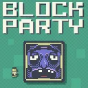
Block Party
Released
Outmaneuver murderous blocks in this platformer with leaderboards, replays, daily challenges, and a level editor.
ui/characterpicker.razor.scss
@import "Theme.scss";

CharacterPicker {
	position: relative;
	flex-direction: column;
	align-items: center;
	pointer-events: none;
	font-family: $font;
	font-smooth: never;
	transform-origin: 50% 50%;

	&.locked-entry-bounce {
		animation: picker-lock-bounce 0.46s ease-out;
	}

	.picker-trigger {
		position: relative;
		align-items: center;
		justify-content: center;
		padding: 2px;
		background-color: #1c2229;
		border: 3px solid #343b45;
		border-radius: 0;
		pointer-events: all;
		cursor: blank-hand;
		transition: background-color 0.1s ease, border-color 0.14s ease-out, box-shadow 0.14s ease-out, transform 0.06s ease;

		&:hover {
			background-color: #252c34;
			border-color: #59626e;
			transform: scale( 1.06 );
		}

		&:active {
			transform: scale( 0.98 );
		}

		&.locked-visuals {
			border-color: rgba( #df5c65, 0.82 );
			box-shadow: 0 0 28px 9px rgba( #df3f4d, 0.48 );
			animation: picker-lock-pulse 1.15s ease-in-out infinite;
		}

		&.locked-fade-in {
			animation: picker-lock-fade-in 0.34s ease-out, picker-lock-pulse 1.15s 0.34s ease-in-out infinite;
		}

		&.locked-shake-a {
			animation: picker-locked-shake-a 0.24s ease-out, picker-lock-pulse 1.15s 0.24s ease-in-out infinite;
		}

		&.locked-shake-b {
			animation: picker-locked-shake-b 0.24s ease-out, picker-lock-pulse 1.15s 0.24s ease-in-out infinite;
		}

		.trigger-lock {
			position: absolute;
			right: -12px;
			top: -12px;
			width: 48px;
			height: 48px;
			z-index: 3;
			pointer-events: none;
			background-image: url( "sprites/ui/level_lock.png" );
			background-tint: #aeb6c2;
			background-repeat: no-repeat;
			background-position: center;
			background-size: contain;
			image-rendering: pixelated;
		}

		.new-badge {
			position: absolute;
			left: -10px;
			top: -10px;
			min-width: 32px;
			height: 32px;
			align-items: center;
			justify-content: center;
			padding: 0 7px;
			background-color: #c98a8a;
			border: 2px solid #f8f5e6;
			z-index: 3;
			pointer-events: none;
			transform-origin: 50% 50%;
			animation: new-badge-pulse 0.5s ease-in-out infinite;

			label {
				width: 100%;
				color: #3a404c;
				font-size: 22px;
				line-height: 0.8;
				text-align: center;
			}
		}
	}

	.preview {
		position: relative;
		overflow: hidden;
		pointer-events: none;
	}

	.preview.paired .rear {
		transform: translate( 11%, -9% );
	}

	.sprite-layer {
		position: absolute;
		left: 0;
		top: 0;
		width: 100%;
		height: 100%;
		background-repeat: no-repeat;
		background-size: contain;
		background-position: center;
		image-rendering: pixelated;
	}

	.preview.overall .sprite-layer {
		filter: brightness( 0 ) saturate( 0 );
		opacity: 1;
	}

	&.leaderboard {
		.clear-selection {
			position: absolute;
			top: -6px;
			right: -6px;
			width: 30px;
			height: 30px;
			align-items: center;
			justify-content: center;
			padding: 0;
			background-color: #c98a8a;
			border: 2px solid #f8f5e6;
			pointer-events: all;
			cursor: blank-hand;
			z-index: 2;
			transition: transform 0.08s ease, background-color 0.1s ease;

			.icon {
				font-family: "Material Icons";
				font-size: 22px;
				color: #3a404c;
			}

			&:hover {
				background-color: #d99a9a;
				transform: scale( 1.08 );
			}

			&:active {
				transform: scale( 0.94 );
			}
		}
	}

	.paired .rear {
		transform: translate( 11%, -9% ) scale( 0.94 );
	}

	.paired .front {
		transform: translate( -11%, 9% );
	}

	.overlay {
		position: absolute;
		width: 100vw;
		height: 100vh;
		justify-content: center;
		align-items: center;
		pointer-events: all;
		z-index: 900;

		.dismiss {
			position: absolute;
			left: 0;
			top: 0;
			width: 100%;
			height: 100%;
			background-color: rgba( $black, 0.18 );
			pointer-events: all;
		}

		.panel {
			width: 900px;
			height: 900px;
			flex-direction: column;
			align-items: center;
			padding: 42px 54px;
			background-color: $black;
			border: 5px solid #59626e;
			pointer-events: all;
			box-shadow: 0 12px 40px rgba( #000000, 0.55 );

			.title {
				font-size: 38px;
				color: $white;
				margin-bottom: 30px;
				letter-spacing: 3px;
			}
		}

		.character-grid {
			width: 100%;
			flex-grow: 1;
			flex-direction: column;
			align-items: center;
			justify-content: center;
			gap: 16px;
		}

		.character-row {
			width: 620px;
			height: 185px;
			flex-direction: row;
			justify-content: center;
			gap: 16px;
		}

		.character {
			width: 118px;
			height: 180px;
			flex-shrink: 0;
			flex-direction: column;
			align-items: center;
			justify-content: flex-start;
			padding: 4px;
			background-color: transparent;
			border: 0;
			border-radius: 0;
			pointer-events: all;
			cursor: blank-hand;
			transition: transform 0.06s ease;

			.character-sprite {
				width: 110px;
				height: 120px;
				position: relative;

				// Soft white oval behind the sprite so the character's dark outer pixels
				// still read against the dark panel. Sized 8:10 (a touch taller than wide)
				// as a share of the viewport, so it scales with PreviewScale like the art.
				// Pre-blurred by tools/bake_glow.py rather than a live filter: blur(), which
				// cost a render target and two blur passes per character per frame. The box
				// is exactly the baked canvas (244x265px at base scale) so background-size
				// 100% 100% is 1:1 — edit the shape in the baker, not here.
				// The PNG's alpha peaks at 255; opacity is the brightness knob.
				.icon-glow {
					position: absolute;
					left: -61%;
					top: -60.5%;
					width: 222%;
					height: 221%;
					z-index: 0;
					pointer-events: none;
					opacity: 0.3;
					background-image: url( "sprites/ui/icon_glow.png" );
					background-repeat: no-repeat;
					background-size: 100% 100%;
				}

				.sprite-layer {
					z-index: 1;
				}

				&.new-character .sprite-layer {
					animation: new-character-pulse 1.05s ease-in-out infinite;
				}
			}

			.character-name {
				height: 36px;
				font-size: 25px;
				color: $white;
				margin-top: 3px;
			}

			&.unlocked {
				&:hover {
					transform: scale( 1.06 );
				}

				&:active {
					transform: scale( 0.98 );
				}
			}

			&.locked {
				// Locked entries render no glow, so the whole sprite box can be silhouetted.
				.character-sprite {
					filter: brightness( 0 ) saturate( 0 );
					opacity: 1;
				}

				&:hover {
					transform: scale( 1.035 );
				}

				&:active {
					transform: scale( 0.995 );
				}
			}
		}
	}
}

@keyframes picker-lock-fade-in {
	0% {
		border-color: #343b45;
		box-shadow: 0 0 0 0 rgba( #df3f4d, 0 );
	}
}

@keyframes picker-lock-bounce {
	0% { transform: scale( 0.86 ); }
	42% { transform: scale( 1.2 ); }
	66% { transform: scale( 0.94 ); }
	84% { transform: scale( 1.07 ); }
	100% { transform: scale( 1 ); }
}

@keyframes picker-lock-pulse {
	0%, 100% {
		border-color: rgba( #c94c57, 0.72 );
		box-shadow: 0 0 18px 5px rgba( #df3f4d, 0.28 );
	}
	50% {
		border-color: rgba( #ff7880, 0.86 );
		box-shadow: 0 0 34px 12px rgba( #ef4655, 0.58 );
	}
}

@keyframes picker-locked-shake-a {
	0%, 100% { transform: translate( 0, 0 ) rotate( 0deg ); }
	16% { transform: translate( -7px, 4px ) rotate( -2deg ); }
	33% { transform: translate( 5px, -6px ) rotate( 1deg ); }
	50% { transform: translate( -3px, -4px ) rotate( 2deg ); }
	67% { transform: translate( 8px, 3px ) rotate( -1deg ); }
	84% { transform: translate( -4px, 6px ) rotate( 1deg ); }
}

@keyframes picker-locked-shake-b {
	0%, 100% { transform: translate( 0, 0 ) rotate( 0deg ); }
	16% { transform: translate( 6px, 5px ) rotate( 2deg ); }
	33% { transform: translate( -8px, -3px ) rotate( -1deg ); }
	50% { transform: translate( 4px, -7px ) rotate( -2deg ); }
	67% { transform: translate( -5px, 4px ) rotate( 1deg ); }
	84% { transform: translate( 7px, -2px ) rotate( -1deg ); }
}

@keyframes new-badge-pulse {
	0%, 100% {
		transform: scale( 0.94 );
		background-color: #b86f6f;
		border-color: #e7dfd2;
		box-shadow: 0 0 2px rgba( #c98a8a, 0.22 );
	}
	50% {
		transform: scale( 1.08 );
		background-color: #e2a2a2;
		border-color: #fff3c4;
		box-shadow: 0 0 9px rgba( #e2a2a2, 0.62 );
	}
}

@keyframes new-character-pulse {
	0%, 100% {
		filter: brightness( 1.04 ) drop-shadow( 0 0 7px rgba( #dddd99, 0.58 ) );
	}
	50% {
		filter: brightness( 1.26 ) drop-shadow( 0 0 18px rgba( #fff3c4, 0.95 ) );
	}
}