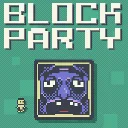
Block Party
Released
Outmaneuver murderous blocks in this platformer with leaderboards, replays, daily challenges, and a level editor.
ui/gifexportoverlay.razor.scss
@import "Theme.scss";

// Sits over the replay. The top of the screen is left clear (the camera shrinks the replay into it —
// see GameManager.BeginGifPreview); the control panel is anchored to the bottom. Pointer-events are off
// on the clear region and on for the panel.
GifExportOverlay {
	position: absolute;
	top: 0;
	left: 0;
	width: 100%;
	height: 100%;
	pointer-events: none;
	z-index: 950;

	.controls {
		position: absolute;
		bottom: 0;
		left: 0;
		width: 100%;
		min-height: 38%;
		flex-direction: column;
		align-items: center;
		justify-content: center;
		padding: 28px 40px 36px;
		background-color: rgba(2, 74, 84, 0.96);
		border-top: 6px solid $white;
		pointer-events: all;
		font-family: $font;
		font-smooth: never;
	}

	.title {
		justify-content: center;
		font-size: 44px;
		color: $white;
		text-shadow: 3px 3px 0 $black;
		margin-bottom: 16px;
	}

	// The two-head timeline component — size its outer box; it styles its own internals.
	GifTimeline {
		width: 70%;
		margin-bottom: 14px;
	}

	.readout {
		flex-direction: column;
		align-items: center;
		margin-bottom: 18px;

		.range {
			justify-content: center;
			font-size: 30px;
			color: $white;
			font-family: $font-mono;
		}

		.stats {
			justify-content: center;
			font-size: 22px;
			color: rgba($white, 0.7);
			margin-top: 4px;
		}

		.warning {
			justify-content: center;
			font-size: 20px;
			color: #ff9b9b;
			margin-top: 6px;
		}
	}

	// SIZE dropdown row. The dropdown needs a fixed width (a width-less one collapses to vertical text)
	// and opens UPWARD (OpenUp) — the panel hugs the bottom of the screen, so a menu hanging below the
	// header would fall offscreen. (The open menu only overlaps the readout, an earlier sibling, so paint
	// order already draws it on top — no z-index needed here.)
	.settings {
		flex-direction: row;
		align-items: center;
		justify-content: center;
		margin-bottom: 18px;

		.setting-name {
			font-size: 24px;
			color: rgba($white, 0.7);
			margin-right: 14px;
		}

		PixelDropdown {
			width: 220px;
		}
	}

	.buttons {
		flex-direction: row;
		justify-content: center;

		button {
			min-width: 200px;
			height: 56px;
			justify-content: center;
			align-items: center;
			margin: 0 12px;
			font-size: 28px;
			color: $black;
			background-color: $white;
			cursor: blank-hand;

			&:hover { background-color: #dddd99; }

			&.cancel {
				background-color: #c98a8a;

				&:hover { background-color: #d99a9a; }
			}

			&.disabled {
				background-color: #6a6a6a;
				color: rgba($black, 0.5);
				cursor: blank-arrow;

				&:hover { background-color: #6a6a6a; }
			}
		}
	}

	// ── result / failure / progress states ──
	.path {
		justify-content: center;
		white-space: normal;
		max-width: 90%;
		font-family: $font-mono;
		font-size: 22px;
		color: rgba($white, 0.5);
		margin-bottom: 10px;
	}

	.hint {
		justify-content: center;
		white-space: normal;
		max-width: 80%;
		font-size: 18px;
		color: rgba($white, 0.5);
		margin-bottom: 22px;
	}

	.error {
		justify-content: center;
		font-size: 24px;
		color: #ff9b9b;
		margin-bottom: 22px;
	}

	.progress {
		width: 60%;
		height: 26px;
		background-color: rgba($white, 0.18);
		border: 3px solid rgba($white, 0.6);
		margin-bottom: 10px;

		.progress-fill {
			height: 100%;
			background-color: #ffd584;
		}
	}

	.progress-label {
		justify-content: center;
		font-size: 24px;
		color: $white;
	}
}