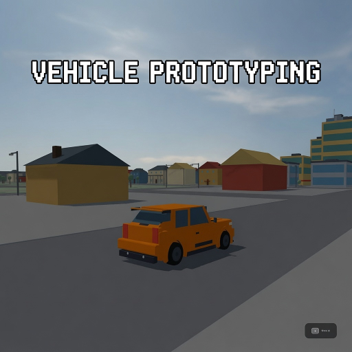
Vehicle Prototyping
Released
A free, forkable driving-game baseline for s&box — a tuned car physics stack, a proving-ground track, and a playtest
ui/_tokens.scss
// =====================================================================
//  Vehicle Prototyping — UI design tokens (CANONICAL SOURCE)
//  Onyx dark-glass theme + signal-cyan accent.
//
//  IMPORTANT — why panels INLINE these instead of `@import`-ing this file:
//    scss `@import` of a shared partial is engine-supported at RUNTIME but is
//    NOT resolved by the headless `dotnet build` — a bad path ships a broken
//    panel that builds GREEN.
//    Recommendation: prefer self-contained *.razor.scss and reserve
//    `@import` consolidation for the post-screenshot pass. Until someone
//    screenshot-verifies `@import` resolution in a GAME project, every panel
//    inlines the literal values below. THIS FILE IS THE ONE PLACE TO EDIT A
//    TOKEN — then drift-sweep the literal into the panels.
//
//  FONT / GLYPH TRAP: many selectors each declaring
//  `font-size` (and ESPECIALLY `letter-spacing`) corrupt glyph fill for the
//  whole panel. Safe config = NO letter-spacing anywhere + font-size ONLY on a
//  handful of hero numerals per panel. font-family is glyph-SAFE.
// =====================================================================

// --- accent ---
$cyan:        #4AD9F2;   // accent
$cyan-hi:     #58E1F7;   // hover
$cyan-deep:   #3AC4DE;   // gradient dark end (bars)
$ink:         #0A161A;   // text on cyan

// --- surfaces ---
$panel-bg:        rgba( 15, 17, 21, 0.90 );  // glass card
$panel-bg-strong: rgba( 15, 17, 21, 0.94 );  // modal card
$panel-bg-soft:   rgba( 15, 17, 21, 0.75 );  // hint bar
$border:      rgba( 255, 255, 255, 0.07 );
$border-hi:   rgba( 255, 255, 255, 0.10 );
$border-hi2:  rgba( 255, 255, 255, 0.12 );
$track:       rgba( 255, 255, 255, 0.12 );   // slider/bar background
$track-soft:  rgba( 255, 255, 255, 0.10 );
$fill-soft:   rgba( 255, 255, 255, 0.05 );   // inset control bg
$fill-soft2:  rgba( 255, 255, 255, 0.06 );

// --- text ---
// OWNER CONTRAST RULE (2026-07-17): no dim gray instructional text — tips, hints, keycaps,
// and labels must be white/bright. Hierarchy comes from size/weight/uppercase, NOT dimness.
// text-body/label/ghost formerly held mid/dark grays (#A6ADB8/#8B93A0/#6E7480) that read as
// "disabled"; all three now match text-hi. Kept as separate tokens (not collapsed to one) so
// semantic intent stays greppable even though the values are currently identical.
$text-hi:     #F2F4F7;   // headings / hero numerals
$text:        #E8EAED;   // body values
$text-body:   #F2F4F7;   // secondary body (was #A6ADB8)
$text-label:  #F2F4F7;   // labels (was #8B93A0)
$text-ghost:  #F2F4F7;   // mono captions / kbd (was #6E7480)

// --- state (house code: grip green / working yellow / sliding red / air grey) ---
$grip:        #8DF06B;   // grip · PASS
$working:     #F2C94A;   // working · WARN · out-of-band
$sliding:     #FF6B6B;   // sliding · FAIL · limiter
$air:         #464C56;   // airborne
$ink-pass:    #0F1A0C;   // text on green
$ink-fail:    #1A0C0C;   // text on red

// --- elevation / shape ---
$shadow:      0 20px 60px rgba( 0, 0, 0, 0.6 );
$radius-card: 18px;
$radius-mid:  16px;
$radius-chip: 12px;
$radius-sm:   10px;
$radius-pill: 99px;

// --- type ---
// Instrument Sans -> Poppins (proven engine face in this repo); JetBrains Mono
// -> "Roboto Mono" (design-note substitute, engine precedent, glyph-safe).
$font: Poppins, sans-serif;
$mono: "Roboto Mono", monospace;