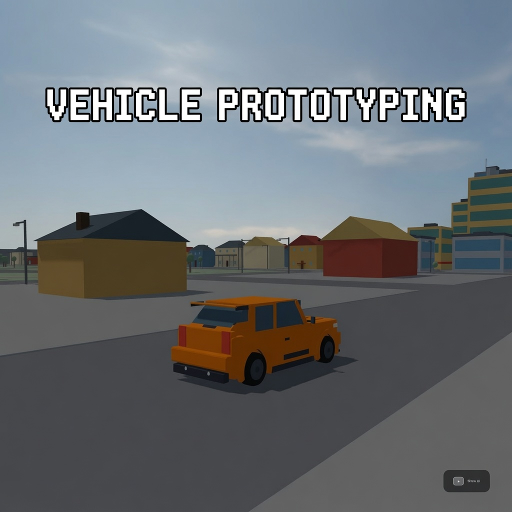
Vehicle Prototyping
Released
A free, forkable driving-game baseline for s&box — a tuned car physics stack, a proving-ground track, and a playtest
ui/telemetrypanel.razor.scss
// Instrumented overlay (design 1b). Tokens inlined from _tokens.scss.
// NO letter-spacing; font-size only on the timing hero value + its unit.

TelemetryPanel {
	position: absolute;
	inset: 0;
	pointer-events: none;
	font-family: Poppins, sans-serif;

	.mono { font-family: "Roboto Mono", monospace; }

	// ---- timing widget (top-center) ----
	.timing {
		position: absolute;
		left: 50%;
		margin-left: -210px;
		top: 32px;
		width: 420px;
		flex-direction: column;
		gap: 10px;
		padding: 18px 24px;
		background-color: rgba( 15, 17, 21, 0.90 );
		border: 1px solid rgba( 255, 255, 255, 0.07 );
		border-radius: 16px;
		box-shadow: 0 20px 60px rgba( 0, 0, 0, 0.6 );

		&.running { border: 1px solid rgba( 74, 217, 242, 0.30 ); }

		.thead {
			flex-direction: row;
			justify-content: space-between;
			align-items: center;

			.tt { flex-direction: row; align-items: center; gap: 9px; }
			.dot { width: 9px; height: 9px; border-radius: 99px; background-color: #4AD9F2; &.idle { background-color: #6E7480; } }
			.tlabel { font-weight: 700; text-transform: uppercase; color: #4AD9F2; }
			.ctx { color: #F2F4F7; }
		}

		.tvalrow {
			flex-direction: row;
			align-items: baseline;
			justify-content: space-between;

			.tval { font-size: 56px; font-weight: 600; line-height: 1; color: #F2F4F7; }
			.tunit { font-size: 22px; color: #F2F4F7; }
			.tbest { color: #8DF06B; }
		}

		.tfoot {
			flex-direction: row;
			justify-content: space-between;
			border-top: 1px solid rgba( 255, 255, 255, 0.07 );
			padding-top: 10px;
			.mono { color: #F2F4F7; }
		}
	}

	// ---- run verdict card (right) ----
	.verdict {
		position: absolute;
		right: 32px;
		top: 380px;
		width: 400px;
		flex-direction: column;
		gap: 14px;
		padding: 20px 24px;
		background-color: rgba( 15, 17, 21, 0.90 );
		border: 1px solid rgba( 255, 255, 255, 0.07 );
		border-radius: 16px;
		box-shadow: 0 20px 60px rgba( 0, 0, 0, 0.6 );

		.vhead { flex-direction: row; justify-content: space-between; align-items: center; }
		.vtitle { flex-direction: column; gap: 2px; }
		.vkicker { font-weight: 700; text-transform: uppercase; color: #F2F4F7; }
		.vname { font-weight: 700; color: #F2F4F7; }

		.badge {
			font-weight: 700;
			border-radius: 8px;
			padding: 6px 14px;
			// transparent base border so the warn state's border never changes the box size
			// (same state-size law as .wchip / .pedals .bar)
			border: 1px solid transparent;
			&.pass { color: #0F1A0C; background-color: #8DF06B; }
			&.fail { color: #1A0C0C; background-color: #FF6B6B; }
			&.warn { color: #F2C94A; background-color: rgba( 242, 201, 74, 0.12 ); border-color: rgba( 242, 201, 74, 0.45 ); }
		}

		.rule { height: 1px; background-color: rgba( 255, 255, 255, 0.07 ); }

		.metrics { flex-direction: column; gap: 12px; }
		.metric { flex-direction: column; gap: 6px; }
		.mrow { flex-direction: row; justify-content: space-between; }
		.mlbl { color: #F2F4F7; }
		.mval { color: #E8EAED; &.pass { color: #E8EAED; } &.fail { color: #FF6B6B; } }

		.mbar {
			position: relative;
			height: 8px;
			border-radius: 99px;
			background-color: rgba( 255, 255, 255, 0.10 );

			.band {
				// FIXED-RAIL FIX — single anchor offset (top) +
				// explicit height:100%, not top+bottom double offsets. See VehicleHud.razor.scss's
				// .rpm .fill comment.
				position: absolute;
				top: 0px;
				height: 100%;
				border-radius: 99px;
				&.pass { background-color: rgba( 141, 240, 107, 0.22 ); }
				&.fail { background-color: rgba( 255, 107, 107, 0.22 ); }
			}
			.mark {
				position: absolute;
				top: -3px;
				width: 3px;
				height: 14px;
				border-radius: 2px;
				&.pass { background-color: #8DF06B; }
				&.fail { background-color: #FF6B6B; }
			}
		}
		.mband { color: #F2F4F7; }

		.runline {
			color: #F2F4F7;
			background-color: rgba( 255, 255, 255, 0.04 );
			border-radius: 8px;
			padding: 8px 12px;
		}
	}

	// ---- live detail cluster (bottom, right of the speed cluster) ----
	.detail {
		position: absolute;
		left: 600px;
		bottom: 48px;
		flex-direction: row;
		gap: 16px;
		align-items: stretch;
	}

	.card {
		flex-direction: column;
		background-color: rgba( 15, 17, 21, 0.90 );
		border: 1px solid rgba( 255, 255, 255, 0.07 );
		border-radius: 18px;
		box-shadow: 0 20px 60px rgba( 0, 0, 0, 0.6 );
	}

	.steer {
		width: 190px;
		padding: 24px 22px;
		justify-content: center;
		gap: 14px;

		.dhead { flex-direction: row; justify-content: space-between; align-items: center; }
		.lbl { color: #F2F4F7; }
		.sval { color: #F2F4F7; }

		.strack {
			position: relative;
			height: 10px;
			border-radius: 99px;
			background-color: rgba( 255, 255, 255, 0.10 );

			.scenter { position: absolute; left: 50%; top: -3px; width: 2px; height: 16px; background-color: rgba( 255, 255, 255, 0.25 ); }
			.smark { position: absolute; top: -4px; width: 14px; height: 18px; border-radius: 6px; background-color: #E8EAED; }
		}
	}

	.pedals {
		flex-direction: row;
		gap: 14px;
		padding: 24px 22px;

		.ped { flex-direction: column; align-items: center; gap: 10px; }

		.bar {
			position: relative;
			width: 26px;
			flex-grow: 1;
			border-radius: 99px;
			background-color: rgba( 255, 255, 255, 0.10 );
			// NO overflow:hidden — warps absolute .fill into a mid-bar diamond/lens
			// (gotcha g-ui-flex-grow-track-holding UPDATE; same fix as VehicleHud .rpm /
			// TuningPanel .sbar).
			// SAME-SIZE FIX (same bug class as .wchip above) — base carries the same 1px
			// transparent border .absbar uses, so entering ABS doesn't widen the BRK bar
			// relative to THR/HBK.
			border: 1px solid transparent;
			&.absbar { background-color: rgba( 255, 107, 107, 0.12 ); border-color: rgba( 255, 107, 107, 0.55 ); }
		}

		.fill {
			// FIXED-RAIL FIX, vertical mirror of the engine's
			// ground-truth pattern: single anchor offset (bottom) + explicit width:100%, not
			// left+right double offsets. See VehicleHud.razor.scss's .rpm .fill comment.
			position: absolute;
			bottom: 0px;
			width: 100%;
			border-radius: 99px;
			&.thr { background: linear-gradient( to bottom, #4AD9F2, #3AC4DE ); }
			&.brk { background-color: #FF6B6B; }
			// ABS-active fill: s&box does NOT support repeating-linear-gradient (logs
			// `Unknown Image Type` every render). A fixed-stop linear-gradient reproduces the
			// red-stripe intent with a small number of hard stops instead.
			&.brk.abs { background: linear-gradient( to bottom,
				#FF6B6B 0%, #FF6B6B 20%, rgba( 255, 107, 107, 0.35 ) 20%, rgba( 255, 107, 107, 0.35 ) 40%,
				#FF6B6B 40%, #FF6B6B 60%, rgba( 255, 107, 107, 0.35 ) 60%, rgba( 255, 107, 107, 0.35 ) 80%,
				#FF6B6B 80%, #FF6B6B 100% ); }
			&.hbk { background-color: #F2C94A; }
		}

		.plbl { font-weight: 600; text-transform: uppercase; color: #F2F4F7; &.hot { color: #FF6B6B; } &.on { color: #F2C94A; } }
	}

	// CARD class is `.gripcard`, NOT `.grip` — the REAL chip-resize bug (build 5's border fix
	// missed it): a bare `.grip {}` here compiles to `TelemetryPanel .grip`, which matches ANY
	// descendant carrying class `grip` — including a wheel chip in the GRIP state (`.wchip.grip`).
	// So grip-state chips (FL/FR while gripping) inherited this card's `padding: 24px 26px` + gap and
	// ballooned to ~big squares, while working/sliding/air chips (no bare card selector) stayed 22×36.
	// Renaming the card de-collides the state vocabulary from the layout hook. (state names
	// grip/working/sliding/air stay the house code — see _tokens.scss.)
	.gripcard {
		padding: 24px 26px;
		justify-content: space-between;
		align-items: center;
		gap: 10px;

		.gplan { flex-direction: column; gap: 10px; align-items: center; }
		.axle { flex-direction: row; gap: 34px; }
		.wcell { flex-direction: column; align-items: center; gap: 5px; }

		.wchip {
			// CONSTANT SIZE IN ALL STATES — state is conveyed by COLOR only (owner directive). Every
			// state also carries an identical 1px transparent border so a border-bearing state can't
			// change the box either. The size-blowout mechanism was the `.grip` card-selector collision
			// above, now fixed by the rename; this stays as belt-and-suspenders.
			width: 22px;
			height: 36px;
			border-radius: 7px;
			border: 1px solid transparent;
			background-color: #8DF06B;
			transition: background-color 0.12s ease, border-color 0.12s ease;
			&.grip { background-color: #8DF06B; }
			&.working { background-color: #F2C94A; }
			&.sliding { background-color: #FF6B6B; }
			// solid, not dashed: the engine styler rejects `border-style: dashed` as a
			// standalone property (Code Error on load) even though the old shorthand
			// `border: 1px dashed ...` parsed silently. Dim solid reads the same at 22px.
			&.air { background-color: #464C56; border-color: rgba( 255, 255, 255, 0.25 ); }
		}
		.wlbl { color: #F2F4F7; }

		.body { width: 64px; height: 34px; border-radius: 10px; border: 1px solid rgba( 255, 255, 255, 0.14 ); background-color: rgba( 255, 255, 255, 0.04 ); }
		.gcap { font-weight: 600; text-transform: uppercase; color: #F2F4F7; }
	}

	// ---- slip mini-strip (bottom-right, self-contained ring buffer) ----
	.slip {
		position: absolute;
		right: 48px;
		bottom: 48px;
		width: 560px;
		flex-direction: column;
		gap: 12px;
		padding: 20px 24px;
		background-color: rgba( 15, 17, 21, 0.90 );
		border: 1px solid rgba( 255, 255, 255, 0.07 );
		border-radius: 16px;
		box-shadow: 0 20px 60px rgba( 0, 0, 0, 0.6 );

		.shead { flex-direction: row; justify-content: space-between; align-items: center; }
		.skicker { font-weight: 700; text-transform: uppercase; color: #F2F4F7; }
		.leg { flex-direction: row; gap: 8px; }
		.li { flex-direction: row; align-items: center; gap: 6px; color: #F2F4F7; }
		.d { width: 8px; height: 8px; border-radius: 99px; &.cyan { background-color: #4AD9F2; } &.amber { background-color: #F2C94A; } }

		.graph {
			position: relative;
			height: 120px;
			border-radius: 10px;
			background-color: rgba( 255, 255, 255, 0.03 );
			overflow: hidden;
			flex-direction: row;
			align-items: center;
			gap: 1px;
			padding: 0 6px;

			.mid { position: absolute; left: 0; right: 0; top: 50%; height: 1px; background-color: rgba( 255, 255, 255, 0.10 ); }
			.col { flex-direction: column; flex-grow: 1; align-items: center; justify-content: center; height: 100%; }
			.up { width: 2px; border-radius: 1px; background-color: #4AD9F2; }
			.dn { width: 2px; border-radius: 1px; background-color: #F2C94A; }
		}
	}
}