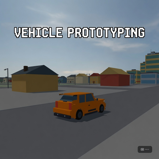
Vehicle Prototyping
Released
A free, forkable driving-game baseline for s&box — a tuned car physics stack, a proving-ground track, and a playtest
ui/sessionmenu.razor.scss
// Session menu — two-column redesign (2026-07-16). Tokens inlined from _tokens.scss.
// Engine styling constraints respected: flexbox only (NO CSS grid — the roster is a wrapped flex
// row), solid borders only (NO standalone border-style: dashed), and every state variant that adds
// a border keeps a same-width base border so nothing resizes on hover/select.

SessionMenu {
	position: absolute;
	inset: 0;
	pointer-events: none;
	font-family: Poppins, sans-serif;

	.mono { font-family: "Roboto Mono", monospace; }

	.backdrop {
		position: absolute;
		inset: 0;
		pointer-events: all;
		align-items: center;
		justify-content: center;
		background-color: rgba( 0, 0, 0, 0.30 );
		backdrop-filter: blur( 8px );
	}

	.card {
		flex-direction: column;
		width: 760px;
		padding: 28px 30px;
		gap: 20px;
		background-color: rgba( 15, 17, 21, 0.94 );
		border: 1px solid rgba( 255, 255, 255, 0.07 );
		border-radius: 18px;
		box-shadow: 0 20px 60px rgba( 0, 0, 0, 0.6 );
	}

	// Keycap chip (Esc / R / [ ]). Border is ALWAYS present so the chip never resizes.
	.keycap {
		align-items: center;
		color: #F2F4F7;
		font-size: 11px;
		border: 1px solid rgba( 255, 255, 255, 0.10 );
		border-radius: 5px;
		padding: 2px 7px;
		background-color: rgba( 255, 255, 255, 0.04 );
	}

	.rule { height: 1px; background-color: rgba( 255, 255, 255, 0.06 ); }
	.vrule { width: 1px; background-color: rgba( 255, 255, 255, 0.06 ); }

	// ---- header ----
	.header {
		flex-direction: row;
		justify-content: space-between;
		align-items: center;

		.titlecol {
			flex-direction: column;
			gap: 3px;

			.title { font-weight: 700; color: #F2F4F7; font-size: 18px; }
			.ctx { color: #F2F4F7; font-size: 12px; }
		}

		.hint {
			flex-direction: row;
			align-items: center;
			gap: 8px;

			.hintlabel { color: #F2F4F7; font-size: 12px; }
		}
	}

	// ---- two-column body ----
	.cols {
		flex-direction: row;
		gap: 24px;
	}

	.leftcol {
		flex-direction: column;
		width: 280px;
		gap: 12px;

		.spacer { flex-grow: 1; }
	}

	.rightcol {
		flex-grow: 1;
		flex-direction: column;
		gap: 10px;
	}

	// ---- buttons (left column) ----
	.btn {
		flex-direction: row;
		justify-content: center;
		align-items: center;
		gap: 8px;
		border-radius: 10px;
		cursor: pointer;
		transition: all 0.12s ease;

		&.primary {
			padding: 12px 0;
			font-weight: 700;
			font-size: 14px;
			color: #0A161A;
			background-color: #4AD9F2;
			&:hover { background-color: #58E1F7; }
		}

		&.ghost {
			padding: 11px 0;
			font-weight: 600;
			font-size: 13px;
			color: #E8EAED;
			background-color: rgba( 255, 255, 255, 0.06 );
			border: 1px solid rgba( 255, 255, 255, 0.10 );
			&:hover { background-color: rgba( 255, 255, 255, 0.10 ); }
		}

		&.quit {
			padding: 10px 0;
			font-weight: 600;
			font-size: 13px;
			color: #FF6B6B;
			background-color: rgba( 255, 107, 107, 0.08 );
			border: 1px solid rgba( 255, 107, 107, 0.35 );
			&:hover { background-color: rgba( 255, 107, 107, 0.14 ); }
		}
	}

	// ---- labelled segmented controls (drive-mode + units) ----
	.field {
		flex-direction: column;
		gap: 6px;

		.fieldlabel {
			flex-direction: row;
			justify-content: space-between;
			align-items: center;
			font-size: 12px;

			.lbl { color: #F2F4F7; }
			.val { color: #E8EAED; }
		}
	}

	.segbar {
		flex-direction: row;
		background-color: rgba( 255, 255, 255, 0.05 );
		border-radius: 8px;
		padding: 3px;
		gap: 2px;

		.seg {
			flex-grow: 1;
			justify-content: center;
			align-items: center;
			color: #F2F4F7;
			font-size: 12px;
			padding: 6px 0;
			border-radius: 6px;
			cursor: pointer;
			transition: all 0.12s ease;

			&:hover { color: #E8EAED; }
			&.on { color: #0A161A; background-color: #4AD9F2; font-weight: 700; }
		}
	}

	// ---- master-volume slider (Sound row) ----
	// Draggable track: 14px tall hit area so it's grabbable (per the slider-drag pattern). The track
	// takes the mouse; the fill is pointer-events:none so LocalPosition stays track-relative, and it
	// carries NO width transition (a transition lags the scrub behind the cursor).
	.voltrack {
		position: relative;
		height: 14px;
		border-radius: 99px;
		background-color: rgba( 255, 255, 255, 0.12 );
		pointer-events: all;
		cursor: pointer;

		.volfill {
			position: absolute;
			left: 0px;
			height: 100%;
			border-radius: 99px;
			background: linear-gradient( to right, #3AC4DE, #4AD9F2 );
			pointer-events: none;
		}
	}

	// ---- vehicle roster (right column) ----
	.rosterhead {
		flex-direction: row;
		justify-content: space-between;
		align-items: center;

		.lbl { color: #F2F4F7; font-size: 12px; }

		.cyclehint {
			flex-direction: row;
			align-items: center;
			gap: 7px;

			.cyclelbl { color: #F2F4F7; font-size: 11px; }
		}
	}

	// Wrapped flex row (NOT grid): two ~185px tiles per row → 2x2 for the four roster cars.
	.roster {
		flex-direction: row;
		flex-wrap: wrap;
		gap: 12px;

		.tile {
			flex-direction: column;
			width: 170px;
			flex-grow: 1;
			border-radius: 12px;
			overflow: hidden;
			background-color: rgba( 255, 255, 255, 0.04 );
			border: 1px solid rgba( 255, 255, 255, 0.08 );
			cursor: pointer;
			transition: all 0.12s ease;

			&:hover { background-color: rgba( 255, 255, 255, 0.08 ); border-color: rgba( 255, 255, 255, 0.16 ); }

			.thumb {
				height: 104px;
				background-color: rgba( 0, 0, 0, 0.25 );
				background-size: cover;
				background-position: center;
			}

			.tilefoot {
				flex-direction: row;
				justify-content: space-between;
				align-items: center;
				padding: 8px 12px;

				.name { color: #E8EAED; font-weight: 600; font-size: 13px; }
				.status { color: #F2F4F7; font-size: 10px; }
			}

			// Selected tile: cyan border + glow. Base already carries a 1px border, so no resize.
			&.on {
				border-color: #4AD9F2;
				background-color: rgba( 74, 217, 242, 0.08 );
				box-shadow: 0 0 0 1px rgba( 74, 217, 242, 0.35 ), 0 0 18px rgba( 74, 217, 242, 0.20 );

				.name { color: #4AD9F2; }
				.status { color: #F2F4F7; }
			}
		}
	}

	.caption { color: #F2F4F7; font-size: 11px; }
}