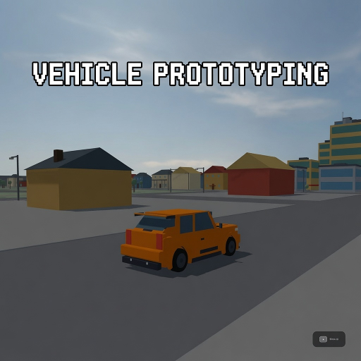
Vehicle Prototyping
Released
A free, forkable driving-game baseline for s&box — a tuned car physics stack, a proving-ground track, and a playtest
ui/tuningpanel.razor.scss
// Lab / tuning (design 1c). Tokens inlined from _tokens.scss.
// This panel type (many rows) is exactly what triggered the glyph-corruption gotcha, so
// it declares ZERO font-size / letter-spacing — hierarchy is weight + color + uppercase.

TuningPanel {
	position: absolute;
	inset: 0;
	pointer-events: none;
	font-family: Poppins, sans-serif;

	.mono { font-family: "Roboto Mono", monospace; }

	.ddot { width: 7px; height: 7px; border-radius: 99px; background-color: #4AD9F2; }

	.panel {
		position: absolute;
		left: 40px;
		top: 108px; // matches WorldControls .panel — clears the topbar chips
		max-height: 660px; // hard cap so a long tab can never reach the bottom Drive HUD cluster
		width: 480px;
		flex-direction: column;
		gap: 14px;
		padding: 22px 24px;
		background-color: rgba( 15, 17, 21, 0.92 );
		border: 1px solid rgba( 255, 255, 255, 0.07 );
		border-radius: 18px;
		box-shadow: 0 20px 60px rgba( 0, 0, 0, 0.6 );
		pointer-events: all;

		.phead {
			flex-direction: row;
			justify-content: space-between;
			align-items: center;

			.ptitle { font-weight: 700; color: #F2F4F7; }

			// right-side header cluster: the "?" explainer button + the "T" keycap chip.
			.pactions { flex-direction: row; align-items: center; gap: 8px; }

			// "?" opens the dial-explainer overlay (TuneHelpOverlay). Rounded chip, cyan-on-hover to match
			// the panel's other clickable controls (steps, tabs).
			.qbtn {
				width: 26px;
				height: 26px;
				justify-content: center;
				align-items: center;
				font-weight: 700;
				color: #F2F4F7;
				border: 1px solid rgba( 255, 255, 255, 0.10 );
				border-radius: 99px;
				background-color: rgba( 255, 255, 255, 0.04 );
				cursor: pointer;
				transition: all 0.12s ease;
				&:hover { color: #0A161A; background-color: #4AD9F2; }
			}

			.kbd { color: #F2F4F7; border: 1px solid rgba( 255, 255, 255, 0.10 ); border-radius: 5px; padding: 3px 8px; background-color: rgba( 255, 255, 255, 0.04 ); }
		}

		.tabs {
			flex-direction: row;
			background-color: rgba( 255, 255, 255, 0.05 );
			border-radius: 8px;
			padding: 3px;
			gap: 2px;

			.tab {
				flex-grow: 1;
				justify-content: center;
				align-items: center;
				color: #F2F4F7;
				padding: 7px 0;
				border-radius: 6px;
				cursor: pointer;
				transition: all 0.12s ease;

				&:hover { color: #E8EAED; }
				&.on { color: #0A161A; background-color: #4AD9F2; font-weight: 600; }
			}
		}

		.dials {
			flex-direction: column;
			gap: 14px;
			max-height: 400px; // scrolls instead of growing the card into the HUD below
			overflow-y: auto;

			.dial { flex-direction: column; gap: 8px; }

			.drow {
				flex-direction: row;
				justify-content: space-between;
				align-items: center;

				.dname { flex-direction: row; align-items: center; gap: 8px; color: #F2F4F7; }
				.dval { color: #E8EAED; }
			}

			.dctl {
				flex-direction: row;
				align-items: center;
				gap: 10px;

				.step {
					width: 28px;
					height: 28px;
					justify-content: center;
					align-items: center;
					color: #F2F4F7;
					background-color: rgba( 255, 255, 255, 0.06 );
					border: 1px solid rgba( 255, 255, 255, 0.10 );
					border-radius: 6px;
					cursor: pointer;
					transition: all 0.12s ease;

					&:hover { color: #0A161A; background-color: #4AD9F2; }
				}

				.track {
					// Click-to-jump + drag-to-scrub hit box (KB g-ui-draggable-slider-tracks-click-jump-drag):
					// events must land on the track (not the fill) so MousePanelEvent.LocalPosition stays
					// track-relative — hence pointer-events:all here + none on .fill. 14px is the grab area.
					position: relative;
					flex-grow: 1;
					height: 14px;
					border-radius: 99px;
					background-color: rgba( 255, 255, 255, 0.12 );
					pointer-events: all;
					cursor: pointer;

					.fill {
						// FIXED-RAIL FIX — engine ground-truth pattern,
						// see VehicleHud.razor.scss's .rpm .fill comment for the full explanation.
						// pointer-events:none so a press over the fill still targets the track (LocalPosition
						// stays track-relative); NO transition:width or the scrub lags the cursor visually.
						position: absolute;
						left: 0px;
						height: 100%;
						border-radius: 99px;
						background: linear-gradient( to right, #3AC4DE, #4AD9F2 );
						pointer-events: none;
					}
				}
			}
		}

		.dirty {
			flex-direction: row;
			align-items: center;
			gap: 8px;
			background-color: rgba( 74, 217, 242, 0.07 );
			border: 1px solid rgba( 74, 217, 242, 0.25 );
			border-radius: 8px;
			padding: 8px 12px;

			.dtext { color: #F2F4F7; }

			&.clean {
				background-color: rgba( 255, 255, 255, 0.03 );
				border: 1px solid rgba( 255, 255, 255, 0.07 );
				.ddot { background-color: #6E7480; }
			}
		}

		.presets {
			flex-direction: column;
			gap: 8px;

			// Issue 3: the saved-tunes ROWS scroll instead of growing the card. Header (.phdr) and the
			// empty-state line live OUTSIDE this container, so only the list scrolls; the Save-current
			// button stays put. max-height fits ~3 rows and lets a 4th peek as a scroll affordance.
			// scroll+gap on a flex column is the collapse-risk context (KB
			// g-ui-overflow-scroll-panel-breaks-even-with-minheight-pins) — this panel is UNSCALED (no
			// transform) and its sibling .dials already scrolls a gapped column fine, but each .prow
			// still carries an explicit min-height floor so a thin row can't collapse to ~0.
			.plist {
				flex-direction: column;
				gap: 8px;
				max-height: 132px;
				overflow-y: scroll;
			}

			.prow {
				flex-direction: row;
				align-items: center;
				gap: 8px;
				min-height: 34px; // thin-row collapse floor for the scroll container (see .plist)
			}

			.phdr {
				justify-content: space-between;

				.plabel { color: #F2F4F7; }

				// compact primary button (the .btn class is scoped under .foot, so style in full here)
				.psave {
					flex-grow: 0;
					justify-content: center;
					align-items: center;
					font-weight: 700;
					color: #0A161A;
					background-color: #4AD9F2;
					border-radius: 8px;
					padding: 8px 14px;
					cursor: pointer;
					transition: all 0.12s ease;
					&:hover { background-color: #58E1F7; }
				}
			}

			.pempty { color: #F2F4F7; }

			.pname {
				flex-grow: 1;
				color: #E8EAED;
				padding: 8px 10px;
				background-color: rgba( 255, 255, 255, 0.04 );
				border: 1px solid rgba( 255, 255, 255, 0.07 );
				border-radius: 8px;
				cursor: pointer;
				transition: all 0.12s ease;
				&:hover { color: #0A161A; background-color: #4AD9F2; }
			}

			.pedit, .pload, .pdel {
				justify-content: center;
				align-items: center;
				color: #F2F4F7;
				background-color: rgba( 255, 255, 255, 0.06 );
				border: 1px solid rgba( 255, 255, 255, 0.10 );
				border-radius: 6px;
				padding: 8px 12px;
				cursor: pointer;
				transition: all 0.12s ease;
				&:hover { color: #0A161A; background-color: #4AD9F2; }
			}

			.pdel:hover { color: #0A161A; background-color: #FF6B6B; }
		}

		.foot {
			flex-direction: column;
			gap: 10px;

			.frow { flex-direction: row; gap: 10px; }

			.btn {
				flex-grow: 1;
				justify-content: center;
				align-items: center;
				font-weight: 700;
				border-radius: 10px;
				padding: 12px 0;
				cursor: pointer;
				transition: all 0.12s ease;

				&.ghost { color: #F2F4F7; background-color: rgba( 255, 255, 255, 0.05 ); border: 1px solid rgba( 255, 255, 255, 0.07 ); &:hover { color: #E8EAED; background-color: rgba( 255, 255, 255, 0.09 ); } }
				&.primary { color: #0A161A; background-color: #4AD9F2; &:hover { background-color: #58E1F7; } }
			}

			.fhint { justify-content: center; color: #F2F4F7; }
		}
	}

	.suspension {
		position: absolute;
		right: 40px;
		top: 108px; // matches .panel — clears the topbar chips
		width: 440px;
		flex-direction: column;
		gap: 14px;
		padding: 22px 24px;
		background-color: rgba( 15, 17, 21, 0.92 );
		border: 1px solid rgba( 255, 255, 255, 0.07 );
		border-radius: 18px;
		box-shadow: 0 20px 60px rgba( 0, 0, 0, 0.6 );

		.shead {
			flex-direction: row;
			justify-content: space-between;
			align-items: center;
			.stitle { font-weight: 700; color: #F2F4F7; }
			.scap { color: #F2F4F7; }
		}

		.rig { flex-direction: row; justify-content: space-between; }

		.scol { flex-direction: column; align-items: center; gap: 8px; }

		.sbar {
			position: relative;
			width: 20px;
			height: 130px;
			border-radius: 99px;
			background-color: rgba( 255, 255, 255, 0.08 );
			// NO overflow:hidden — same trap as VehicleHud .rpm (gotcha
			// g-ui-flex-grow-track-holding UPDATE): clipping the track warps the absolute
			// .sfill into a floating lime diamond/lens at mid-bar. Children carry their own
			// radii instead of relying on parent clipping.
			&.bottom { background-color: rgba( 255, 107, 107, 0.15 ); border: 1px solid rgba( 255, 107, 107, 0.6 ); }

			.sfill {
				// FIXED-RAIL FIX, vertical mirror of the engine SliderControl / .rpm .fill:
				// single anchor (bottom) + explicit width:100% + height via inline style.
				position: absolute;
				bottom: 0px;
				width: 100%;
				border-radius: 99px;
				background-color: #8DF06B;
				&.bottom { background-color: #FF6B6B; }
			}
		}

		.slbl { color: #F2F4F7; &.bottom { color: #FF6B6B; font-weight: 700; } }
		.skg { color: #E8EAED; }
	}
}