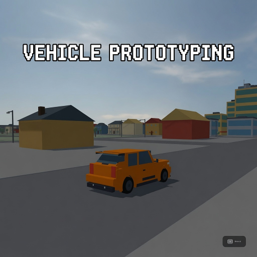
Vehicle Prototyping
Released
A free, forkable driving-game baseline for s&box — a tuned car physics stack, a proving-ground track, and a playtest
ui/helpoverlay.razor.scss
// First-run help overlay. Tokens inlined from _tokens.scss (see note there). Zero font-size /
// letter-spacing (glyph-corruption law); key chips use the body font (no mono). Every text is a
// <span> and each .row holds ONLY element children (key chip + description span) — mixing a bare
// text node with an element child corrupted the descriptions to solid blocks on the first cut.

HelpOverlay {
	position: absolute;
	inset: 0;
	pointer-events: none;
	font-family: Poppins, sans-serif;

	.backdrop {
		position: absolute;
		inset: 0;
		pointer-events: all;
		align-items: center;
		justify-content: center;
		background-color: rgba( 0, 0, 0, 0.45 );
		backdrop-filter: blur( 10px );
	}

	.card {
		flex-direction: column;
		width: 470px;
		padding: 28px 32px;
		gap: 12px;
		background-color: rgba( 15, 17, 21, 0.94 );
		border: 1px solid rgba( 255, 255, 255, 0.10 );
		border-radius: 18px;
		box-shadow: 0 20px 60px rgba( 0, 0, 0, 0.6 );
	}

	.head {
		flex-direction: column;
		gap: 4px;
		.title { font-weight: 700; color: #F2F4F7; }
		.sub { color: #F2F4F7; }
	}

	.section {
		color: #4AD9F2;
		font-weight: 700;
		margin-top: 4px;
	}

	.rows {
		flex-direction: column;
		gap: 8px;
	}

	.row {
		flex-direction: row;
		align-items: center;
		gap: 14px;

		.key {
			justify-content: center;
			align-items: center;
			width: 96px;
			flex-shrink: 0;
			color: #E8EAED;
			font-weight: 600;
			border: 1px solid rgba( 255, 255, 255, 0.12 );
			border-radius: 6px;
			padding: 6px 0;
			background-color: rgba( 255, 255, 255, 0.06 );
		}

		.d { color: #E8EAED; }
	}

	.footwrap {
		flex-direction: column;
		gap: 2px;
		margin-top: 2px;
		.foot { color: #F2F4F7; }
	}

	.btn {
		margin-top: 6px;
		justify-content: center;
		align-items: center;
		font-weight: 700;
		color: #0A161A;
		background-color: #4AD9F2;
		border-radius: 10px;
		padding: 13px 0;
		cursor: pointer;
		transition: all 0.12s ease;
		&:hover { background-color: #58E1F7; }
	}
}