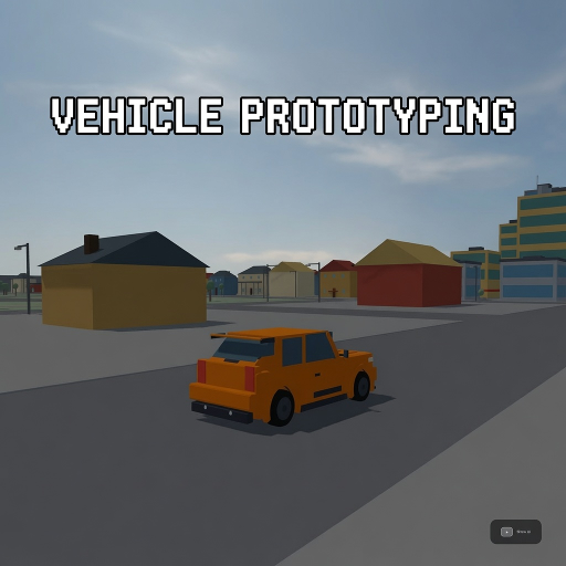
Vehicle Prototyping
Released
A free, forkable driving-game baseline for s&box — a tuned car physics stack, a proving-ground track, and a playtest
ui/tunehelpoverlay.razor.scss
// Dial-explainer overlay for the Tuning panel. Tokens inlined from _tokens.scss (house convention:
// panels self-contain literals — @import isn't resolved by the headless build). ZERO font-size /
// letter-spacing except the single title (glyph-corruption law, see HelpOverlay). All instructional
// text is bright (#F2F4F7 / #E8EAED family) per the standing text-contrast order — no dim gray.
//
// LAYOUT LESSON (owner screenshot, first cut): a `max-height + overflow-y: auto` flex column with
// shrinkable children does NOT scroll here — yoga COMPRESSES the rows into the cap instead (pills
// squashed to a sliver, text painting over neighbouring rows, tail clipped). The working recipe is
// the TuningPanel .plist one: give the scroller an EXPLICIT height + `overflow-y: scroll`, and make
// every child incompressible (flex-shrink: 0) so rows keep their natural content size and the
// region actually scrolls. Card geometry: fixed width, fixed-height scroll region, auto-height
// header/lede/footer around it — no max-height anywhere.

TuneHelpOverlay {
	position: absolute;
	inset: 0;
	pointer-events: none;
	font-family: Poppins, sans-serif;

	// Full-screen dim that captures clicks (a click on the backdrop closes). pointer-events:all here is
	// what makes this a real modal over the still-rebuilding Tuning panel underneath.
	.backdrop {
		position: absolute;
		inset: 0;
		background-color: rgba( 6, 7, 9, 0.55 );
		backdrop-filter: blur( 6px );
		pointer-events: all;
	}

	// Centering layer ON TOP of the backdrop. pointer-events:none so empty-space clicks fall through to
	// the backdrop (= close); the card re-enables events for itself. Sibling of the backdrop, so card
	// clicks never bubble to the close handler (no StopPropagation needed).
	.modalwrap {
		position: absolute;
		inset: 0;
		justify-content: center;
		align-items: center;
		pointer-events: none;
	}

	.card {
		width: 560px;
		flex-direction: column;
		gap: 14px;
		padding: 24px 26px;
		background-color: rgba( 15, 17, 21, 0.96 );
		border: 1px solid rgba( 255, 255, 255, 0.10 );
		border-radius: 18px;
		box-shadow: 0 20px 60px rgba( 0, 0, 0, 0.6 );
		pointer-events: all;

		.chead {
			flex-direction: row;
			justify-content: space-between;
			align-items: center;
			flex-shrink: 0;

			.title { font-size: 20px; font-weight: 700; color: #F2F4F7; }

			.xbtn {
				width: 30px;
				height: 30px;
				justify-content: center;
				align-items: center;
				font-weight: 700;
				color: #F2F4F7;
				border: 1px solid rgba( 255, 255, 255, 0.10 );
				border-radius: 99px;
				background-color: rgba( 255, 255, 255, 0.04 );
				cursor: pointer;
				transition: all 0.12s ease;
				&:hover { color: #0A161A; background-color: #4AD9F2; }
			}
		}

		.lede { color: #E8EAED; flex-shrink: 0; }

		// The ONLY scrolling region: fixed header/lede above, fixed footer below, this fills the middle.
		// EXPLICIT height (not max-height) + overflow-y: scroll = the proven house scroller (TuningPanel
		// .plist). Children are a FLAT list of section labels and dial rows, each flex-shrink: 0 so the
		// column can never squash them into the viewport instead of scrolling (the first-cut failure).
		.scrollbody {
			flex-direction: column;
			height: 430px;
			flex-shrink: 0;
			gap: 10px;
			overflow-y: scroll;

			.section {
				color: #4AD9F2;
				font-weight: 700;
				flex-shrink: 0;
				// Clear air above each group so headers never crowd the previous row. Applies to the first
				// section too (no :first-child exception — that selector has no house precedent here); the
				// small extra lead-in at the top of the scroll region is deliberate.
				margin-top: 8px;
			}

			// One pill per dial: bold name line, plain-language summary under it, both INSIDE the pill's
			// padding so the background always wraps the text. Column layout, element children only (name
			// span + summary span — never a bare text node beside an element; glyph-corruption law).
			.drow {
				flex-direction: column;
				gap: 3px;
				flex-shrink: 0;     // never compress — the scroller scrolls instead (owner-screenshot bug)
				min-height: 34px;   // thin-row collapse floor inside a scroll container (house .prow lesson)
				padding: 10px 12px;
				background-color: rgba( 255, 255, 255, 0.03 );
				border: 1px solid rgba( 255, 255, 255, 0.06 );
				border-radius: 10px;

				.dname { font-weight: 700; color: #F2F4F7; }
				.dsum { color: #E8EAED; }
			}
		}

		.cfoot {
			flex-direction: row;
			justify-content: space-between;
			align-items: center;
			flex-shrink: 0;
			margin-top: 2px;

			.fnote { color: #F2F4F7; }

			.btn {
				justify-content: center;
				align-items: center;
				font-weight: 700;
				color: #0A161A;
				background-color: #4AD9F2;
				border-radius: 10px;
				padding: 11px 18px;
				cursor: pointer;
				transition: all 0.12s ease;
				&:hover { background-color: #58E1F7; }
			}
		}
	}
}