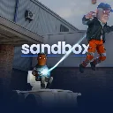
Sandbox
Released
●1
Build, create and explore in our official Sandbox game.
ui/notices/noticepanel.cs.scss
@import "/UI/Theme.scss";

$notice-bg: rgba( 38, 38, 38, 0.7 );
$notice-text: rgb( 230, 230, 230 );

NoticePanel
{
	flex-direction: column;
	width: 513px;
	background-color: $notice-bg;
	font-family: $body-font;
	font-weight: 500;
	font-size: 16px;
	color: $notice-text;
	overflow: hidden;
	animation: notice-in 0.3s ease-in-out;

	&.leaving
	{
		animation: notice-out 0.3s ease-in-out forwards;
	}

	.body
	{
		flex-direction: row;
		align-items: center;
		gap: 13px;
		padding: 9px 13px;
	}

	.icon
	{
		flex-shrink: 0;
		font-size: 25px;
		position: relative;
		top: 2px;
		line-height: 15px;
		font-family: "Material Icons";
	}

	.text
	{
		flex-grow: 1;
		flex-shrink: 1;
		font-size: 16px;
		font-weight: 600;
		line-height: 15px;
	}

	.bar
	{
		height: 2px;
		flex-shrink: 0;
		background-color: rgba( black, 0.35 );
		overflow: hidden;
	}

	// remaining time, anchored left so it drains right to left. Width is set from code
	.fill
	{
		height: 100%;
		background-color: $hud-accent;
	}

	&.manual .fill
	{
		width: 100%;
		animation: progress-sweep 2s ease-in-out infinite;
	}
}

$slide-distance: 600px;

@keyframes notice-in
{
	from
	{
		transform: translateX( $slide-distance );
	}

	to
	{
		transform: translateX( 0px );
	}
}

@keyframes notice-out
{
	from
	{
		transform: translateX( 0px );
	}

	to
	{
		transform: translateX( $slide-distance );
	}
}

@keyframes progress-sweep
{
	0%
	{
		transform: translateX( -100% );
		opacity: 1;
	}

	50%
	{
		transform: translateX( 0% );
		opacity: 1;
	}

	85%
	{
		transform: translateX( 100% );
		opacity: 1;
	}

	100%
	{
		transform: translateX( 100% );
		opacity: 0;
	}
}