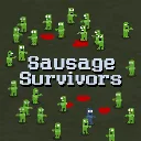
Sausage Survivors
Released
2d zombie survival
ui/panelcomponents/mainmenu.razor.scss
MainMenu {
	position: absolute;
	top: 0;
	left: 0;
	right: 0;
	bottom: 0;
	justify-content: center;
	align-items: center;
	font-weight: bold;
	font-family: "Mini Pixel-7";
	pointer-events: all;
	background-color: rgba(black, 0.2);
	//backdrop-filter: blur( 1px );
	flex-direction: column;
	padding: 50px;
	cursor: "default-cursor";

	.title {
		position: absolute;
		top: -15px;
		right: 36px;
		//align-self: flex-end;
		font-size: 124px;
		text-stroke: 5px black;
		color: #fff;
		//text-shadow: 8px 8px 0px black;
		flex-shrink: 0;
	}

	> .content {
		gap: 32px;
		width: 100%;
		height: 100%;

		.button-container {
			flex-direction: column;
			//justify-content: flex-end;
			justify-content: flex-end;
			flex-shrink: 0;
			gap: 8px;
		}

		.content-panel {
			height: 100%;
			flex-grow: 1;
			background-color: rgba(black, 0.8);
			border-radius: 10px;
		}
	}

	.button {
		width: 300px;
		background-color: #4CAF50;
		border: none;
		color: white;
		padding: 15px 32px;
		text-align: center;
		align-content: center;
		justify-content: center;
		align-items: center;
		font-size: 54px;
		margin: 4px 2px;
		cursor: pointer;
		//box-shadow: 6px 6px 0px black;
		//border-radius: 10px;
		cursor: "select-cursor";
		position: relative;

		InputHint {
			position: absolute;
			left: 16px;
		}

		&:hover {
			background-color: #45a049;
			sound-in: ui.button.over;
		}

		&:active {
			background-color: #65c069;
		}

		&.red {
			background-color: #f44336;

			&:hover {
				background-color: #d32f2f;
			}

			&:active {
				background-color: #f34f4f;
			}
		}

		&.blue {
			background-color: #2196F3;

			&:hover {
				background-color: #1e87f0;
			}

			&:active {
				background-color: #2ea7ff;
			}
		}
	}

	.fade_in {
		position: absolute;
		top: 0;
		left: 0;
		right: 0;
		bottom: 0;
		z-index: 1000;
	}
}