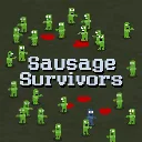
Sausage Survivors
Released
2d zombie survival
ui/panels/choicepanel.razor.scss
ChoicePanel {
    position: absolute;
    right: 10px;
    bottom: 0;
    top: 0;
    align-items: center;
    justify-content: flex-end;
    flex-direction: row;
    //background-color: red;

    .choice_modal {
        width: 320px;
        backdrop-filter: blur( 10px );
        padding: 10px;
        gap: 10px;
        flex-direction: column;
        align-items: center;
        justify-content: center;
        background-color: #000a;
        font-family: "Mini Pixel-7";

        .choice_lvl_label {
            color: #fffe;
            font-size: 38px;
            font-weight: bold;
            justify-content: center;
        }

        .choice_button_container {
            flex-direction: column;
            gap: 16px;
        }

        .choice_button {
            max-width: 320px;
            min-height: 90px;
            pointer-events: all;
            flex-direction: column;
            align-items: flex-start;
            cursor: "select-cursor";
            padding: 5px;
            padding-left: 100px;
            opacity: 1;

            //border-radius: 4px;
            color: #aaa;
            position: relative;
            background-color: #0003;

            &:hover {
                opacity: 1;
                filter: brightness( 2 );
                background-color: #fff3;
                color: #fff;
            }

            &:active {
                background-color: #000033ff;
            }

            .choice_title {
                color: #66ff66;
                font-size: 30px;
                font-weight: 400;
                align-items: center;
                gap: 6px;

                InputHint img {
                    width: 30px;
                }
            }

            .choice_icon {
                position: absolute;
                left: 8px;
                top: 8px;
                width: 80px;
                height: 80px;
                image-rendering: pixelated;
                background-size: cover;
                background-repeat: no-repeat;

                .status_level_label {
                    position: absolute;
                    color: #fff;
                    top: 4px;
                    right: 12px;
                    font-size: 36px;
                    font-family: "Mini Pixel-7";
                    font-weight: 600;
                    color: white;
                    opacity: 1;
                    text-shadow: -3px 3px 0px #000000;
                    text-stroke: 2px black;
                    pointer-events: none;
                    //background-color: blue;
                }
            }

            .choice_description {
                font-size: 22px;
                //color: #fffe;
                padding-top: 2px;
                padding-bottom: 4px;
                padding-right: 4px;
                //border: 1px solid blue;
                font-weight: 300;
            }
        }

        .reroll_button {
            width: 100%;
            height: 40px;
            background-color: #000000cc;
            pointer-events: all;
            margin-top: 4px;
            margin-bottom: 4px;
            align-items: center;
            justify-content: center;
            gap: 8px;
            cursor: "select-cursor";

            InputHint img {
                width: 30px;
            }

            &:hover {
                background-color: #000000ff;
            }

            &:active {
                border: 3px solid #88880099;
            }

            .reroll_button_label {
                color: #aaaaaa;
                font-size: 28px;
                pointer-events: none;
            }

            .disabled_text {
                color: #aaaaaa22;
            }
        }

        .disabled {
            pointer-events: none;
            border: 3px solid #ffffff11;
        }
    }
}