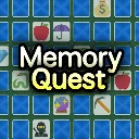
Memory Quest
Released
Remember and match cards with interesting abilities.
ui/cardtypetooltip.razor.scss
CardTypeTooltip {
	position: absolute;
	width: 280px;
	//width: 320px;
	//height: 180px;
	//border-radius: 10px;
	justify-content: center;
	align-items: center;
	background-color: #111111fd;
	flex-direction: column;
	//padding-top: 8px;
	//padding-bottom: 8px;
	//padding-left: 6px;
	//padding-right: 6px;
	background-color: #11111188;
	box-shadow: 0px 8px 4px #00000099;
	//background-color: #000000aa;
	backdrop-filter: blur(12px);
	border: 4px solid #000000aa;
	border-radius: 15px;
	padding: 8px;

	.name {
		font-size: 24px;
		color: #fff;
	}

	.icon_container {
		flex-direction: row;
	}

	.icon {
		width: 80px;
		height: 80px;
		background-repeat: no-repeat;
		background-size: contain;
		background-position: center center;
		margin-top: 8px;
		margin-bottom: 8px;
		filter: drop-shadow(0px 8px 3px #00000055);
	}

	.description {
		font-size: 16px;
		color: #999;
		white-space: pre-wrap;
		width: 100%;
		flex-shrink: 0;
		//justify-content: center;
		//align-items: center;
		//flex-wrap: wrap;
	}

	.explanation {
		font-size: 16px;
		color: #ffffff66;
		white-space: pre-wrap;
		width: 100%;
		flex-shrink: 0;
		font-style: italic;
		padding-top: 12px;
	}

	.hp_container {
		width: 60%;
		height: 10px;
		//background-color: blue;
		justify-content: center;
		align-items: center;
		margin-bottom: 8px;
	}

	.hp_icon {
		font-size: 16px;
		font-family: W10Emoji;
	}
}